This article first appeared in the journal Exhibition (Fall 2025) Vol. 44 No. 2 and is reproduced with permission.
Exhibition graphic designers are tasked with turning compelling stories into beautiful visuals that touch a diverse audience of visitors. As standards for universal graphic design (UGD) evolve, our approach to the blank page must evolve too. Reconsidering how we use some traditional levers of design, or discarding them completely, is essential moving forward. In creating change, we cannot fall into the mindset that UGD is somehow a restriction. Rather, we must approach this challenge with unbending positivity. We must commit ourselves to a universal design ethos which demands solutions that both maximize the quality of aesthetic storytelling and reach people with and without disabilities.
Universal design (UD) is “the design and composition of an environment so that it can be accessed, understood and used to the greatest extent possible by all people regardless of their age, size, ability or disability.”[i] It is widely agreed upon that, when applied to exhibitions, UD improves visitor experience for everyone. Specifically, a UGD approach benefits people with an array of conditions that may or may not fall into the category of legally recognized disabilities, such as those with vision loss who can see functionally but with limitations, seniors, and those with brain-based differences and disabilities such as dyslexia. The guidance presented in this paper will not meet the needs of people with profound vision loss or the legally blind. Additional UD measures such as tactile experiences, auxiliary aids, and multisensory enhancements such as braille, assistive listening, and audio description must be employed to create access for this community of visitors.
The United States National Park Service’s (NPS) approach to design is firmly rooted in decades of existing accessibility law. In creating its facilities, exhibitions, programs, and services, the primary laws, associated standards, and codes that the NPS must follow include:
- 1968 Architectural Barriers Act[ii]
- Sections 504 and 508 of the 1973 Rehabilitation Act[iii], [iv]
- American National Standard ICC A117.1[v]
Signed in 2000, the National Park Service Director’s Order No. 42 identifies UD and its principles as an approach that facilitates NPS’s ability to meet its legal obligations.[vi]
Harpers Ferry Interpretive Design Center (HFC) is NPS’s locus for exhibition design and media production. Since its inception in 1970, HFC has helped “create a deeper meaning and connection to our nation’s treasured stories and lands.”[vii] In addition, HFC is a leader in the advancement of accessibility and UD.
In the late 1980s, HFC began development of its Programmatic Accessibility Guidelines for National Park Service Interpretive Media.[viii] These guidelines serve as a foundational document for the planning, design, and fabrication of all NPS media projects, including exhibitions. They were created by media experts in conjunction with accessibility specialists who are steeped in this subject matter and have many connections within the disability community, and/or are members of this community themselves. HFC is currently in the process of updating the guidelines, including adding state-of-the-art recommendations for exhibition graphic design and typography. These upgrades are based on existing research, outreach to organizations representing people with disabilities, guidelines published by these organizations, and feedback from workshops with members of the disability community that have occurred over time.
Kristy Van Hoven, PhD, a scholar who studies the health and wellness benefits of museum participation, explains, “Although the law outlines generalized requirements for access, they are often left to the interpretation of those implementing accessibility strategies.”[ix] This is true for exhibit graphic design. While accessibility guidelines provide more specificity, there remains ample room for interpretation when developing a design’s look and feel. It is through this process of interpretation that committed creatives can redefine what is possible. This paper explores three NPS visitor-center projects that show us how the intersection between exhibition graphic design and UD can be traversed with inspirational results.[x]
Case Study 1: César E. Chávez National Monument (CECH),[xi]
Keene, California
Civil rights and labor leader César E. Chávez’s contributions to the national story will be memorialized in the visitor center at Nuestra Señora Reina de La Paz, the home and workplace of the Chávez family and Chávez’s final resting place.[xii] New exhibits have been collaboratively created by the Chávez family, CECH NPS personnel, HFC, and Howard+Revis Design, a contracted planning and design firm.
UD has played a major role in the exhibition’s development process. As HFC’s contracting officer’s representative Ed Mooney explains, “This project was so steeped in civil rights, it needed to set an example.”
To ensure that accessibility remained at the forefront through every stage in the process, Howard+Revis brought in Jan Majewski, an expert in museum and exhibition accessibility from the Institute for Human Centered Design (IHCD). Kateri Ang, Howard+Revis’ graphic designer, describes the CECH creation process in the following terms, “We honor the story while ensuring that every visitor, regardless of ability, can engage with the exhibition. Throughout the development phases, we gave Jan our thoughts, and then she would send feedback . . . it was a collaboration between us.”
To tell Chávez’s story, Howard+Revis created a layered graphic program that referenced the rich visual language of the United Farm Workers (UFW) movement. Accessibility was considered in unison with aesthetic choices, an approach that required a flexible mindset. Ideas that did not meet accessibility guidelines were not pursued. But as Nina Reck, Howard+Revis’ graphic designer explained, “We always ended up coming to something that was just as good or better, but that was also accessible.” What could have been seen as constraints were actually creative inspirations.
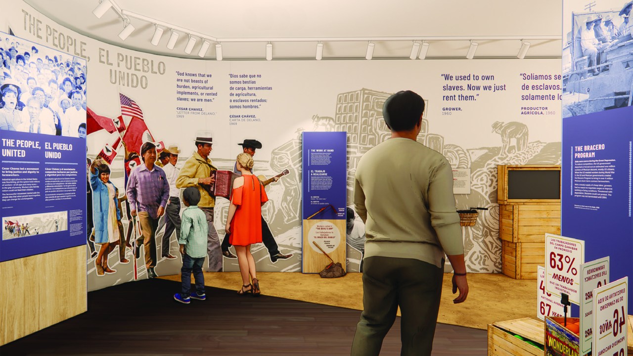
Given the project’s mandate, HFC required an accessibility workshop at the completion of the Design Development Two (DDII) phase. Full-scale prints of exhibition graphics were analyzed by the team, including HFC’s and Howard+Revis’ accessibility specialists. Reviewers reinforced that a clear, consistent visual hierarchy makes it easier for all visitors to navigate an exhibition and take in information (fig. 1).


Illustrative murals were stylistically inspired by wood block prints from El Malcriado, a publication that served as the voice of the UFW. These function both as spatial backdrops and storytelling devices. Reviewers noted that the meaning of these murals might not be understandable to all visitors.[xiii] In response, the Howard+Revis team created additional explanatory graphics, with comprehensive views of the murals and highly legible explanatory text (fig. 2).
Further conversations evolved around the project’s typographic program. HFC’s accessibility guidelines define successful text as both “legible (letterforms are clear and distinguishable) and readable (text can be absorbed with speed, accuracy, and enjoyment).”[xiv] Creating accessible typography is more than choosing the right font. “It is also using the font properly: size, line length, leading, letter and word spacing, color, lighting, contrast, etc.”[xv]
Howard+Revis’ designers found typefaces evocative of the history and combined them in universally understandable ways. They worked skillfully within typographic accessibility guidelines that advise limited use of styles such as all caps, handwritten, cursive, italic, and condensed typefaces. For example, designers created data-driven placards visually inspired by hand-painted grocery signs. They simplified layouts, employing two sans serif fonts for most type. Use of all caps was considered accessible because line lengths were short. For select words, they chose Ed’s Market Regular Slant, a sign-paint inspired font. In accessibility guidelines, oblique (slanted versions of a roman font) are generally considered more legible and readable than italics (fig. 3).[xvi]


Moreover, in searching for the right title treatment designers agreed that a condensed font could help comfortably fit longer titles. As Ang put it, “condensed fonts are not necessarily accessible or not. It’s dependent on the exact typeface. It’s important to choose the right condensed font.” At the accessibility workshop, Howard+Revis presented eight different font choices for the titles. The consensus was that Barlow Condensed Bold worked best, from both aesthetic/storytelling and accessibility perspectives (fig. 4).
Finally, reviewers felt the exhibition had too much text and that, without sacrificing stories, word count should be reduced. Elizabeth Eubank, Howard+Revis’ content developer, qualified accessibility as “a natural limiting factor,” stating, “This is a huge, decades long story. There’s a lot of detail and nuance, and a lot of people who deserve to have their story told. But, because of the accessibility standards, you can’t just make the text smaller to make everything fit. It forced us to be brief, clear, and efficient with the story.”
Case Study 2: San Antonio Mission National Historical Park (SAAN)[xvii]
San Antonio, Texas
Comprised of four missions (Concepción, San José, Espada, and San Juan), a colonial ranch, and an aqueduct, this UNESCO World Heritage Site speaks to the historical merging of Indigenous and Spanish cultures.[xviii] In a joint effort between HFC, SAAN’s NPS staff, and the consulting planning/design firm 106 Group, new visitor center exhibits have been developed at Mission San Juan.
106 Group’s expertise, gained from a decade of working on NPS wayside projects, makes finding accessible solutions second nature. One NPS TAIP (Targeted Accessibility Improvement Project) in particular, Devils Tower (DETO) National Monument, provided crucial feedback.[xix] Across DETO project phases, accessibility specialists from NPS, HFC, and the National Center for Accessibility participated in reviews. They brought expertise drawn from past projects where users from the low-vision community evaluated graphics. The knowledge acquired from these DETO critiques continues to inform all of 106 Group’s work.
Within the studio, designers constantly check one another’s progress, making sure:
- Text is large enough and contrast levels sufficient[xx]
- Leading and spacing work to increase legibility[xxi]
- Text and images are placed at universally legible heights off the ground[xxii]
- Photos and graphics have a full range of values[xxiii]
Creatives rely on their well-honed instincts to find the right balance between accessibility and aesthetic quality. Graphic designer Andrew Devich characterizes this process as “a delicate dance.” He emphasizes the need “to keep your design ego in check. . . . What might look great, isn’t always the most accessible.”
Adequate contrast between type and background is essential in creating UGD.[xxiv] As such, contrast levels were carefully considered when creating SAAN’s color palette. The exhibition’s blues and greens reference themes at the heart of the mission story: water and agriculture. Designers tested a range of tonal combinations to analyze how colors worked together. They reviewed printed samples, chose best options, and checked choices digitally with a color contrast analyzer (fig. 5).[xxv]

Additionally, 106 Group leaned into possibilities with typography. For titling, the team wanted an expressive font that paid homage to the 1700s mission era. Accessibility guidelines advise limited use of decorative fonts,[xxvi] so finding an acceptable choice required a deft understanding of typographic subtleties. Across options,106 Group looked at factors critical in determining a font’s legibility such as x-heights, ascenders/descenders, and whether one letter could be mistaken for another.[xxvii] After much back-and-forth, the team settled on Ode, an elegant, period-specific typeface. To enhance the accessibility of this solution, titles and/or their meanings are captured in a secondary place. For example, in the introductory panel, the title “Yanaguana” also appears in a highly legible sans serif font, Proxima Nova, as part of the body text (fig. 6).

Lastly, exploration is ongoing as to whether text can be placed accessibly on anything other than a solid background. In general, designers want to retain the option of using textured backgrounds and believe that under certain circumstances this can be made to work. 106 Group brings us closer to understanding what an acceptable solution might look like. Reducing a texture’s opacity, until it is almost indistinguishable (approximately 5 percent), adds just enough visual interest, while text remains legible and readable (fig. 7). Additionally, a slightly bolder font weight can bolster accessibility. Devich stresses the importance of picking a main text font with a wide variety of weights. “This allows type to be punched up just a notch, without becoming tediously bold.”

Case Study 3: Montezuma Castle National Monument (MOCA)[xxviii]
Camp Verde, Arizona

Dating back to approximately 1050 CE, this 20-room high-rise apartment nestled into a towering cliff tells a story of Native American ingenuity, survival, and prosperity.[xxix] Team members at HFC worked with NPS staff at MOCA and Tessellate, the project’s consulting planning/design firm, to create new visitor center exhibits that opened to the public in December 2024.
Tessellate’s exhibition development process began by considering a broad range of audience abilities and identifying potential barriers to the visitor experience. One by one, they addressed the barriers with accessible solutions.
Aesthetically, 2D and 3D elements work holistically together. The simple beauty of the exhibition’s structural design complements a bold approach to exhibition graphics (fig. 8).
UGD solutions work in harmony with storytelling. Compositions are structured around large, softened geometric and organic shapes. These are inspired by the weaving and ceramic patterns of the ancestral people yet connect to the present day with a contemporary look and feel. As Tessellate’s producer Emily Conrad notes, “We didn’t want anything to feel like it was in the past . . . we wanted to have a vibrancy of the here and now. Interpreting the content in a graphic, illustrative visual style created the timelessness that we were looking for.” She describes the graphic approach as “impactful at a glance.”
Maria Burke, Tessellate’s graphic designer, explains how this design strategy tells visitors, “not only did . . . people live here and have a very rich culture, but . . . their descendants are still living on the same land. We were trying to bring in that human quality with a hand-drawn approach . . . a visual reminder that these were created by people. So, they are not perfect. They are not machine made” (fig 9).
A high-contrast color palette of red argillite, ochre, turquoise, sage, earthenware, sand, salt, and obsidian was inspired by the landscape and materials and pigments found at the site. Colors are tastefully combined in legible ways. Tessellate tested their choices in Adobe Illustrator to verify graphics could be understood by people with color blindness (fig. 10).[xxx]
The team used simple type treatments to balance the powerful illustrative style. They chose a sans serif, Carla, for the main body and label text to reinforce the exhibition’s contemporary aesthetic and allow for consistency between printed and digital applications.[xxxi] Intentionality with increased spacing between letters and sentences enhances legibility. For titling, the team went with NPS Rawlinson, the National Park Service’s serif. This created a complementary dynamic between titles and text, while giving NPS visitors a sense of comfort through familiar branding.

In addition, Tessellate kept exhibition texts concise. They used the fewest words possible while ensuring that messaging remained impactful and communicative of the narrative. Wherever feasible, they told the story visually, replacing words with photographs, illustrations, tactiles, and hands-on interactives (fig. 11).
Finally, the MOCA project reminds us that UD includes providing cross-generational experiences. Families come to National Parks with small children that don’t yet read. Tactiles and hands-on experiences allow people of all ages to engage with an exhibit by touch. From a design perspective, these learning opportunities fit seamlessly within the exhibition’s environmental and aesthetic graphic approach.


Designers Have the Power to Create Change
In Design for Belonging, designer and teacher Susie Wise reinforces that “belonging is the thing that matters most.” She goes on to assert that belonging is “a feeling, and you can’t design a feeling. What you can design . . . are the concrete things . . . to set the stage for belonging to emerge . . . we designers have a responsibility – to grapple with what happens, in, from, by and through our designs.”[xxxii]
Designers have power. We make choices that determine whether or not people feel welcome in a space. When exhibition graphics are universally designed, a much broader range of visitors will feel that they belong.
At Harpers Ferry Center, we’ve learned many lessons as we’ve worked to ensure that more and more people with and without disabilities feel they belong in our National Parks. For example, we’ve learned that incorporating UGD strategy from the earliest project stages makes a big difference. HFC’s Ed Mooney stresses the importance of having accessibility conversations often and of making incremental changes along the way: “These small things add up to a greatly improved exhibition.”
In addition, we’ve learned that creating opportunities for the user community to participate in reviews provides invaluable feedback.
Moreover, we’ve learned that we cannot settle for mediocrity. We must persist with a design’s development until the very best solutions emerge.
As designers, we must lean in deeply to our expertise and push hard to create visually compelling outcomes that benefit the most people. What we know today will undoubtedly evolve as we continue to explore, experiment, and receive more feedback from the user community. As these case studies demonstrate, designing exhibition graphics accessibly does not mean sacrificing aesthetic excellence. Rather, these projects showcase what is possible when we wholeheartedly embrace the opportunity of universal graphic design.
Resources for Creating Accessible Graphics
Accessibility Guidelines
- Programmatic Accessibility Guidelines for National Park Service Interpretive Media
- Smithsonian Guidelines for Accessible Exhibition Design
- AccessAbility 2: A Practical Handbook on Accessible Graphic Design, Association of Registered Graphic Designers
- The 7 Principles of Universal Design, The National Disability Authority
Writing Accessible Content
- The Smithsonian Institution’s Guide to Interpretive Writing for Exhibitions
- Exhibit Labels: An Interpretive Approach, Second Edition, Beverly SerrellNote: This book is not specifically about accessibility but many of its recommendations naturally speak to the goals of UGD. The chapter on typographic design explains the importance of designers and writers working together.
Digital Tools
- TPGI: Color Contrast Analyzer
- Adobe Color Safe Checker
- Adobe Illustrator and Photoshop tools to soft proof for color blindness
- Coblis: Color Blindness Simulator
Valerie Faithorn is an exhibit designer at Harpers Ferry Interpretive Design Center, National Park Service, in Harpers Ferry, West Virginia. valerie_faithorn@nps.gov
[i] CIO Council Operations, “Universal Design – What is It?,” U.S. Chief Information Officers Council, blog post, December 20, 2017, https://www.cio.gov/2017/12/20/universal-design.html.
[ii] “The Architectural Barriers Act of 1968,” National Park Service/Accessibility/Laws & Policy, last updated January 7, 2022, https://www.nps.gov/subjects/accessibility/laws-and-policy.htm.
[iii] “Section 504 of the 1973 Rehabilitation Act,” National Park Service/Accessibility/Laws & Policy, last updated January 7, 2022, https://www.nps.gov/subjects/accessibility/laws-and-policy.htm.
[iv] “Section 508 of the 1973 Rehabilitation Act,” National Park Service/Accessibility/Laws & Policy, last updated January 7, 2022, https://www.nps.gov/subjects/accessibility/laws-and-policy.htm.
[v] “Intended for adoption by government agencies and those involved in setting model codes, this standard offers comprehensive criteria for making sites, facilities, buildings, and related elements accessible to and usable by people with disabilities.” See, “ANSI A117.1 vs. ADA Guidelines for Accessible Design,” ANSI: American National Standards Institute,” blog post by Brad Kelechava, June 14, 2023, https://blog.ansi.org/ansi-a117-1-ada-guidelines-accessible-design/.
[vi] “Director’s Order No. 42: Accessibility for Visitors with Disabilities,” November 3, 2000, https://www.nps.gov/subjects/policy/upload/DO_42_11-3-2000.pdf.
[vii] “Inspiring Visitors through Interpretive Media,” Harpers Ferry Center, accessed May 15, 2025, https://www.nps.gov/subjects/hfc/index.htm.
[viii] Programmatic Accessibility Guidelines for National Park Service Interpretive Media (Harpers Ferry Interpretive Design Center, Version 2.4, October 2019). The guidelines are available to download at HFC Media Accessibility Guidelines.
[ix] Kristy Van Hoven, PhD, “Creating Access for Patients and Caregivers Through Museo-Medical Partnerships,” in An Accessible Past: Making Historic Sites Accessible, ed. Heather Pressman, (Rowman & Littlefield, 2023), 165.
[x] The planning and design work streams for the highlighted case studies did not include direct design reviews with the user communities. As such, the development of UGD for these projects drew on the learned expertise of design and accessibility specialists at HFC and its consulting partners.
[xi] Content and quotations for Case Study 1 derived from “A Conversation with Harpers Ferry Center’s Ed Mooney and Members of the Howard+Revis Creative Team,” interview with the author, February 27, 2025, and follow-up emails, April 14–16, 2025.
[xii] For more information see, “César E. Chávez National Monument,” National Park Service, accessed May 15, 2025, https://www.nps.gov/cech/planyourvisit/basicinfo.htm.
[xiii] Reinforced in Programmatic Accessibility Guidelines for National Park Service Interpretive Media, 40. “Some people have difficulty seeing a large exhibit, mural, or architectural feature in its entirety. Consider providing an approachable photograph of the full scene.”
[xiv] Harpers Ferry Center Media Accessibility Specifications for National Park Service Interpretive Media, unpublished draft, 106.
[xv] Programmatic Accessibility Guidelines for National Park Service Interpretive Media, 36.
[xvi] RGD, AccessAbility 2: A Practical Handbook on Accessible Graphic Design (The Association of Registered Graphic Designers, 2021), 22; https://rgd.ca/working-in-design/resources/accessability-2-a-practical-handbook-on-accessible-graphic-design.
[xvii] Content and quotations for Case Study 2 derived from “A Conversation with 106 Group,” interview with the author, February 28, 2025, and follow-up emails, March 14 and 31, 2025.
[xviii] For more information see, “San Antonio Missions National Historical Park,” National Park Service, accessed May 15, 2025, https://www.nps.gov/saan/index.htm.
[xix] “Devils Tower Completes Accessibility Project,” NPS News Release, August 6, 2021, https://www.nps.gov/deto/learn/news/2021-8-06-devils-tower-completes-accessibility-project.htm.
[xx] Programmatic Accessibility Guidelines for National Park Service Interpretive Media, 36–38.
[xxi] RGD, AccessAbility 2, 28–29.
[xxii] There is some minor differentiation in guidelines when it comes to eye-level zone. In HFC’s current version of its guidelines, eye-level zones for an exhibition’s main text are specified at 40″–60″ off the ground: Programmatic Accessibility Guidelines for National Park Service Interpretive Media, 37. In the forthcoming revised version of these guidelines, these zones shift to 35″–60″. In RGD’s guidelines, the vertical placement is specified at approximately 43″–67″. RGD, AccessAbility 2, 76.
[xxiii] Programmatic Accessibility Guidelines for National Park Service Interpretive Media, 50. “Photographs should have a wide range of grayscale variation. Select black-and-white or color images that have a focused subject and uncomplicated surroundings . . .” This can be a problem, especially with historic photos.
[xxiv] Programmatic Accessibility Guidelines for National Park Service Interpretive Media, 38. The forthcoming revised version of these guidelines explains, “Color choices impact the clarity and contrast of words and images differently for each viewer. The hue, lightness, and saturation of each color and how colors are combined affect the ability of a person with low vision or color blindness to detect and distinguish information.”
[xxv] “Color Contrast Analyzer (CCA),” TPGI, accessed May 15, 2025, https://www.tpgi.com/color-contrast-checker/.
[xxvi] RGD, AccessAbility 2,22.
[xxvii] Ibid., 24–25. X-heights are the ratio of the height difference between uppercase and lowercase letterforms. Ascenders/descenders are the upward/downward vertical stroke found in certain lowercase letters such as p and b. Some typefaces have “needlessly similar” letterform designs that can be misunderstood by various readers.
[xxviii] Content and quotations for Case Study 3 derived from “A Conversation with Members of Tessellate’s Creative Team,” interview with the author, March 3, 2025, and follow-up emails, April 15 and 23, 2025.
[xxix] For more information see, “Montezuma Castle National Monument,” National Park Service, accessed May 15, 2025, https://www.nps.gov/moca/index.htm.
[xxx] For more see, “Soft-proofing for color blindness,” Design Guidelines: Accessible Images in Illustrator, Adobe, accessed May 15, 2025, https://www.adobe.com/accessibility/products/illustrator.edu.html#filters.
[xxxi] An Interview by the Editors, “Scaffolding to Build Inclusive Interactives: Ben Jones’ Digital Design Approach,” in Inclusive Digital Interactives: Best Practices + Research, (A collaboration of Access Smithsonian, Institute for Human Centered Design, and MuseWeb, 2020), 18. Jones stresses the importance of visual clarity when designing digital visitor experiences and advises that “sans serif fonts tend to be best for body text.” This is reinforced in “Understanding Accessible Fonts and Typography for Section 508 Compliance: Why Sans Serif,” GSA Section508.gov, last updated March 2025, https://www.section508.gov/develop/fonts-typography/.
[xxxii] Susie Wise,Design For Belonging: How to Build Inclusion and Collaboration in Your Communities (Ten Speed Press, 2022), xii–xiii.
Upcoming Events
-
AASLH Women’s History Hour: Leading the Change
Event Date:Presented by: American Association of State and Local History (AASLH) -
Museum Digital Summit
Event Date:Presented by: MuseumNext -
Environmental Monitoring for Collections of All Sizes
Event Date:Presented by: C2C Care/FAIC -
Digital Innovations in Collections Stewardship and Access at Jewish Museums
Event Date:Presented by: American Alliance of Museums