In my time heading the Excellence Programs at AAM (including MAP and Accreditation) it was always a challenge to coax, cajole or even gently bully museums into producing well-tailored risk management plans.
AAM staff tried disseminating standards, writing books and compiling sample documents. (Turns out sample documents can backfire. I reviewed one emergency response plan which seemed strangely familiar, checked Google Maps and found that the assembly site specified for staff after evacuation was in…a different city than the museum. Oops.)
My current focus on the long-term future gives me a new perspective on risk management. I sometimes find myself reading the news, shaking my head and thinking things like “that museum spent $45 million on new buildings which are, oh, let’s see, 200 yards from the Gulf Coast?!”
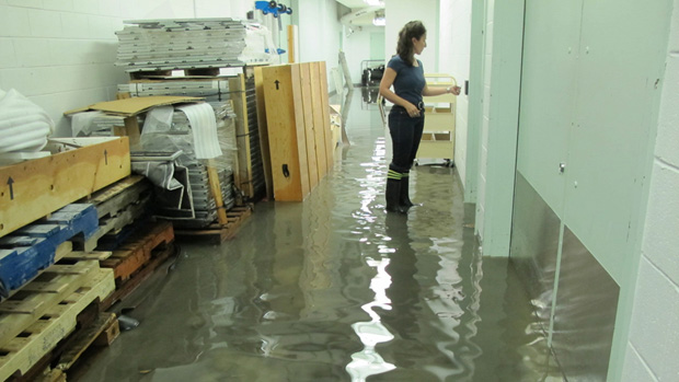 |
| Flooded collections storage in Montreal Museum of Contemporary Art, from torrential storm on May 29, 2012 |
Depending on where your museum is, maybe the issue isn’t storm surge or rising sea levels. Maybe the risk is drought & wildfires, tornados or other severe weather. In any case, the historical data on frequency of these events becomes less useful for predicting current risk as climate change accelerates. (Basically, hundred year floods aren’t as scarce as they used to be.)
So this is a brief plea for you to keep environmental trends on your radar as you develop your museum’s risk management policies, and for you to make short term plans in a long-term context.
Apropos of rising tides, here are some tools you should check out if you are near a coastline (or even upstream on a tidal river.)
Surging Seas (SS) provides interactive maps showing threats from sea level rise and storm surge for over 3000 coastal towns and cities the continental US, searchable by city, county or zip code. The site also links to fact sheets on storm surge and sea level by state, to any plans and reports produced by states, regions or municipalities, and to the full Surging Seas report. (SS is a project of Climate Central, a project funded by various government agencies, philanthropic foundations and universities to compile and disseminate research on climate change.)
Here is another mapping tool for looking at rising sea level impact, from the National Oceanic and Atmospheric Administration. It doesn’t make projections about sea level rise, but it lets you play with parameters and test out various scenarios.
For projections on sea level rise, check out this data from the Intergovernmental Panel on Climate Change. The outer level projections are premised on accelerated melting of ice sheets in Greenland and Antarctica—a worst case scenario showing an increase in mean global sea level of 80 cm, or a little over 2 ½ feet, by 2100 (though some argue even this is a conservative estimate). Your museum’s risk assessment, though, should take into account local factors such as coastal erosion, subsidence, storm size and frequency, etc—hence the importance of the locality-specific risk maps I listed first.
And if you want to throw data to the wind and just get silly, check out Burrito Justice’s vision of the “San Francisco Archipelago” in 2070. (Untenable premise: 200 foot rise in sea level. For more realistic SF projections, check here.) How many SF museums are underwater in THIS map?
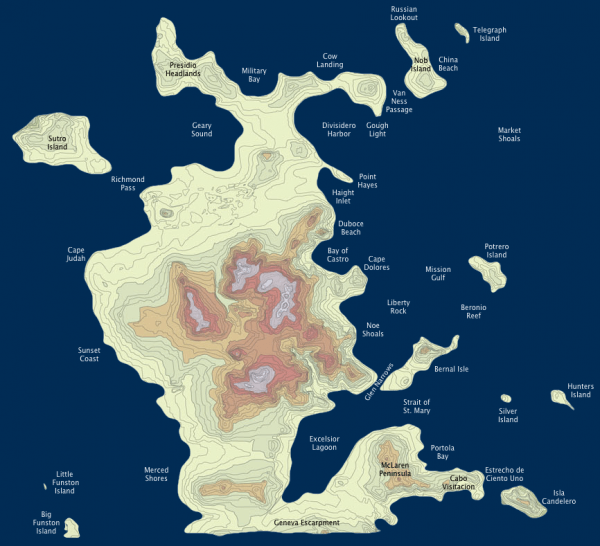 |
| Credit: Map of San Francisco Archipelago 2070 from BurritoJustice.com |


