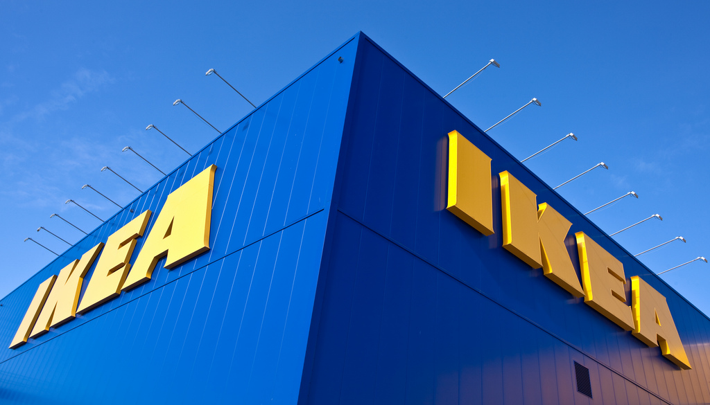
During a recent holiday shopping excursion to IKEA, while resting on a NORSBORG series chaise and with a belly full of meatballs and lingonberry sauce, I took a few minutes to pretend I was in a museum rather than an overcrowded store. The showrooms were like small galleries, and each VARDAGEN drinking glass a priceless artifact. But sadly I failed in my fantasy. It was just too chaotic to allow a few meditative minutes.
Still, I couldn’t help but make some museum comparisons, and I think there are a few lessons that museums and exhibit designers can learn from IKEA. Of course, museums and big box stores are not the same thing. They have different goals and governance structures, and diametrically opposed funding streams; and unquestionably, consumer products are not sensitive artifacts.
But there are some similarities, such as having a visitor circulation route, a need for intuitive signage, and the delivery of public amenities like food, restrooms, and safety. With nearly 400 stores worldwide and over 900 million visits per year – and annual sales greater than the GDP of Serbia – IKEA is doing something right in its mission to lure in visitors and keep them engaged. Here are eight things to learn from IKEA about museum planning.
- Have a Clear Route. Known as the “Long Natural Path” by employees, IKEA’s main route through its stores has two great lessons for museums: First, the pathway is clear. Through its scale and colored arrows, along with regularly placed “You Are Here” maps, guests know exactly where to go. Second, it’s designed to curve approximately every fifty feet, so that guests stay alert and intrigued by what’s around each corner.
- Provide Shortcuts. In addition to the “Long Natural Path,” IKEA provides quick routes through the store: openings that let visitors avoid massive showrooms. They exist primarily for life safety reasons, but anyone can use them. In museums, visitors often want to bypass galleries they’re not interested in, or head for the exit because they’re short on time.
- Place Things Off the Beaten Path. IKEA puts unique spaces to the side of the main circulation route not just for square footage efficiency, but because it invites exploring. Within museum galleries, small rooms or alcoves, with AV elements or signature artifacts, can do the same.
- Make Volunteers & Docents Stand Out. Among the visual complexity of stocked BILLY bookcases and a nearly continuous movement of customers, it’s extremely easy to spot IKEA employees in their bright yellow shirts. The color is eye-catching and matches perfectly with IKEA’s simple two-color brand.
- Stay on Message. Through each enormous store, IKEA has a solid consistency in their design: branding, signage, wayfinding, and showroom layouts. When museums follow this model, in graphic design, gallery aesthetics, and online material, it lets the highlights – the unique artifacts, stories, or special exhibits – shine through.
- Let People Touch Things. A recent Atlas Obscura article encourages touching in museums, not just for the visually impaired, but because visitors naturally want to touch things. Of course, museums have to be sensitive to things that stores do not, but IKEA succeeds in grabbing attention by allowing guests to feel objects and move them around.
- Encourage Easy Eating. Museum cafés – whether at contemporary art institutions or children’s discovery centers – are notoriously expensive; whereas IKEA provides meals at uncomfortably low prices. From $1 hot dogs to a sustainable salmon salad for around $8, their food is affordable so that a family visit can easily become a nearly day-long experience.
- Exit Through the Gift Shop. Following the showrooms, IKEA guides its guests through the Marketplace, encouraging impulse buys. Whether or not to be this direct in museums is often debated, but it has become commonplace in large, blockbuster traveling exhibits. At the very least, gift shops should be placed close to the exits.
It bears repeating that IKEA and museums are very different, but as with so many public spaces – malls, civic centers, parks, etc. – there are crumbs of good design and planning that can be tweaked for use in museums. It wasn’t very long ago when Paco Underhill’s classic, Why We Buy: The Science of Shopping, was a standard volume on nearly every exhibit designer’s bookshelf. In that book, Underhill quotes the Dalai Lama who is claimed to have stated, “Shopping is the museum of the twentieth century.” Let’s learn what we can from the successes of places like IKEA, so that museums become the shops of the twenty-first century.
About the Author
David Whitemyer is the Director of Business Development at Luci Creative, an exhibit design firm, and an instructor in Johns Hopkins University’s Museum Studies program. He can be reached at david@lucicreative.com

Upcoming Events
-
CEO Chat: Censorship
Event Date:Presented by: American Alliance of Museums -
Makerspaces for Museums and Historic Sites
Event Date:Presented by: American Association for State and Local History (AASLH) -
Planning and Budgeting for Fundraising Success – OMA Webinar
Event Date:Presented by: Ohio Museums Association -
AASLH History Hour: Civic Practice
Event Date:Presented by: American Association for State and Local History (AASLH)


Excellent observations. Thank you. Museum professionals can learn a lot by getting out of our silos and experiencing other spaces in other sectors. I rarely buy anything from Ikea at this stage in life, but like to check in once a year with a friend just to see new designs and products and eat in the cafe, and I inevitably end up buying something I didn’t know I needed. You didn’t mention the creative child-care facilities, the family loyalty program, and the accessibility via visible moving ramps and elevators. In College Park, MD, there is an exceptional breakfast for only $2 to which I used to take my mother that includes: eggs, turkey sausage, breakfast potatoes, Swedish pancakes and strawberry jam. Maybe that gets an early morning crowd stoked up for some shopping? I even saw a kids-eat-free offer on Tuesdays; maybe that is a slow day. It is great community relations but also brilliant marketing. So, what a coincidence: I also teach in the JHU Museum Studies Program and may include this example in my upcoming course on museum marketing and communications!
.
Deborah, thanks so much for your thoughtful comments! RE JHU – Small World! If you’re teaching now, have a wonderful semester. I’m excited to get my spring course off and running tomorrow.
As an avid Ikea and museum goer, this article parses the similarities and differences expertly.
Many thanks, Ed. Instead of coffee in Scituate or burgers in Hingham, perhaps next time we should go to the IKEA in Stoughton for some “museum research.”
Thank you David. Great points – I also frequent museums and IKEA often. You are correct, they stay on brand, plus achieve as you stated ‘…mission to lure in visitors and keep them engaged.’
Mandi, I appreciate your kind words, and I’m glad you enjoyed the article. Thank you!