Essential Evaluators seeks to gather evaluators in a common space to dialogue, reflect, and support each other in a world upended by COVID-19 and the Black Lives Matter protest movement. This is a time of uncertain and unknown expectations in our professions, in our institutions, and in our communities. We invite you to join us as we rethink, revision, and ultimately redefine our roles as evaluators and our place in museums.
Other posts in this series:
- A New Era Emerges
- A Brave New Dance
- In the Fog of War
- The Silver Lining
- Snapshot | Data Collection
- Separation of Powers
Designing a research or evaluation project is a lot like making a good soup. You can have the most detailed recipe and follow the directions step by step, but the bowl that makes it to the table is always going to be laden with the chef’s unique touch. Likewise, in research and evaluation projects there are best practices and analytical frameworks to follow, but every step of the design and analysis process is implicitly infused with the preferences, choices, worldviews, and value systems of the evaluator. Accordingly, research can be biased along racial, ethnic, colonial, class, or sexual lines, even when that is not the intention of the evaluator. The bottom line is that there is no such thing as unbiased research just like there is no such thing as a neutral museum. However, as evaluators, it is our job to detect and attenuate hidden and unintended biases so that results can be empirical, trustworthy, and—to the extent it’s possible—objective.
To explore this topic of hidden research biases, we invited Heather Krause to write a guest blog for this edition of Essential Evaluators. Krause, PStat (Accredited Professional Statistician), is the Founder and Principal Data Scientist of Datassist, a firm specializing in data collection, analysis, and visualization. She is also the founder of We All Count, a project for equity in data. A data scientist and statistician, including roles on the United Nations Data Advisory Board of Directors and as a Keough Fellow of Data Ethics, Notre Dame, Krause has worked in data for decades. She started We All Count after she increasingly found herself uncomfortable with the way data is used, taught, collected, and communicated. Even though she knows inequity and bias are everywhere in data science, she watched as “experts” presented data as “objective,” obscuring critical processes by purposefully using confusing and pedantic jargon. Krause’s goal in developing We All Count has been to demystify the process, engendering critical thinkers around every step of data collection, analysis, and reporting.
One of the tools Krause has created is the Data Equity Framework, which breaks data projects down into a systematic “pipeline” so that potential inequity can be delineated in each part of the research and evaluation process. This framework is designed to help all mission-driven organizations take the first steps toward embedding equity in their data and evaluation projects by providing tools and checklists to support long-term strategic planning. The end result is to generate transparent, intentional, inclusive data and evaluation projects.
The Data Equity Framework is as follows:
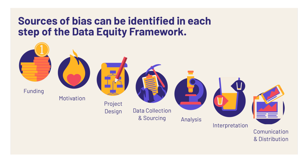
- Funding: Where are the resources for the project coming from? Who isn’t getting the money? Where and how we allocate resources as a society, and within our organizations, can affect the fundamental understanding of our world, requiring us not only to be right but to be fair in examining the impact of funding.
- Motivation: What is the goal you hope that data science can help you achieve? Why we do a project has a huge impact on all the following steps in a process. Hidden or secondary agendas are common. Stated motivations like “evaluate the impact of our project” need to be considered as much as hidden motivations, like “need to show awesome impact for next board meeting.”
- Project design: Constructing the methodology of any data project has many potential equity pitfalls, the most prevalent bias being towards comfort: what do the people involved know how to do? The design of a data project is inherently subjective, because it runs up against the limits of what the people running it think to measure.
- Data collection & sourcing: Where are you getting your data from? The requirements for equitable data collection are complex. It’s not as simple as trying to ask everyone and not leave people out. Sample selection is important, of course, but so is survey design, collector behavior, scope and scale, cultural translation, collection mediums, data corruption, compatibility, fidelity, and much more.
- Analysis: How will you process the data once you have it? Highly trained reputable analysts can be given the exact same dataset and come up with multiple results. And the majority of these different results are correct. How? Why? Because the statistical methodology that you use, the variables that you choose to include or exclude from the models, the way you choose to classify the data point, etc., all change the results. This doesn’t make them incorrect; it just makes them embedded within your worldview.
- Interpretation: In reality, all data results are meaningless before an interpretation is applied to them. Assumptions about causality, correlation, and expectations often lead to flawed conclusions or biased “facts.” By considering data results from a variety of perspectives—social, cultural, mathematical, historical, etc.—we can reduce the potential of a one-sided, inequitable interpretation. Just acknowledging that the data don’t “speak for themselves” is an important step in the process.
- Communication & analysis: Your strategies for communicating, persuading, and explaining your data can be heavily lopsided. Even the most “objective” or “academic” assertions are inherently designed to persuade, and those that pretend not to be are the most dangerous. When you don’t assume that your audiences speak like you, think like you, and recognize all the same examples as you, you begin to create tighter, more effective pedagogies and arguments.
It’s critical to think about how these steps apply to museums. Consider, for example, step three, project design. Museum evaluations are often designed to measure the success of a program or exhibition. But thinking about the framework, perhaps we need to ask: Who gets to define success? Is it the people with the money? Is it the research and evaluation team? Is it the most marginalized population in the community the museum is intended to serve? After decades of working with performance measures or reporting goals that have been set by—let’s be honest—often wealthy white people, Krause cautions that she has seen a lot of inequitable habits that pass themselves off as robust uses of data.
Krause recalls one museum that had initiated a program designed to increase attendance of visitors between the ages of fourteen and twenty-nine. The researchers carefully collected data, and in the end the evaluation was deemed a huge success. Across the community, attendance of people aged fourteen to twenty-nine had increased. However, when the data was broken down by racial identity, it became clear that the project had not had similar effects across all types of young people. While the attendance rate for white young adults had increased by 30 percent, for Black young adults it had only increased by 5 percent, and for Latinx young adults it had actually decreased by 10 percent. Looking at only the single average made these trends invisible.
When we look at data from a deep equity perspective, we find further disturbing trends in these gaps. Prior to the project, white young people attended the museum 20 percent more often than Black young people, and 22 percent more often than Latinx young people. But by the end of the project these gaps had both increased significantly. White young people attended the museum 40 percent more often than Black young people and 60 percent more often than Latinx young people. The project did not improve on these gaps and if anything seemed to make them worse. So, is this a success or not? It all depends on who got to define “success” as part of your project design step.
Let’s consider another case that concerns the data collection and acquisition step. One of the strongest tools to embed equity into this step is to develop a data biography for every single dataset you use. A data biography is just what it sounds like: it details the full who, what, where, when, why, and how of the data—which should include the audience relations data, the community sociodemographic data, the fundraising data, and definitely any data you purchase or are given from external sources. To understand why this is important, think about the charts you’ve probably seen comparing different rates of violence in places around the world. Before you believe these charts, you need to check the data biography very carefully, because the method of collecting data on violence varies a lot from place to place—even within countries and definitely between countries. One place might be reporting official police reports, another place might be reporting results of a non-profit organizational monitoring data through surveys, and yet another might be using machine-learning-generated estimates. All of these are potentially valuable ways of estimating violence—but they are definitely not apples to apples.
This same phenomenon is common in museum data sets. For example, Krause once worked with an organization which purchased an expensive dataset to help with fundraising and development. But, when an in-depth data biography on the database was constructed, a bias was detected. Krause found that the gender of each individual was “intuited” by the data collection agency staff via the sound of the person’s voice on the phone. Another group was imputing household income through zip codes. There are, of course, huge equity problems with both of these approaches and unless a data biography is constructed for datasets, you are at risk for embracing this hidden bias.
Krause suggests that if you’re collecting your own data, you should carefully record exactly how each question is being asked (the gender question with answers of male/female/other will get you different answers than even the slight variant male/female/another); who is asking the question (the answers given by respondents will vary quite a lot depending on whether the person asking the question is of higher or lower social status); and the specific way the sample of respondents was chosen.
Each of these pieces is akin to an ingredient in your soup. The quality of the data going into your project is like the quality of the vegetables. The data biography is like knowing where the chicken came from and what it ate. It’s not necessary to throw away all your data and evaluation recipes to make progress towards equity, but it is absolutely essential to consider the ingredients going into them.
As museums continue to embrace the lessons Black Lives Matter imparted and redress the overt and covert biases and prejudices that have historically existed within our institutions, it is incumbent on us, as evaluators, to collect and share data that is as free of bias as possible. We must scrutinize the data for hidden biases and agendas and when necessary, we must voice concern and opposition when data equity has not been achieved. This is how we become and remain Essential Evaluators.
Upcoming Events
-
CEO Chat: Censorship
Event Date:Presented by: American Alliance of Museums -
Makerspaces for Museums and Historic Sites
Event Date:Presented by: American Association for State and Local History (AASLH) -
Planning and Budgeting for Fundraising Success – OMA Webinar
Event Date:Presented by: Ohio Museums Association -
AASLH History Hour: Civic Practice
Event Date:Presented by: American Association for State and Local History (AASLH)


Thank you Heather Krause for the Data Equity Framework! We first encountered it in June, and we have found it so helpful in identifying concrete actions we will take to pursue anti-racist practices in our work: https://rka-learnwithus.com/rka-anti-racism-pledge/
Hi Amanda,
Glad you found it helpful; we did as well! We just shared Krause’s framework with the Denver Evaluation Network and hope to keep the conversation going among our institutions. Like you mentioned, it has some concrete steps that people find helpful in starting conversations and changing institutional practices.