After reviewing hundreds of entries every year, the jury for AAM’s annual Museum Publications Design Competition awards only one publication with the Frances Smyth-Ravenel Prize for Excellence in Publication Design, recognizing it as the best submission overall.
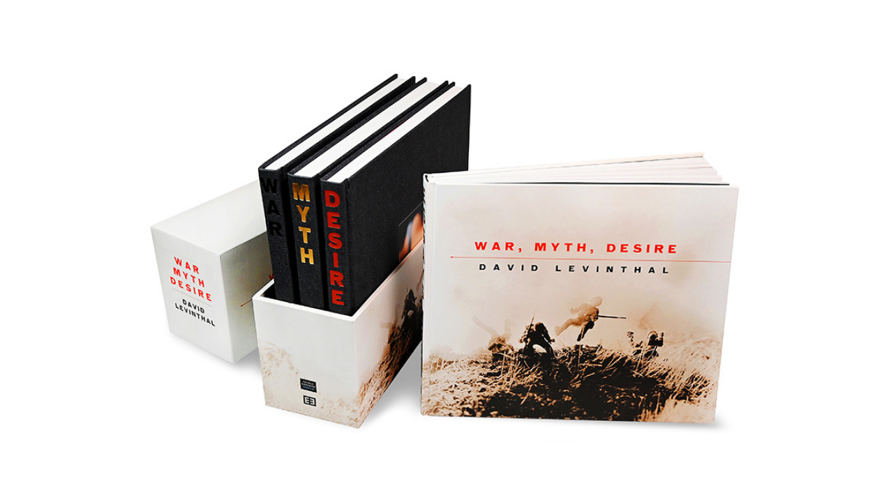
This year, the winner is David Levinthal: War, Myth, Desire, a publication of the George Eastman Museum in Rochester, New York, designed by Design Monsters studio.
We recently talked to the book’s designer, George Corsillo, to learn more about the concept behind his prizeworthy design: a four-volume retrospective of the artist David Levinthal’s photographs which took two years to complete. To view a list of all winners from the competition, click here.
What was the initial design concept, or what did you want the book design to convey?
David Levinthal and I had previously worked together on three book projects—a re-imagining of Hitler Moves East in 2012, War Games in 2013, and History in 2015. Consequently, we had figured out that our design style and tastes overlap.
David brought me to this project when he started working on the exhibition with the George Eastman Museum. We wanted this retrospective set to be a comprehensive, elegant, well-produced product—but also to have a sense of playfulness, a constant in both David’s and my work. (Notice the little hairline arrows that point to the “past.”)
Significantly, it was through the generous support of Donald Rosenfeld Jr. and a second anonymous donor that many important Levinthal photographs were added to the museum’s permanent collection. These gifts made the retrospective possible.
What were the key decisions that needed to be made in the execution of the design?
As always, there are basic book design decisions—book size and format, paper stock, special endpaper and book cover stock, and even which printer would print the box set. At first we considered printing in Italy, but decided to use our previous friends at Kehrer Verlag in Heidelberg, Germany, who had done a great job with both War Games and History. They helped us find perfect endpapers and a great cover stock, which is actually textured paper that mimics a fine fabric book covering. It embosses very well too.
The most important decision was how to package the book set. I had previously designed a large art book with a slipcover. It was hard to handle and with four books that weigh a total eleven pounds, a slipcover would be unwieldy because one needs to tip the slipcover to get the books out—and they could easily fall on the floor.
I envisioned a closed box that split half way up, so that the top could be lifted off with the books standing upright and uniform, creating a David Levinthal mini-library with the spines and the titles all lined up beautifully.
Did the design concept evolve over time, and if so what prompted this?
Yes. The project grew. It was originally envisioned as a three-book set titled Retrospective. The box set was renamed War, Myth, Desire—the names for the three photo volumes and the title of the exhibition at the George Eastman Museum.
In time, it was decided to separate the essays into a fourth volume in the set. That volume was also the model for a separate stand-alone book that was sold separately and included reference illustrations as well as a sampling of plates from the other three books in the box set.
How long did the design take, and what were some of the key details that needed to be managed and how?
The total design time for War, Myth, Desire was about two years.
The key details included creating perfect reproductions of over 450 photographs. This was dependent upon making the best quality digital files and scanning some prints that were decades old. The photography was organized by David Levinthal’s studio and the staff at George Eastman Museum.
Both David’s assistant Ryan and I traveled to Kehrer Verlag in Germany for the press run, a two-week process.
Kehrer does incredible, precise printing and once the pressman had gotten a perfect, balanced print, it was up to us to determine if adjustments were needed, often saying “that’s great, but the original gallery print is more magenta, or more green,” etc. This was an important adjustment because the book image had to match the big print in the gallery.
A key detail for this project was the photograph on the box exterior. How could we take a large, flat photograph, and “wrap” it onto the box seamlessly? Three people—myself, Ryan Oskin, and the very talented Patrick Horn at Kehrer, worked to retouch the photo of exploding WWII soldiers to look as if it disappears on the edge. Check out the box bottom and you’ll see an amazing cloning job.
Who were the other stakeholders involved in the process? What questions did they help inform? Were there any sticking points?
Erin Hudak, David Levinthal’s studio director, handled the photographs and sequencing on David’s end.
Coordination and organization was handled by the team at the George Eastman Museum—particularly exhibition curator Lisa Hostetler, project manager Amy Schelemanow, and editor Molly Tarbell, along with others on the museum staff.
The printers at Kehrer worked their magic in Germany.
And the writers—essays by Lisa Hostetler, Joanna Marsh, and Dave Hickey, and book introductions by Garry Trudeau, Roger Rosenblatt, and David Levinthal himself—explained to us, the audience, just what we were looking at, and why it mattered.
These talented people were taking care of the “content,” while at Design Monsters studio, Susan McCaslin and I put it all together.
And under the guidance of Bruce Barnes, director of the George Eastman Museum, an academic book was produced with a touch of playfulness.
Sticking points?
Just one big one. The box, which seemed so elegant and workable in concept, took months to get right. The fabricators sent us many unusable and poorly constructed samples until we almost gave up. Then, it actually worked. Snug fit, perfect edges…we lucked out!
In retrospect, would you have done anything differently with the design?
No. I am very happy with the final product.
More broadly, what is the value and impact of great design?
I love typography. I love color—both bold and subtle. I love the contrast between very large and very small. I love surprise. With practice, all these elements can meld in a way that will make the viewer happy. The trick is to make it all look effortless. It looks effortless because all distraction has been removed. And, when the design is “wrapping” another artist’s work, it’s best to make your design fall into the background so the real star can shine.

Upcoming Events
-
Planning and Budgeting for Fundraising Success – OMA Webinar
Event Date:Presented by: Ohio Museums Association -
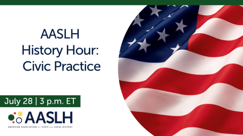
AASLH History Hour: Civic Practice
Event Date:Presented by: American Association for State and Local History (AASLH) -
What It’s Like to Participate in Museums Advocacy Day
Event Date:Presented by: American Alliance of Museums -
From Idea to Acceptance: How to Submit a Winning Annual Meeting Session Proposal
Event Date:Presented by: American Alliance of Museums