This is a recorded session from the 2025 AAM Annual Meeting & MuseumExpo. Developing an accessible exhibition requires collaboration among museum staff, artists, and audiences. In this session, learn how presenters developed guidelines for producing exhibitions that go beyond legal compliance with the Americans with Disabilities Act (ADA) and center audiences from the outset. Follow the process from the research phase to drafting and revision in partnership with the Institute of Human Centered Design, to user testing by staff and community stakeholders. Explore strategies for developing accessibility standards for exhibition design at your institution.
Speakers:
- Sarah Lampen, Associate Director of Learning and Accessibility, Walker Art Center
- Erin McNeil, Associate Director of Curatorial Affairs, Walker Art Center
- Doc Czypinski, Associate Director of Exhibition Installation, Walker Art Center
Additional Resources:
Slide deck for A Holistic and People-Centered Approach to Accessible Exhibition Design
Transcript
Erin McNeil:
Good morning, everyone. Welcome to the session, A Holistic and People-Centered Approach to Accessible Exhibition Design.
Doc Czypinski:
With development beginning in 2020, the Walker’s Exhibition Installation and Accessibility Manual is a living document resulting from the collaborative effort between Walker staff from curatorial affairs, visual arts, exhibition installation, registration, and PELI, short for public engagement, learning and impact.
It was created with the intent of ensuring the Walker’s audiences can successfully engage and interact with the artwork we present in our exhibitions. The Walker defines accessibility as a process of collaboration between individuals and communities and institutions, making sure that everyone has what they need to participate equitably and engage with our programming.
The guidelines within the manual were designed to go beyond satisfying legal compliance, assisting both staff and artists in centering the audience to improve access and deepening visitor engagement from the beginning of the exhibition planning process.
Erin McNeil:
So, with that information about the guidelines and how the Walker thinks about accessibility, we thought it would be useful to give you all some context and grounding as this is a presentation that focuses on accessibility throughout, we will be describing both ourselves and any images on our slides so that everybody can participate equitably in our presentation.
Our main working group consists of the three of us here today at AAM, although I do want to really stress that because accessibility is everyone’s responsibility in our organization, we’ve strategically brought in other collaborators along the way, including curators, registrars, educators and senior staff, and made sure that they were really weighing in and part of key junctures of our process.
My name is Erin McNeil. I use she/her pronouns and I’m a tall white woman with short brown hair and today I’m wearing a black dress. I’m the Associate Director of Curatorial Affairs at the Walker Art Center. The Walker is a very interdisciplinary place and Curatorial Affairs oversees moving image, performing arts, and the visual arts departments. Working directly under the senior curator. I maintain the visual arts budget, the exhibition schedule, and I run our touring exhibitions programs. If you have any interest in that, come and see me later.
Our institution does not have a formal exhibitions management department per se, so I help develop cross-departmental procedures, meeting cadences and deadlines, all with an eye towards optimization. In this capacity, I work on many working groups, which is something I really enjoy.
Doc Czypinski:
My name is Doc Czypinski. I use he/him pronouns. I am a tall-ish white male with brown hair and wear glasses. I’m also wearing a gray sweater. Today I am the Associate Director of Exhibition Installation at the Walker, which is… My role in the Walker is to work with managing the exhibition installation team, working closely with registration and visual arts to schedule a budget and plan for our exhibition program and ultimately manage the team that executes it.
Sarah Lampen:
And good morning, everyone. I’m Sarah Lampen. I use she/her pronouns and I’m a white woman in my late 30s with long brown hair. I’m five-six. I’m wearing a navy-blue dress and white sneakers that are going to be helpful when I have to rush to the airport in a couple hours.
I’m the Associate Director of Learning and Accessibility in the Walker’s Public Engagement, Learning and Impact Department, or PELI. The PELI department at the Walker is comprised of the majority of the institution’s visitor-facing staff, so that includes our visitor experience team, which includes gallery assistants, our box office staff, as well as a small volunteer program. And the other half of the department is comprised of education staff.
And so, within PELI I manage the learning division, which includes school and gallery programs and that includes our tour program for visitors of all ages. I also oversee the youth programs division as well as the Lifelong Learning and Accessibility Division, which produces programs for visitors of all ages with and without disabilities. And then I also work with colleagues across the institution, including Erin and Doc, to really think about and strategically plan to improve accessibility for visitors with disabilities in our built environment, our programs, as well as increasingly digital resources.
As we get started with the presentation, we want to invite people to attend to your access needs. Feel free to get up, move around, come go, whatever you need to do. Please feel free to do so. Thanks Erin.
Before we get into the accessibility guidelines we developed, I think it’s helpful to have some context about the Walker Arts Center in case I imagine some of you in the room haven’t visited us yet. On the slide we see a picture of the Walker Arts Center, which is comprised of a large brick tower in the foreground of the image that was built in 1971 by Edward Larrabee Barnes before the Americans With Disabilities Act was passed. Connected to that tower is a newer addition by Herzog & de Meuron from 2005, and that addition is in the shape of a sort of irregular square that’s cladded in metal. People often tell us that this view of the building, the building looks like a robot due to the irregularly shaped windows kind of resembling eyes and the mouth on the building.
So, we’ll get into the unique challenges and opportunities of our built environment a little bit later in the presentation.
The Walker is a contemporary multidisciplinary arts institution, and we present, collect and support the creation of works across fine arts, performing arts, moving image, and we also have a design department. Our multi-acre campus is in Minneapolis, Minnesota and it’s located on the traditional ancestral and contemporary homelands of the Dakota people who continue to live and work in the community today.
The Walker includes 65,000 square feet of gallery space, a theater, a cinema, and we also partner with the Minneapolis Parks and Recreation Board to steward our Minneapolis Sculpture Garden, which is adjacent to the museum. Our collection includes more than 16,000 works and we focus on emerging arts by artists from the Twin Cities, but also from artists across the nation and across the globe as well. We rank among the five most visited modern and contemporary art institutions in the United States, and together with the Sculpture Garden, we attract more than 700,000 visitors per year.
So, the Walker’s mission is to empower people to experience the transformative possibilities of the art and ideas of our time and to imagine the world in new ways.
And our approach to the development of these accessible guidelines that we’re going to be speaking to today was really informed by our strategic plans articulation of the importance of centering our audience from the outset of exhibition development or program development to ensure that the community has equitable access to the art we present and to deepen our community’s engagement with that art.
Historically museums have approached accessibility through the development of specialized programming to provide access and while programs are really important, and we offer those as well. This project really meant to ensure that the Walker can provide equitable access to deaf and disabled visitors any day they choose to visit. So, over the course of this presentation, we’re going to share how we centered audiences in the development and the revision of these guidelines.
So, over the next 40 minutes or so, probably a little longer than that, we’ll describe how we developed our accessibility guidelines, from first, how we identified the need for Walker-specific guidelines. The research that we did at the outset of the project will also tell you about our iterative process of drafting and revision and implementation that we really during that process emphasized user testing by staff and visitors with disabilities.
And then we’ll follow that by describing the necessary revisions we had to make to our exhibition making workflows and timelines to ensure shared accountability and responsibility for thinking about accessibility. Then we’ll end the presentation portion by sharing some next steps as the work of accessibility really requires consistent revision and evolution based on our new learnings of which we have many over the course of our work with living artists.
And then we’ll plan to spend the final 20 minutes or so in breakout groups discussing how you all might initiate or extend this work at your own institutions. And we’ll also leave some time for questions at the end.
So now I’m going to hand it over to Doc who is going to tell you about how we decided that the Walker needed an institution-specific set of accessibility guidelines.
Doc Czypinski:
Our work on this project began with identifying the need. Presenting the work of both living and non-living artists, much of which produced at a time predating the current cultural understanding of accessibility and housed within two buildings, each possessing distinctive architectural features, we found the need to be rather self-evident and the opportunities abundant.
We have another image of the Walker’s exterior, its main entrance projecting from the hillside. The original brick-clad Barnes building is in the foreground adjoined by the 2005 Herzog & de Meuron expansion is sheathed in metal, glass and cementitious surfaces. At the right side of the image is a grass-covered hill we refer to as the upper garden.
In this image we see an illustration of the Walker’s interior. On the left, a depiction of the interior of the Barnes tower comprised of a centrally located passenger elevator wrapped by a stairwell with seven gallery spaces that cascade in half-floor intervals from the main lobby to the seventh floor. On the right of the image is depicted a layout of the public and gallery spaces in both the Barnes and Herzog buildings beyond those found in the tower. The distinct architectural features of these two buildings and the transitional spaces between them each present unique challenges in applying a more broad and consistent approach toward accessibility.
Walker exhibitions embody a history of providing support for both artists and their vision. As such, Walker exhibitions have and continue to be the host to a range of unique and varied forms of artistic expression. We understood early on that the prospect of successfully developing guidelines to increase accessibility for these presentations would require an approach that was at the very least proportionately unique.
This image and the four to follow are just a few examples of a variety of works found within our exhibitions and the accessibility challenges therein. This is an image from a 2007 exhibition featuring an environment created by Thomas Hirschhorn meant to resemble a cave. The walls are clad in cardboard, which was covered in packing tape, aluminum foil, plastic wrap, printouts of text and imagery. Walking along a narrow path with rocks made of tape and cardboard, the people in this image are blurry indicating that they were in motion when the photo was taken.
With narrow and uneven paths changing grade throughout. This work was not accessible for those using mobility devices. The rocks were not affixed to the floor and susceptible to being displaced or stepped upon by patrons making the pathway even more unpredictable. Lighting, while bright, was inconsistent, creating shadows and reflections on the packing tape that covered the walls. I’ll also mention that in my memory of this work, there was little airflow in the space, making the environment somewhat stifling and potentially problematic for those with respiratory conditions and or anxiety.
At the time the field was at large not consistently considering accessibility for deaf and disabled people. Prevalent thinking among staff was that ADA guidelines did not apply as the artwork was temporarily on view and not a permanent fixture.
This photograph shows a portion of an installation from 2018 by the artist Laure Prouvost. It’s comprised of a dark narrow hallway with black walls and a sculpture sitting on a shelf next to a white canvas with text in the foreground. The text is not legible from this angle and the sculpture is round, light in color and has multicolored feathers protruding from its surface. The dark environment with abrupt lighting transitions interacting with the reflective surfaces of our floors made this space potentially difficult to navigate for those who were blind and/or had low vision.
Another component of this exhibition featured two to three hardened puddles of resin that contain small objects and plant debris that laid directly on the floor. The clear resin was difficult to see despite being in well-lit portions of the gallery and posed a potential tripping hazard for patrons taking in the installation.
In this image we see a person holding a lantern as they navigate an installation by Cameron Jamie from an exhibition in 2006. Meant to resemble a mountain pathway, the walls are steep and constructed of a net-like variegated cardboard material typically used in packaging. The textured walls in the pathway fill the images frame. Much like the Hirschhorn, this installation possessed similar traits in both the grade and uneven terrain. Unlike the Hirschhorn, this installation was much darker and intentionally so. The patrons were given a lantern by which they could navigate the winding narrow mountain path without it seeing was difficult if at all possible.
This is an image of an exhibition called Designs for Different Futures. It was our first large post-pandemic exhibition. In the center of the gallery is a dome hanging from the ceiling. There are multiple projectors inside the dome pointed inward. On the floor there is a circle of raised dots, demarcating the dome’s perimeter to increase its perceptibility for patrons utilizing a cane to navigate. This was one example of our earlier mitigation strategies for perceptibility.
The walls that surround the dome feature installations of 2D works a screen and several 3D objects on a riser in the corner. What this image does not provide is a sufficient example of the unseen obstacle to accessibility for this project, which was the multiple sources of loud and overlapping sound in the echo-prone galleries of the Barnes. At this particular moment in time, we were about one year into our work on the manual.
This is an installation view of an exhibition featuring Liz Larner from 2022. The image contains two sculptures in a large room with peach-colored walls. One sculpture is a white floor-bound sphere made of gauze approximately three feet in diameter. The second a sculpture consisting of multiple white cords attached at the top of parallel gallery walls and then to two blocks on the floor in an arc. The cords create a form that suggests a bird in flight.
The larger sculpture in this image presented challenges around detection and perceptibility. In this circumstance, the approach to mitigation was limited as anything added to the floor would take away from the simplicity of the artist’s intent. We had determined that our best option for resolving the issue was in how we would orient the object in space. We positioned the points of contact with the floor in such a way as to create a direct and less obstructed path to cross the room to another doorway just out of the frame near the photograph’s left edge.
There will always be work to do in making exhibitions like this more accessible to our audiences. For the works that remain challenging, we have found success in strategically utilizing interpretation, and measures that are currently within our reach. For example, a recent exhibition called Multiple Realities featured a structure designed by Stano Filko, with mirrored floors.
Within the structure, a book was on display meant to be paged through by patrons. The glass floor, however, was not strong enough to support mobility devices. We had sought permission to reinforce that floor, but our request was denied and as such we were unable to provide wheelchair access to the book. So a second copy was then installed outside of the structure.
In the end, making an exhibition accessible means ensuring that as much of the material presented can be experienced equitably by all audiences. There is no such thing as perfect, and each and every project and artwork offer an opportunity for conversation and potential growth.
Sarah Lampen:
So, like most institutions, the Walker has for years referred to the Smithsonian Guidelines for Accessible Exhibition Design to help us consider accessibility when designing floor plans.
These were an excellent resource, but we often ran into scenarios in our exhibitions and built environment that required additional consideration. Some of these concerns included sound travel and other sensory considerations that were really surfaced pretty strongly by visitors in a journey mapping study that the Walker produced in partnership with HGA Architects between 2021 and 2022.
So, after we identified a need for a Walker-specific set of guidelines, our team began to review other relevant resources produced by the National Museum of Scotland and the National Park Service, among others. Our colleagues are doing incredible work in this area. And I also reached out to a number of colleagues working in museum accessibility, including colleagues at MoMA, the Denver Art Museum and the Portland Art Museum to ask questions about how they approach accessibility and exhibition design. And I found that everyone I spoke to was thinking about these considerations with their and everyone wanted us to be sharing collectively as a field, our learning and our knowledge more widely.
As a contemporary art museum at the Walker, we really have a unique opportunity to work with artists as partners in thinking about our audiences from the outset of exhibition planning. And I will particularly want to thank artists whose practice centers accessibility, as their work is really pushing institutions to reconsider the assumptions that we make about visitors that ultimately inadvertently reinforce assumptions and exclusionary practices.
So, the work that the Walker has done with Jordan Lord and Alison O’Daniel through our Moving Image Department as well as Carolyn Lazard’s exhibition, Long Take, in 2022 at the Walker have been really influential in positioning the Walker’s approach to accessibility as an approach that centers dialogue with people with disabilities. And for those of you who might not yet be familiar with Lazard’s work, I really encourage you to review their practical guide for institutions to improve accessibility. It’s called Accessibility in the Arts: A Promise and a Practice, and it’s fantastic.
Erin McNeil:
So, one of our biggest takeaways and something we wanted to reinforce throughout this presentation is that this was an iterative project and that we were often testing and creating the guidelines like simultaneously as we went along.
We implemented learnings from each new exhibition instead of waiting for some sort of final authoritative document. And this is something we would encourage all of you to consider as well. We’ve been in this process for nearly five years, which was sort of depressing when we put it all on paper. We’ve been working really actively on this project for about five years, and our exhibitions keep getting more and more accessible because we keep actually applying our lessons as we go.
So, this next picture is a photograph of an installation of the Walker’s permanent collection. As part of the exhibition Five Ways In. You’ll see large colorful paintings by Joan Mitchell, Sylvia Plimack Mangold, and Kerry James Marshall hung on the walls while a large green cylinder of Ellsworth Kelly sits on the floor. There’s a really beautiful organic resonance between the green of the sculpture and the green horizon line in the Mitchell painting.
As you look at this, the photographer is actually, I mean, really smooshed in the corner of the gallery. So, you can see there’s really not a lot of space to get around that sculpture. And even though it is technically complying to ADA standards, one of the things we noticed is that people would try and back up to get a better viewpoint on that Mitchell painting and they would often step on the Kelly. So, this was a problem and it was really a learning experience for us.
For exhibitions like the one just shown, they were a real catalyst for us to reframe some of our gallery experiences and expectations. And in particular, we would often as a staff talk about the Smithsonian’s definition of circulation route and cane detectability. And we found that really many members of staff had different interpretations about these guidelines and sort of different visual pictures in their mind about when they would apply.
For instance, lots of times when we were talking about circulation route, people were like, well, if it’s not in a hallway, it’s fine, which is not very helpful. And this often resulted in really uneven treatments of different works across our different gallery spaces and in our different exhibitions.
So frequently these different understandings really came into conflict during the final walkthrough of an exhibition where, you are all museum people, so I’m sure you understand. That’s a very tense moment in exhibition installation, and we would find that these differing opinions and that real-time constraint of needing to open the exhibition would create a lot of what we thought was avoidable tension between staff members, all of whom we really want to acknowledge were just trying to do the best they could for our audiences, for the artist’s intent, and to keep the artwork itself safe in our spaces. It’s a really delicate dance trying to strike that balance. And we felt that that particular moment was not very conducive to collaborative and good decision-making.
Our breakthrough really came through in the form of these new definitions. We now talk about the path of travel instead of the standard circulation route. This allowed us to reframe the problem and re-center people’s relationship to the object in space. This also allows us to really hold people’s experiences as well as the artwork’s safety when we talk about how to make sure an artwork is perceptible or detectable. We think these joint definitions and the fact that we generated them ourselves with our colleagues has actually been really instrumental in creating a joint understanding and accountability for this throughout our organization.
We thought that this particular bit might be interesting to you all. So, if you see the handouts that are scattered on the ends of the tables, you’ll see the front page has our new definitions such as detectable/perceptible and cane detection. And then on the back of the sheet we’re giving you just one section to show you and showcase our methods and our thought process as we put together the manual.
You’ll see what we call mitigation strategies for cane detectability, which are ranked in terms of what we prefer for audiences, but also really allow for a creative and generative discussion between artists and curators and our registrars so that we can really judge and respond best to how an object can be protected and its intent respected while also thinking about audiences from the outset. This creates optionality and allows for us to have just earlier conversations about the artwork.
So, in this next picture, this is our current and latest permanent collection installation, which is called This Must Be The Place. In this picture, the walls of the gallery are an orange-ish yellow. In the foreground you’ll see a large wooden sculpture by Ursula von Rydingsvard sitting directly on the floor surrounded by gray tactile tape at all sides. There’s also in the middle an Allison Saar sculpture of a person that’s sitting on a low base and that base’s edge is like a light gray to distinguish it from the floor even more. And in the very back there’s a Mark Tansey painting that hangs with a set of low stanchions in front of it.
And I think that you also see that there’s a lot of circulation around the different pieces, which was done intentionally to make sure that there was plenty of space around the works.
And I would say that we wanted to show this. I mean, obviously I think we’re all used to having these sorts of installations in our spaces, but I think what was really unique about this process is that we really decided on it early. It caused checklist revisions, and we really were trying to deal with each piece and its space in a unique way. This got us a lot of buy-in with our curatorial staff and with our registration team.
I’d also say that this new system engenders trust and respect between the Walker staff members and trust between us and our visitors. It allows us to resolve all of our conflicts earlier, much earlier in the process. And the guidelines provide a real clear path towards resolution when we have differing opinions and different perspectives about what’s going on. Building this optionality into our planning means that we think our guidelines are much more likely to be because we’re actually meeting people.
This next photograph depicts a large installation by the artist Khalil Robert Irving in a gallery with white walls, white ceiling and white floor. The installation is comprised of a light large, rectangular wooden platform and you’ll see that there are steep steps running on… Or two steps running on two sides of the structure. And there’s also a ramp in the foreground. Low cane rails run the length of the other two sides,
And you’ll also see… It was important, this show was called Archaeology of the Present. So, Khalil’s idea was really to create a platform and then sync works into it. So, you’ll see those five sunken recesses in the platform that are surrounded by the cane rails.
We showed this because we were really proud of this installation because we were working with the artist really from the outset to consider accessibility, and that’s why this actually looks the way it does. We were really working together with the artist to make sure that the cane rails were in and that people would be able to have equitable access to this work. It’s a real great example of what it means to collaborate early with an artist to get accessibility in from the very beginning.
Sarah Lampen:
So, after completing an initial draft of our guidelines as a group, we realized that there was really an opportunity to go beyond ADA compliance and certain common installation scenarios to develop standards that were specific both to the Walker’s unique built environment, but also some of our installation conventions.
And in order to arrive at workable standards that our teams felt comfortable with, we realized that it would be actually very helpful to facilitate a shared process to build consensus and develop some standards together.
So, we decided that Doc’s team would install a gallery that was being temporarily used as storage with various artworks, cases, labels, and sample seating so that we could test as a group different options for installations with our colleagues. So, this slide features a photograph of me standing in that test space with a wheelchair in front of a white gallery wall that’s hung with five Andy Warhol Soup Can prints that are each hung at a different height.
So next we invited groups consisting of curators, registrars, visitor experience and education staff into the space, and we facilitated conversations that asked staff to really consider a visitor’s experience in that space. We facilitated discussion and collected both verbal and written feedback that we then collated to set some standards based on the group’s feedback.
So, our team developed prompts for each item that we hope to standardize and staff submitted notes via a standard worksheet, a pile of which you see pictured here with handwritten notes. You can see my messy handwriting in the foreground. And the prompts really ask staff to consider their experience of an artwork or a case or a label when standing, when seated, when close up and when far away. The groups of staff were made up of people with and without disabilities. And we also made clear during this process that we would be facilitating testing with visitors with disabilities in current exhibitions to really ensure a range of experiences and perspectives were represented.
People experience disability differently and as someone who identifies as disabled, I can’t speak for everyone’s experience and that’s why that user testing with many stakeholders is really important. These sessions resulted in really rich cross-departmental conversations, providing opportunities for PELI staff to share directly with curators and registrar’s visitor feedback, and really to engage in embodied learning together was really powerful experience.
So, Doc’s going to tell you about how this process both produced some aha moments and also helped us develop standards that we all felt comfortable with, that we all felt ownership over and maybe most importantly that we all understood.
Doc Czypinski:
So, what did we standardize? The data collected in our facilitated gallery experience resulted in an immediate standardization of some core installation practices such as the center height from which art was installed, the text sizes of our labels, and defined the parameters required for creating a detectable and perceptible approach. Additional guidelines were also created for pitch and placement of labels as well as the distance relationships between artworks, stanchions and walls. However, we have no time to get into those today.
Collating the feedback collected from the facilitation, we determined a range for the center height of wall-bound artwork. In this image from the facilitated experience, you see Erin, Sarah, and I looking at three of the Warhol Soup Can prints installed at different heights. The center height, which was once determined at the curator’s discretion, would now fall in a range between 56 inches and 59 inches from the floor. This range is primarily applied to works of a moderate size. The height for larger works is adjusted based on its dimensions.
People noted that when the work was presented in a range of heights, it became obvious that work installed higher did not create for a more comfortable viewing experience. This insight served as an important reminder to us that many of the standards we formerly clung to were born out of conventions of seeing and enculturated truths. Higher is not better and we can change how we prefer to see things. The table in this image contains the collated responses to the hanging height of each artwork from the facilitation. The series of 10 nearly identical artworks were installed each at a center height ranging from 54 inches to 64 inches from the floor.
Participants were not given the hanging heights and asked to identify and rank their preferences while sitting and standing. The results in the column on the right display consensus by the test group for heights between 56 and 59 inches from the floor.
We also established a preferred text size and letting for labels displayed on the walls and those mounted within cases. The image here shows two of the four options offered for review in that test. There was an immediate consensus within the group that the smallest sample displayed for the test was far too small. Interestingly, the example was, in fact, the Walker’s previous standard came as a surprise. In a side-by-side comparison, it was not comfortable to read. This change was actually implemented immediately following the facilitation experience and for all exhibitions going forward.
So, labels formally utilized a type size of 16 and a half points at a leading of 20 points and were six inches wide overall. The new standard for our labels is now a type size of 20 points with a leading at 24, making them seven inches wide.
We also successfully socialized the concept and use of the detectable/perceptible approach as a measure of accessibility and the application of mitigation strategies. In this image, Erin, Sarah, and I, along with our senior curator, examine different aspects of the test space. Sarah pushes a wheelchair through stanchions that are demarcating the minimum ADA-compliant path between two sculptures. Note how narrow that is. Erin and Siri are examining artworks hung at different heights on the wall. And I am testing a prototype for more accessible gallery seating.
Where we’d once applied the ADA term circulation route to aid in evaluating what measures were required to address perceptibility, we have now shifted to a more accurate measure that focuses on the relationship between the viewer and the artwork in the space.
Erin McNeil:
So, when we first started the manual, we focused on the physical built environment of the gallery space. However, we knew just because of the amount of moving image and sound work our institution routinely presents that we would eventually need to create guidance about sound as well.
Based on the success of our facilitation in 2022 and knowing that sound is likely to be very tricky for our organization, we know that we want to do a sound facilitation test. Our current plan is to do a facilitated group experience where we ask staff members to experience multiple artworks at multiple volumes all while moving through different parts of our building. As we were describing earlier, our building is kind of wonky. We think that this embodied and durational experience of sound will be really helpful for staff members.
These next few slides will just give you a taste of some of the multimedia installations we routinely do with our exhibitions. This photograph depicts an installation by the artist Andrea Büttner. Five videos are projected onto two walls of a darkened gallery with many speakers pointed towards the center of the gallery where you’ll see a few small benches. The images depict people playing on and destroying pianos. And this was a quite cacophonous space when we installed it.
This next slide is from the first gallery of our building and from the exhibition Multiple Realities, which included multiple moving image works with audio in the same space. In the center of this gallery one, you’ll see that there are four screens all hanging in the center and you can’t see it because it’s really something you hear, but they each had their own soundtrack, some of them including car noises and crashing, screaming, intermittent sounds. Because of where this gallery is placed in our building, this sound actually has the ability to travel down into our main lobby and up the column of the Barnes building. There’s also a 2D artwork and additional moving image projections on the surrounding walls.
Now I would say we’re not done with this yet. Obviously, I was telling you about our plans to do the sound test, but we thought that this group might be interested just to think about how we’re… Just to hear about how we’re approaching it in some of our considerations. Whereas formally we used to consider, and we still will consider, sound in terms of maximum decibels. As we move forward, we’re also thinking still about cumulative decibels, but also trying to understand overlapping sounds as those could be really challenging for people with sensory sensitivities, neurodivergent people and those who are hard of hearing.
And additionally, we’re trying to attempt to assess the types of sounds. For instance, music versus sirens or screaming versus running water and how those sounds are, or in most cases are not actually confined within the galleries that they’re being presented in. Part of our group testing will definitely include people moving through adjacent spaces and being with the work for a long time so that they can have an understanding of how the sound really moves.
Sarah Lampen:
So, after our process of initial testing, we then incorporated new standards into our draft and then we began the process of revising the draft.
So, we partnered with the Institute for Human Centered Designs’ director of Cultural Projects, Jan Majewski, who is the project lead on the development of the original Smithsonian guidelines in 1998. So, a little bit of a celebrity moment for me, and also Jan has been the perfect person to work with on this project.
So as part of our work together, Jan visited the Walker in August 2024 and reviewed each exhibition with its curator, its registrar, its lead preparator, as well as the three of us. And that gave Jan an opportunity to familiarize herself with the Walker’s unique built environment and to ask questions and point out areas of consideration in the galleries in real time. We also hosted an informal coffee meet and greet with Jan and a wider variety of staff, which really helped us to socialize the project and build more excitement about the work. I think we all know the power of bringing in an expert at key moments in a project. So that was really helpful.
And then Jan went back to her organization and reviewed our draft guidelines with an eye not only towards ADA compliance, but she also made suggestions for ways that we could go beyond compliance to really center audiences in our work. And her feedback has been really helpful in clarifying our understanding of updates that have been made to the ADA and in helping us identify priorities for our work.
So, after incorporating Jan’s revisions, we then began to solicit feedback from local deaf and disabled community members. As we’ve mentioned, the Walker has been incorporating the draft guidelines into exhibition planning for years as we work to refine and revise the guidelines, which has really allowed us to test different approaches to installation.
So, for example, in this image you see a number of 2D and 3D abstract artworks by artist Tetsuya Yamada installed on a low riser that extends along two walls that meet in a corner. You’ll notice the edge of the riser is painted light gray to contrast with the white floor and the white surface of the riser. And in the foreground, the very front edge of the picture there is vinyl asking people not to touch or to step on the riser, and that vinyl consists of both text and a symbol.
And then out of frame we had a box with a diagram of the different artworks that visitors could carry with them to identify object information with artwork. And so, after receiving positive feedback from visitors and from staff observing visitor behavior in the galleries, we’ve continued to incorporate a lot of these strategies in future installations.
So, in addition to regular review and collation of visitor feedback that we receive through comment cards, through surveys and through staff observing visitors and talking to visitors in the galleries, we’ve invited disabled community members to visit the Walker either on their own or with me depending on their preference or their access needs. And we gave each community member a PDF with standard questions about their experience of the exhibitions on view.
And for those who visited on their own, they returned responses to those questions via email. And then we scheduled a short follow-up call to just ask any clarifying questions that we had. And for those who visited with me, I recorded and transcribed our conversation.
So, we then compiled those responses and we’re currently in the process of determining which recommendations we can incorporate into our document. And I want to note that each participant was compensated $100 an hour for their participation and that compensation is really important part of this process.
So, the questions that we gave our community members were really designed to assess how comfortable visitors felt in exhibitions, to understand their experience navigating each exhibition, to get a sense of their sensory experience of each exhibition. And we were really trying to assess the ease with which they were able to access the art and interpretation in the galleries.
Of course, because people experience disability differently, our feedback was not always consistent across participants and recommendations sometimes conflicted with each other. And I think that’s really why it’s so important to do user testing and to work with disabled community members to develop your practice because it allows you to more fully understand all the potential impacts, as well as the interplay between different installation decisions that we’re making.
So, some key patterns did emerge in the feedback that we’ve collected so far, and these patterns and this feedback will influence all of our decision-making going forward. So, some of those patterns were the importance of consistency. All of our partners brought that up. It’s important to be consistent so that visitors know where to find interpretive materials, know what they can and touch, but it’s especially important for visitors who are blind or partially sighted. And this is a major area of growth for the Walker going forward.
The importance of contrast for legibility and visibility came up quite a bit, as well as the importance of giving visitors the opportunity to opt into experiences with extreme sensory input. Erin’s already spoken to how sound behaves in our galleries, and so that came up quite a bit and is going to be very important for us to consider when we’re designing exhibitions to ensure that our spaces are accessible for visitors with sensory sensitivities.
Due to the nature of the art that we present. Each exhibition is different, entirely different as you’ve seen from the images we’ve shared. And each exhibition provides us with new opportunities and challenges. And as a result, we plan to continue to facilitate user testing with deaf and disabled partners as we open new exhibitions, and we’ll continue to refine our approach as we go. And we hope that this partnership with our community will increase a feeling of trust within the disability community for the Walker’s commitment and also our ability to create inclusive experiences.
So now I’m going to hand it back to Erin who’s going to tell you a little bit about how we have operationalized this work.
Erin McNeil:
Yes, the operationalizing is really key and often I think elusive, so we’re really excited to talk about this part.
During implementation, which as we talked about above often happened simultaneously with building consensus among our co-workers and revision of the guidelines themselves. We really focused on systematic changes to our processes, including generating mutually reinforcing milestones and checkpoints to distribute the responsibility for centering accessibility across our project teams. That didn’t just land on one person to do it. And we also worked with colleagues to identify how their areas can really make a difference for accessibility.
And then we continued to iterate, refine, and implement the learnings in each new exhibition instead of waiting, like I said, for that final authoritative document. We really love beautifully designed things at the Walker. There’s always a desire to put it into a PowerPoint and have it be like the final thing. And so that was absolutely like a culture change, to think about it as a working document. Accessibility is a process and because disability is experienced differently by each person, and each exhibition and each artwork is really unique, these guidelines are a place to begin a collaborative planning process with our colleagues, artists, visitors, and our partners.
This slide features a photograph of an installation by the artist Paul Chan. In center of the image, you’ll see colorful cloth sculptures, some of which are inflated vertically by a fan and others which are lying on the ground. These behave like the tube men you see outside of gas stations, so they’re quite erratic and full of life. In the back left corner of the gallery, there are two colorful inflated sculptures of the same type, and all the walls to the right feature small shelves with additional colorful sculptures.
Sorry. This exhibition provided a key opportunity for staff to partner with an artist to reconsider some of our long-running practices to produce our exhibitions, and also really paved way and made some things really clear for our new processes. With this exhibition, as was practiced at the time, our curator and the artist worked together very exclusively and collaboratively and deeply to finalize a floor plan before it was shared more widely with other staff members.
And then once it did end up being shared more broadly, there were several accessibility concerns that came up right away. The accessibility concerns were mostly in response to three bodies of work that were displayed directly on the floor. So these ones that you see here, these are called the breathers. They move. There are arguments which are artworks that are basically just electrical cords that plug into the floor, that plug into the walls or other objects and non-projections, which are projectors that sit on the floor and just sort of vaguely flicker, but they don’t actually cast a moving image onto a wall.
Paul is very clear that these works are not precious, so he didn’t want them put on plinths and to sort of hide them behind… Low risers would’ve really disrupted the view of them because they would look too similar. We were also really nervous that people would potentially trip on these cords when they were going through the galleries.
The revisions necessary to arrive at the final floor plan for that exhibition helped our working group come to a key insight that has driven so much of our work. And I would say if you don’t remember anything else from our presentation, this would be the thing we’d want to drive home. It is much more difficult to retroactively fix a floor plan than it is to give clear guidance and to partner with the artist and the curator from the outset to consider accessibility.
So, this is our old process. While the curator and the artists were both really receptive to our feedback, the floor plan creation process for that show ended up being quite protracted. In order to ensure a smoother process and a more accessible result moving forward, we now provide the curators with the exhibition installation guidelines at the beginning, and we’ve added some procedural gates to our floor plan creation process.
So, this slide is our initial process. It’s a colorful diagram showing, you’ll see the curator there as sort of the central node sharing and receiving information from the artist, from the chief and senior curators, and then passing that information off to our registration and exhibition installation teams. There’s a sort of flow back and forth around all of them with the final outcome being a checklist and a floor plan. And then a… Do you see the checklist and the floor plan came out and then we would do that very contentious one-week walk-through review.
This is our attempt to visualize our updated process or revised process. Again, it’s the same colorful diagram, but first, I would say the first thing that we did is we’ve now added a step where the curator talks about the checklist before it ever goes anywhere else in the org, very closely with our chief and senior curators. They have been real allies for us in this process because one of the things that we’ve really realized is that to make exhibitions more accessible, everybody needs to work differently, and this includes our curators. It often means that to have the kind of space and approach that we want in our exhibitions, they’re going to have to have fewer artworks from the beginning. So letting having that step happen where there is real checklist understanding between the curator and the senior curators is super instrumental in helping this work happen.
Additionally, you’ll see that we added two reviews and checkpoints with our PELI staff. The first checkpoint comes before the curator gives their checklist to the registrar for input into our system, FileMaker. So, the curator is now required to meet with our accessibility and interpretation team to discuss issues, ideas, and affordances before it ever ends up in FileMaker. This is really a great step, and I think kind of emblematic of the way we try to think overall.
The curators really want their checklist into FileMaker. They want to be able to get their cutouts, they want to start working on their floor plans. So, this creates a really good incentive structure for them to have those conversations. Then after they’ve done that review, there’s typically a PELI feedback that then follows the checklist and the floor plan throughout the rest of its life at the Walker. So, I think that that has been really helpful.
So then after that review, then it can go to the registrar and then it can go to our exhibition installation team for cutouts so that the curators can start working on their floor plans. I do want to stress that as we look at this flowchart. Some of these checkpoints have been added at different moments in time and have responded to different needs. So, we often did have a moment where the curator would show sort of a codified final floor plan to mostly our security team to ask about how many guards they would need in a space.
But that now this art and visitor safety floor plan review is actually run not by the curator, and it’s not a meeting called by the curator. It’s actually called by the registrar, and they walk everyone through the exhibition pointing out and having actually on the diagram all the mitigation strategies. They’re showing the path of travel. So this has been a great gate and sort of an update to our process that we have found really helpful.
This is just a slide to show you in another way the new workflow. I would also say that additionally, our PELI colleagues are now being added to exhibition installation meetings, which Doc runs, at key moments to make sure that all of their accessibility concerns that they surfaced at the outset have actually been resolved in the floor plan. This has just resulted in much, much better, more thought-out floor plans where there are fewer objections at the very end. Fewer surprises, that’s really what we want.
This next photograph is of a person walking through another gallery space in the same Paul Chan exhibition. We wanted to use this to illustrate that the artist worked with us to create this clearer path of travel with all the electrical cords sort of installed nearer to walls as opposed to in the middle of the space. And all of the cords have actually been adhered to the floor so that they are less prone to move. While we arrived at this floor plan, after a lot of very productive conversation, our new processes ensure that we’re going to have those conversations at the beginning, and we’re going to talk about accessibility right from the start of the show.
Doc Czypinski:
As we continue our work to increase accessibility in our exhibitions, our energy is focused toward providing support for conversations with artists regarding accessibility around the audio in our presentations.
We are also moving toward more broadly socializing the content of the manual and training staff of the curatorial registration and exhibition installation departments to better equip them with the application of these guidelines. Accessibility at the Walker is considered everyone’s responsibility, as has been mentioned multiple times during this presentation.
As mentioned at the start of the workshop, the manual is a living document. It will continue to grow and evolve as we encounter new challenges. Perhaps among the most important steps we take from here will be ensuring that the document continues to be relevant to the work we do and the audiences we serve.
So, this photograph shows an installation from our Sophie Calle exhibition this past winter. The center of the gallery features a bedroom tableau composed of everyday objects arranged on a platform with a railing in two walls. The railing features labels the correspond to each object on the tableau and creates a cane-detectable barrier. A person in the background is looking at a large-scale photograph in the next gallery.
This display serves as a recent example of our department’s development, testing, and implementation of the guidelines in concert with one another. Creating tableaux is not a common practice. Within our exhibitions, we had to devise a labeling system that not only identified the objects but aligned with the guidelines within the manual. This necessitated ensuring that we gave ourselves enough time to design and prototype the fixture, which also needed to come apart in a manner that would be easy to ship for a tour.
Heights were tested to be sure that it was low enough not to obstruct the view of patrons and mobility devices. Text needed to be large enough to be read easily while leaving enough space to identify all of the objects. As final placements would not be confirmed until it met with the artist’s approval. A heightened level of coordination was necessary between our design department and installation staff to get the final layout to print and in the hands of the preparators for fitting.
In the end, the amount of time it took to execute the final installation meant that it was among the last of the major projects completed prior to opening. Without being planful, the comprehensive success of our efforts here would’ve been unlikely.
Sarah Lampen:
Okay, so now we’d like to spend some time together considering how you might or are already approaching this work at your institutions.
We’d like you to gather in groups at your tables to discuss the following questions, and I’ll read those. Who would be key partners and allies in initiating and executing this work at your own institution? What accessibility concerns are most often raised by deaf and disabled visitors to your institution? And if that information isn’t available, think about how you might gather that information. When’s the right moment to address these concerns in your institution’s exhibition planning process, knowing that we all have different processes. What kind of intervention in your process might facilitate a consideration of audience and accessibility? And what would you need to make change at your institution?
And we’ll focus that share out on if there were any commonalities that surfaced in your group. What challenges you’ve encountered in this work and what success people have experienced.
And we’d love to hear if anyone has advice to share from their own institution.
This recording is generously supported by The Wallace Foundation.
Upcoming Events
-
Strengthening the History Workforce Virtual Summit
Event Date:Presented by: American Association for State and Local History (AASLH) -
Gettin’ To Know You: The Art of Networking
Event Date:Presented by: American Alliance of Museums -
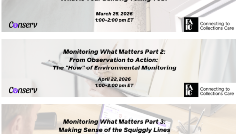
Environmental Monitoring for Collections of All Sizes
Event Date:Presented by: C2C Care/FAIC -
2026 AIC & CAC Annual Meeting & Conference
Event Date:Presented by: American Institute for Conservation