This op-ed first appeared in the journal Exhibition (Fall 2025) Vol. 44 No. 2 and is reproduced with permission.
Too often, an offering is considered accessible when it achieves only the bare minimum: Can someone reach the content at all? That question misses a fundamental point and perpetuates the setting of the proverbial bar so low that it may be on the floor. There’s a vast gulf between letting a blind visitor hear the soundtrack of an immersive installation and inviting them into its full atmosphere. If the music is available but the lighting cues, spatial dynamics, and visual storytelling stay out of reach, we’re delivering information, not experiential inclusion. A design that ends at content access may satisfy a compliance checkbox, but it withholds the key elements that compose shared and richly textured experiences.
Tragically, these low expectations may also be internalized by disabled audiences such that being able to barely access only a portion of an experience is seen as a win. At Prime Access Consulting, Inc. (PAC), we reject this culture of diminished expectations. Access is only the first milestone, never the finish line. True inclusion means reimagining every sensory, emotional, and intellectual layer of a work so that disabled participants can experience, critique, and shape it on equal terms. We champion design that pairs vivid audio description with tactile or haptic cues, that synchronizes spatialized sound with lighting changes, that normalizes surfaces and experiences being at comfortable heights for seated and standing individuals, and, most critically, that involves disabled experts from concept to completion. Anything less isn’t progress; it’s exclusion by another name.

Recently there has been an increase in resource spend and design attention given to multisensory design in exhibitions and themed experiences. This is often inaccurately positioned as being in the service of accessibility. Many disabled people are considered or identify as being disabled because of the way they experience the world sensorily. So, it is logical when designing an exhibition to consider how we might engage multiple senses. However, while a noble intention, most instances of multisensory design provide greater stimulation but do not yield greater accessibility.
Critical to resolving this issue is understanding that “multisensory” and “multimodal” are not synonyms. Engaging multiple senses (multisensory) is different from designing materials for concurrent and redundant presentation via multiple modalities (multimodal). Multimodal design utilizes multisensory design tactics to surface interpretive, instructional, and directional information via audio, tactile, visual, and other means.
For example, let’s take a map designed for sighted readers and reproduce it with raised lines. We’ve created a tactile object, but not necessarily a meaningful one. Vision captures an entire layout—colors, symbols, scale—in a single glance, while a tactile reader must explore it piecemeal, one fingertip-sized patch at a time. Without intentional redesign, it is guilty of what the blind French philosopher Pierre Villey called “talking to the fingers with the language of the eye”: the tactile version offers only fragments of the message the visual map conveys in full.
If our intent is to increase accessibility and usability while creating a meaningful experience for all, a deliberate mapping must be done between different modalities of engagement to ensure the outcome is true inclusion, not just additional stimulation.
Tactics
At PAC, we are privileged to work with a great diversity of collaborators and partners in an effort to help organizations welcome the widest possible audience. Through this quest, we encounter many unique contexts and circumstances—art galleries, science centers, history museums, themed entertainment venues, sports and performing arts centers, festivals, digital and physical environments, and more. With a goal of providing not only operationally sustainable accessibility, but nonsegregated inclusive experiences, we spend a lot of our time thinking critically about multisensory design tactics being used to express multimodal experiences.
We have observed increased attention to accessibility and multisensory design in the cultural sector. We applaud, embrace, and encourage these efforts as they are so often caried out by well-meaning people with the noblest of intentions. Unfortunately, good intentions are not sufficient to yield good outcomes.
What?
Modality mapping is an interpretive process that assigns meaning across multiple sensory inputs. This process strategically maps content across modalities, ensuring that there are multiple ways of doing and experiencing something. What does this mean in practice? If, in a designed experience, an event happens that is presented through synchronized lighting and audio effects, then two modalities are being provoked. This gives visitors two opportunities to react, respond, or engage. This is key when those visitors may not have or may prefer the use of one such modality.
The process of modality mapping considers each modality as part of a system of content or information delivery. A basic example of this would be exhibit text that is not only presented as visual, printed text. It is also presented as braille text and offered digitally to be read through text-to-speech. In offering these different methods of delivery, we return agency to the user by allowing each individual to choose how they can or want to engage with the content—something so rarely granted to disabled users.
Why?
Designers make assumptions and assertions about their audience or users all the time—what the user will want or need, what they will find engaging or interesting, how they will learn or consume information—and we anticipate how users will move or interact within a space. However, when designing for inclusion and accessibility, honorable design intentions may be overshadowed by decisions rooted in assumptions about disabled audiences by nondisabled designers. This leads to non-inclusive and inaccessible experience outcomes.
Consider the aforementioned quote from Pierre Villey, “talking to the fingers the language of the eye.” Villey is referencing the types of assumptions nondisabled designers make when designing for disabled audiences. For example, a graphic designer who chooses iconography based on visual recognizability might assume those icons will also be tactilely recognizable for a blind or low-vision user. But this is not the case. When a sighted user sees two dots above a curved line within a circle, they quickly recognize it as a smiley face. When a blind user tactilely experiences the same graphic, they might interpret it as two grapes and a banana on a plate. If the circle is yellow, even more sighted users will interpret it as a smiley face. Yellow, however, can’t be felt so not all the information is being conveyed tactilely that is being conveyed visually. These visual codes are commonly used but are not universal across all modalities. A process of modality mapping needs to take place to break down these assumptions, rethink assertions, and design experiences that are meaningful and engaging for the widest possible audience.
How?
Modality mapping requires a designer or team to critically evaluate each aspect of an experience and then decide on which modalities communicate each of them. It is driven by the intended experiential and learning objectives and guided by this question:
What modalities best convey the story or information?
While a seemingly simple question, it asks the designer to critically consider the content and what tactics are needed to convey the information across each modality. Consider the following examples showing how different tactics can be used to achieve relevant multimodal experiences.
Visual to Touch
Touch objects, material samples, and tactile reliefs are three commonly used tactics for translating visual information to touch. However, simply providing people with something to touch is not the same as creating something that is tactilely informative, interesting, and that functions as expected. When mapping visual content to touch, it is important to ensure tactile clarity and distinguishability among the elements being communicated or highlighted. Scale, resolution, and fidelity are all important characteristics to consider when surfacing design and functional intention.
In some cases, it might take more than one touch object to provide a wholistic understanding of a visual piece through touch. Consider the touch objects PAC developed in collaboration with the Boise Art Museum for Marie Watt’s Canopy (Old One) (intro image). In this case, multiple touch objects were needed. One is a scaled 3D model to represent the overall shape and form of the piece. The second is a replica of a section of the piece to represent scale and detail. Moreover, a third touch object could have been a sample of the wood to represent the materiality of the piece. In this example, the key features of the artwork—form, scale, details, and material—are mapped to individual touch objects to provide a full understanding of the piece through touch.
Visual to Sound and Touch
Modality mapping can be used in brand development to create multimodal branding. At PAC, we have developed an educational and community-building resource hub called Mosaic. It was important to the team to ensure the brand is multimodal, therefore inclusive, in its presentation and use (fig. 1). As such, we developed a series of assets across modalities that map the gestalt of the Mosaic brand to a visual graphic and animation, an auditory earcon, and a tactile language.

The animation for the brand uses the design motif of the triangles in the logo to show a zigzagging series of linked triangles unfolding on a white background to create a wide letter M. The movement of the triangles was then mapped to an earcon. The earcon is described as, “a note held on a stringed instrument and, as a series of linked triangles unfolds into a letter M, a brassy rumble plays, adding the sound of shuffling papers. The notes of a G-Major chord ring out on a piano synced to the appearance of the syllables in the name Mosaic.”


We then used the visual graphic logo to develop a tactile award presented at the inaugural Mosaic Convening in October 2024. The award is in the shape of the Mosaic M and maps the range of oranges and purples to textures: the oranges use a diagonal hash pattern that becomes denser as the color deepens (fig. 2), and the purples use a dot pattern that similarly becomes denser as the color deepens (fig. 3). In this way, the single touchable object not only tactilely represents the shape and form of the logo, but also the color relationships.
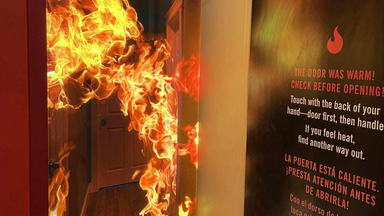
Fire!, an exhibition at the California Science Center, extends this concept to museum exhibitions and location-based experiences. During the design phase of the exhibition, which serves to promote fire safety, developers expressed a desire to include an installation teaching caution when opening doors during a fire (fig. 4). The original concept had users touch a door to learn whether it is safe to open a during a fire. The irony of the design at that point in the process was that they were mapping hot and cold temperatures that might be felt in a live fire via thermoception to visible color by bathing the door in blue or red light. If the door was blue, that meant it was safe to open; if it was red, it wasn’t safe.
This concept relies on people understanding that blue means cool and red means hot. It also means a visitor must see the colors to be able to interact with the installation, which is intended to teach about temperature. As we progressed through planning the interactive, we designed it to be both more accurate to the real-life situation and strategically redundant in the way it conveyed information to visitors. In the final design, the doors were warmed and cooled—with the temperatures mapped to the blue and red color changes—ensuring both touch and sight modalities of engagement for the activity (fig. 5).


Sound to Haptics
Haptics are a form of touch-based communication involving the use of tactile sensations, such as pressure, vibration, texture, or motion, to convey information or to provide feedback. The modern mobile phone is a great example of incorporating haptics into an experience in an inclusive, multimodal way. Think of everything that happens when you get a text message: You may get a sound alert, a visual notification, a haptic response, and Siri may even notify you through your AirPods. In this way, the same information is being conveyed through multiple, synchronized modalities—audio (sound effects), visual (graphics), and touch (haptics).
How might this be leveraged in a gallery setting? With the landscape of modern technology constantly evolving, there are many opportunities to leverage these built-in advancements in a gallery setting in meaningful ways. It is critical, however, that inclusion and accessibility are brought along and considered in the process as these innovations progress. In many cases, lighting effects are used in experience design. But making lighting effects multimodal is a unique opportunity to explore haptics as well as audio. All three of these modality perceptions, at their base, have to do with frequencies—light, sound, vibration—and as such, when thinking about making certain effects or events multimodal, a simple path to explore is reproducing frequency perceptions across modalities. In the Great Animal Orchestra installation by Bernie Krause and United Visual Artists, the audio is mapped to visual effects projected around the room. This means the immersive audio installation is accessible via at least two modalities, and both are attempting to facilitate feelings of immersion. We might posit that the audio, which could also easily be mapped to touch, might be even more immersive if it were also mapped to haptic devices. In fact, some live music venues now offer haptic vests as an available accessibility affordance. In this case, visitors would actually “feel” the immersion, in addition to hearing and seeing it.
Conclusion
Inclusive design cannot be achieved through good intentions alone or by simply increasing sensory stimulation. It requires a deep and deliberate effort to understand how meaning is conveyed across different modalities and how those modality interactions can be synchronized to create equitable, rich, and salient experiences for all users.
Modality mapping is not just a technical or interpretive approach, but a mindset shift that challenges designers to reconsider assumptions, dismantle ableist defaults, and construct experiences that grant agency to every visitor. Accessibility must not be an afterthought or a partial accommodation, but a foundational design principle that honors the full spectrum of human experience. Only then can we move from mere access toward true inclusion.
Corey Timpson is a Principal at Prime Access Consulting in Ottawa, Ontario, Canada. corey@pac.bz
Maria Braswell is an Inclusive Experience Designer at Prime Access Consulting in Philadelphia, Pennsylvania, USA. maria@pac.bz
Robin Marquis is a Senior Inclusion Strategist at Prime Access Consulting in Baltimore, Maryland, USA. robin@pac.bz
Sina Bahram is a Principal at Prime Access Consulting in Cary, North Carolina, USA. sina@pac.bz
Upcoming Events
-
Confessions from the Security Vault
Event Date:Presented by: Southeastern Museums Conference -
From Fragmentation to Alignment: Project Management in Museums
Event Date:Presented by: American Alliance of Museums -
CEO Chat: Censorship
Event Date:Presented by: American Alliance of Museums -
Planning and Budgeting for Fundraising Success – OMA Webinar
Event Date:Presented by: Ohio Museums Association