We recently had the opportunity to learn more about the design of Unsettled (Nevada Museum of Art), the 2018 Frances Smyth-Ravenel Prize for Excellence in Publication Design, from designer Brad Bartlett of Brad Bartlett Design. The book covers 200 artworks by 80 artists living and/or working in the Greater West, a geographic area that stretches from Alaska to Patagonia, and from Australia to the American West. To view a list of all winners, click here.
What was the initial design concept or what did you want the book design to convey?
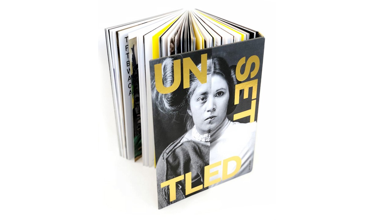
Brad Bartlett (BB): We approached the book as a sculptural object, a kind of material embodiment of the subject matter. The book features artwork that explores ongoing legacies of colonialism, cultural tensions, and the ongoing conflict in the Greater West—a super-region that stretches from Alaska to Patagonia. The cover typography reflects the region’s cultural and geological instability, while its gold foil stamping refers to the region’s rich natural resources and contentious history of precious metal extraction. The reverse-spine wraps around the fore-edge of the book, exposing its binding and suggesting an unfinished or ‘unsettled’ quality. The book is the exhibition catalogue as well the program for the 2017 Art + Environment Conference.
What were the key decisions that needed to be made in the execution of the design?
BB: The arc of the visual narrative unfolds over the duration of the book and has a beginning, middle and ending. The sequence of images were meticulously positioned to create meaning and to tease out threads of narrative.
Wedged in between the sequence of images are large text provocations that provide context, while acting as a pacing mechanism. In this way, a kind of semantic alchemy emerges from the juxtaposition of text and image. The book is a kind of film and this process feels more like editing than simply composing a series of page layouts.
In addition to visual editing and image sequencing, we were particularly sensitive to typography and typographic composition. We chose to work with typefaces designed by Klim- a New Zealand Type Foundry- because its geographic location falls within the Greater West super region.
Alaska-based Iñupiaq artist Allison Warden’s (AKA AKU-MATU) twitter poems flow through the book, framing and activating images of cultural artifacts and contemporary art, and suggesting the political and cultural observations about the collision of ancient and future.
Did the design concept evolve over time and what prompted this?
BB: In many ways, the book is like a musical score that works its way into your head like a song. For instance, how does one image resonate with another? Is the experience enhanced by contrast and tension, by consonance or dissonance?
One key element was decided early on- the cover- and that was driven by the impact of artist Nicholas Galanin’s stark juxtaposition of Star Wars’ Princess Leia with a photograph taken of a Pueblo Indian girl by Edward Curtis.
How long did the design take and what were some of the key details that needed to be managed and how?
BB: The design took about four months. The production timeline, physical parameters and budgetary considerations all influence the process. We had to make early decisions on size, binding, and paper stock to ensure our delivery date. Since the book was printed in Europe by Hirmer Verlag, we needed to take into account shipping the books across the Atlantic to make the opening dates for the Exhibition and 2017 Art + Environment Conference Conference.
Who were the other stakeholders involved in the process? What questions did they help inform? Were there any sticking points?
BB: The process was incredibly smooth because of the coordinated efforts of all the project team members. Project manager Amy Oppio, COO/deputy director at the Nevada Museum of Art, was the thoughtful and steady presence that deftly facilitated the gathering of content and all production needs. Rainer Arnold, project manager at Hirmer Verlag Publishers in Munich, patiently coordinated production materials. Author Joanne Northrup, curatorial director and curator of contemporary art at the Nevada Museum of Art, curated the exhibition- she put a lot of trust in the design and her timely and impactful ideas nourished the design process. Lastly, museum director David Walker is the visionary presence behind the scenes that makes it all possible.
More broadly, what is the value and impact of great design?
BB: In the broadest sense, design is a catalyst for transformation and powerful instrument for social change.
In the way that an architect isn’t simply making a building, but asking us to think about the possibilities of what a building can be, the same holds true for design. Great design should introduce us to the new ways of thinking, new ways of form-making, new ways of story-telling and new ways of pushing the medium itself.
As a cultural artifact, design should be judged not only on aesthetic merits or subjective notions of beauty, but by the thoughtful elevation of meaningful content and its subsequent impact on the world.
In retrospect, would you have done anything differently with the design?
BB: We wanted the book to be a multi-sensual experience and worked with scent-artist Bruno Fazzolari to craft a scent for the book. Unfortunately, the complex chemistry of the scent mixed in with varnish proved to be time-sensitive and cost prohibitive. As it turned out, Bruno was at the opening and offered to hand-scent the books!
Upcoming Events
-
Planning and Budgeting for Fundraising Success – OMA Webinar
Event Date:Presented by: Ohio Museums Association -
AASLH History Hour: Civic Practice
Event Date:Presented by: American Association for State and Local History (AASLH) -
What It’s Like to Participate in Museums Advocacy Day
Event Date:Presented by: American Alliance of Museums -
From Idea to Acceptance: How to Submit a Winning Annual Meeting Session Proposal
Event Date:Presented by: American Alliance of Museums