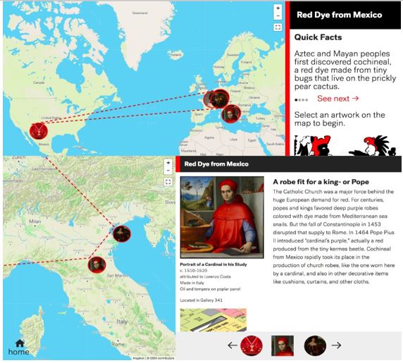
How is a red bug from Mexico so deeply tied to the representation of papal power in the late-1400s? First some background.
It all starts with small red bugs, called cochineal, that live on cacti. They were first discovered by the Aztec and Mayan peoples’ thousands of years ago. They learned that the bugs’ bodies produced a chemical which could be used for dye and paint.
Cut to the 1500s and the brutal conquest and subsequent colonization of the Aztec Empire by the Spanish. The Spanish admired the clothes of the native peoples made with the cochineal dye and saw that it could be a profitable resource. They took over cochineal production and began shipping tons of cochineal to European textile centers.

Meanwhile, in Europe, the fall of Constantinople in 1453 disrupted the supply of a different dye made from the murex shellfish, which was only found in the Mediterranean Sea. The shellfish produced a brilliant purple dye reserved for the elite. With the source of the quintessential purple dye cut off, Pope Pius II introduced what he called “cardinal’s purple,” which was actually a red produced from the tiny kermes beetle. When cochineal imports began flooding into Europe, the cochineal bug quickly came into favor for, among other things, the production of church garments, like the red robe worn here, by a cardinal.
That the dye made from a small red bug harvested in Mexico could find its way to Europe and make such a lasting impact demonstrates– well– a lot of things. It illustrates the impact of colonial exploits, it shows the extraordinary development of seafaring and trade, and it reminds us that power is performed through what we wear. Among many other things.
Anthropologist Arjun Appadurai explained that it is by following the trajectories, the often complicated and nuanced paths of objects, in this case, a small red bug, that we “can interpret the human transactions and calculations that enliven things.” He goes on to say that even though it is people that “encode things with significance…it is the things in motion that illuminate their human and social context.” By exploring the things and their movements (bugs, robes, etc.) we can better understand their expansive and interconnected histories.
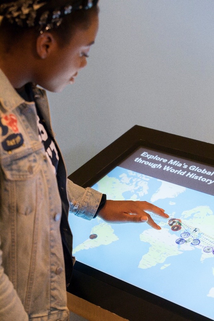
In an effort to illuminate these connections, Minneapolis Institute of Art (Mia) turned to technology. In 2015, Mia received a grant from the Institute of Museum and Library Services (IMLS) to create a digital, interactive map that situates our objects within a broader context; one that illustrates how cultures have exchanged ideas and materials for centuries and how art reflects those exchanges.
Over the course of a three year grant period, Mia went from paper prototypes to a robust web-based platform that covers seven topic areas from the spread of Buddhism to the topic articulated above, red dye from Mexico. The Digital Experience (TDX) team led the work and includes members from curatorial, education, and media and technology. Because of the cross-functional nature of the team, it helped to ensure the tool and its content was developed collaboratively and inclusive of multiple perspectives.
In addition, the team stayed grounded by focusing on a few key messages that we agreed were critical to convey. In short: Stuff is connected; globalism isn’t new; go see and experience these objects in the museum– when possible. Each decision was made with these guideposts in mind. Although admittedly reductive, these ideas helped us broach the tough, more substantial and necessary conversations surrounding the project. Things like the need to work against the physical and philosophical constructions of the museum’s space, or the ways in which we propel and privilege histories that seek to dismantle the grand narrative or great hero that too frequently takes center stage. And how can we encourage visitors to experience the physical space of the museum in new ways, by seeking out objects from seemingly disparate periods of time or “category” in order to get a better understanding of our collective history?
 A digital platform allowed us to step up to many of these goals simultaneously. With increased space to include different types of rich media, from text to video, to photography and cartography, we presented information in consistent forms across each topic area.
Each area follows a sort of formula to ensure each time a visitor clicks to a new area of focus, they have access to the same type of information. Information that can ground visitors and help them get acquainted with the theme. There’s also a short video to complement and reinforce what they have just read. Once you’ve taken all that in, you’re invited to explore the objects associated with the topic and see how one connects to another across geographies and time periods.
Taken together in this digital format, we may be better positioned to tell more complex stories of commerce, artistic exchange, and change in one place. Critically, we hope to also have more time and space to share the histories of enslavement, colonialism, and conquest represented in our objects.
The physical walls of the museum– those that divide the collection across geographic or cultural boundaries– often limit comprehensive interpretations of museum collections. The divisions established along with the emergence of modern museum practice often create fissures in our ability to see the broader history of an object. While this practice is being called into question, there are still very real, often physical, barriers to displaying the vast and often complex connections of objects, materials, and exchange in an art museum.
 So we gave technology a shot. We leveraged its ability to provide more space. We welcomed the opportunities it presents for new juxtapositions and connections. We even used some flashy animation to keep your attention. But these stories are still incomplete. For now, the map relies upon the objects in our collection. While we are exploring the ways we can leverage objects outside of it, it’s still in progress. There are many more stories to explore and more modes of telling them. We’re also thinking about the ways we can go beyond the institutional voice and seek out other meaningful contributions. So there’s work to do.
Despite its shortcomings and room for growth, leveraging technology has given us this flexibility to test and to learn and we’ll continue to adjust and add as we go along. Fred Wilson’s “Mining the Museum” installation at the Maryland Historical Society in 1992 demonstrated that objects placed in different context or juxtaposed with others expose new narratives. In one instance of this intervention, Wilson placed manacles of enslaved Africans from the historical society’s collection within an existing exhibition titled, “Metalwork 1793-1880”, which featured silver dinnerware and extravagant display pieces. By placing these objects together in stark and painful conversation, Wilson disrupted a simple viewing experience and demanded the viewer contemplate these contrasting objects. With that powerful model and institutional critique in mind, we’re hoping that exploring these connections in the digital space help viewers see these objects anew, too.
Explore the map online and at the museum in three different locations in Mia’s galleries 200, 240, and 310.
Credit is due to the project team, past, and present including Alex Bortolot, Juline Chevalier, Debbi Hegstrom, Eric Helmin, Kjell Olsen, Katherine Stalker, Meaghan Tongen, and Sarah Winter for their immense contributions.
This project was made possible in part by:
The views, findings, conclusions or recommendations expressed in this project do not necessarily represent those of the Institute of Museum and Library Services.

Upcoming Events
-
CEO Chat: Censorship
Event Date:Presented by: American Alliance of Museums -
Makerspaces for Museums and Historic Sites
Event Date:Presented by: American Association for State and Local History (AASLH) -
Planning and Budgeting for Fundraising Success – OMA Webinar
Event Date:Presented by: Ohio Museums Association -
AASLH History Hour: Civic Practice
Event Date:Presented by: American Association for State and Local History (AASLH)