Author’s Note: When I initially wrote this blog post several months ago, it was to describe and celebrate an initiative that I spearheaded at the National Gallery of Art that made new use of museum collection data. The point of the blog post was to show that museums are sitting on a digital resource that they may not even think of as valuable beyond supporting online access to their collections or digitized collections management.
In the midst of mass museum closures because of COVID-19, many museums are rethinking their digital initiatives and outreach. Social media and external-facing parts of institutions’ websites have been front and center during this time. However, this post shows that the behind-the-scenes data that supports these initiatives can also become the star of the show. This data can be repurposed and presented in ways that help the public see museums and their collections in new ways—and all in a digital format easily accessed from home.
Furthermore, while we work from home, my team at the Isabella Stewart Gardner Museum (where I became Assistant Curator of the Collection several months ago) has been focused on digital cataloging and data clean-up because it is something that—apart from taking physical measurements and updating analog object files—can mostly be done remotely. This time is, therefore, not only an opportunity to potentially engage with collections data in new ways but also do the cataloging and other preparatory work that makes projects like the Datathon possible. With these facts in mind during this pandemic, I hope you enjoy learning about the project.
When I arrived at the National Gallery of Art as an Andrew W. Mellon Postdoctoral Curatorial Fellow in 2018, one of the first things I needed to learn was how to use The Museum System (or TMS), the software many museums use to catalog and track their collections. As the museum’s Database Administrator taught me how to use the system, all I could see was data—invaluable data about the content, history, and changing display locations of the National Gallery’s collection. Towards the end of the training session, I asked one key question: “Does this export to a spreadsheet?” Could this rich information be exported into a form fit for statistical analysis?
The answer was, happily, “Yes”—and about two years later, with the help and support of many NGA staff members, the museum hosted Coding our Collection: The National Gallery of Art Datathon.

For the event, which you can watch in full here, we invited interdisciplinary teams of data scientists and art historians to analyze, contextualize, and visualize permanent collection data exported from TMS. We were, to the best of our knowledge, the first American art museum to host an event of this kind. Participants, all of whom had prior experience in this kind of research, came from a wide range of institutions: Bennington College; Carnegie Mellon University; Duke University; George Mason University; Macalester College; New College of Florida; University of California, Los Angeles; and Williams College. The National Gallery also fielded its own cross-departmental team. (The full list of participants is available here).
The event taught us fascinating things about the collection, mostly focused on trends in acquisition or display over time, with some notable exceptions. (We were surprised to learn from the George Mason team that, after Leonardo da Vinci, the artist in the collection most searched on Wikipedia was Neil Armstrong, whose photos of the first moon landing the NGA owns.) But before we delve further into those results, let me give some perspective on this quantitative approach to analyzing a collection.
Some Further Information about Data-Driven Art History
The idea for this event started with my slightly odd combination of research interests: I love art and I love statistics. I have been lucky enough to indulge these two interests in my academic work and train as both an art historian and an economic historian. My research is, primarily, data-driven art history. In this research, I’ve learned there are certain things a quantitative approach to art history can—and cannot—achieve.
One of the key things I believe it can achieve is helping identify sample bias, which emerges when an analysis focuses on an unrepresentative part of the population being studied. For example, when social scientists have used military records to study the historic heights of a population—how tall people were—they have ended up with biased results because some armies had minimum height requirements. In art history, sample bias is more subtle. It is linked to canon formation, and to the fact that collectors, curators, and scholars may pay disproportionate attention to select artists, geographies, artistic movements, and media.
Data can have a democratizing effect. Though we may have a qualitative sense of what a museum owns and chooses to display, it is difficult to rely only on curatorial familiarity to fully comprehend the content and formation—as well as the strengths and blind spots—of a collection, especially one the size of NGA’s. Zooming out to a quantitative birds-eye view of a museum’s collection allows one to take stock of both the “greatest hits” and lesser-known objects, such as those only rarely put on display for conservation reasons, or from outside a traditional canon or narrative. This new view allows for a better understanding of the full range of objects that a museum has preserved. With the help of data-driven analyses, the sample studied can be expanded, and all of a museum’s tens of thousands of objects can be considered together in new ways.
Now, I do not want to overclaim: data does not provide simple objective truth. First, museum data is not flawless. Cataloging is a profoundly human process; there is the possibility of error, and museum staff are always learning new information that can result in changes to title, date, or attribution. Furthermore, tracing the specific demographics of the artists featured in the collection or how displays and spaces have transformed over time is complicated. This data, like the works of art it represents, is complex and sometimes imperfect. Any statistical analysis must also be understood in the context of institutional and art history. Quantification is at its best when contextualized with qualitative analysis, as the interdisciplinary teams who participated in the Datathon exemplified. Nonetheless, combining collection data with analytical methods that are relatively new to art history provides a novel opportunity. The event allowed us to measure the current scope of the National Gallery’s collection, take stock of its history, and look toward its future with a more complete view of its contents.
Making the Datathon Happen
Facilitating an event like the Datathon required meeting with and gaining the support of many stakeholders. Three primary concerns were raised about hosting an event like this: worries about releasing previously proprietary data, questions about how the museum’s data did and did not capture certain information, and fear of the possibility of “bad news” in the teams’ findings.
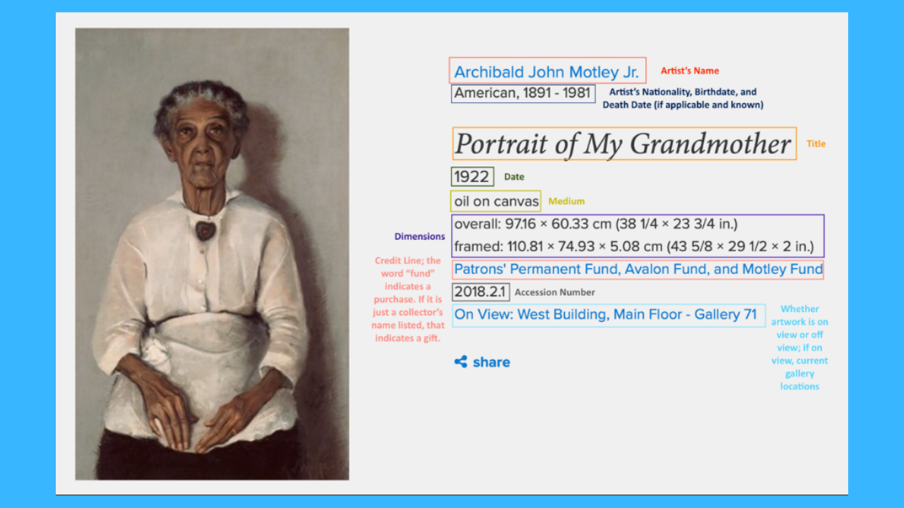
The first concern was allayed by only releasing data that could already be web scraped from the NGA’s public website. This included information about maker, medium, date of acquisition, and public location over time. An annotated screenshot of the object page for a painting from the museum’s collection—Archibald Motley Jr.’s Portrait of My Grandmother—demonstrates all the information that can be gleaned from the basic cataloging of a permanent collection object.
For museums whose collections are online, this information is already fully accessible and able to be deployed for statistical analysis if a researcher wants to scrape it—as one of our participating teams did for this exceptional journal article.
The prospect of releasing data also prompted questions among stakeholders about what kind of information is systematically recorded about artworks and the artists who made them. While medium, provenance, and object-level information are always recorded, only select information is systematically recorded in TMS about artists. Existing cataloging standards stipulated that nationality and birth and death (when available) should be recorded. However, for the Datathon we also wanted to provide data about the gender and race of artists included in the collection. The National Gallery’s staff therefore worked hard to add Getty Union List of Artist Names (ULAN) identifiers to artist records, which provide information on gender and ethnicity. Some teams chose to supplement this demographic information with their own data and programs available that estimate the gender of an artist based on first name. Though not perfect, this solution allowed for the approximation of demographic information that teams wanted to engage with and analyze.
The final concern about “bad news”—that, for example, the corps of artists included in the National Gallery’s collection would be less diverse than expected—was, to the credit of my colleagues, quickly dismissed. Museums are facing ongoing calls to be transparent about the diversity of the collections they hold and how those collections have changed over time. Rather than dodge those questions, it was clear that this event presented an opportunity to face them head-on.
While preparing for the Datathon, I met with colleagues across curatorial departments and in education to ask which questions they had about the collection that data-driven analyses could possibly address. Among their many suggestions, several common inquiries emerged: about the diversity and inclusiveness of the collection, how works have been displayed in our galleries over time, and how data on the provenance of works can teach us about the formation of a national collection. Their questions were provided to teams as potential jumping-off points for their analyses—although teams were ultimately free to explore what they wished. Crowdsourcing questions from staff not only generated interesting inquiries from those who know the collection best, but also built interest in the event and support for it across the museum.
So, what did we learn?
Each of the six participating teams chose to focus on different research questions, use different methods, and incorporate a range of supplementary data. Several teams also built web-based dashboards and apps that staff members at the National Gallery can now use to continue quantitatively exploring the content of the museum’s holdings. Rather than summarizing each team’s findings, this section provides an overview of findings that fall into the two categories that describe most of the research presented: trends in acquisition and trends in display. Therefore, this summary is not complete. Full presentations are available on YouTube and the teams’ slides are available here.
Trends in Acquisition
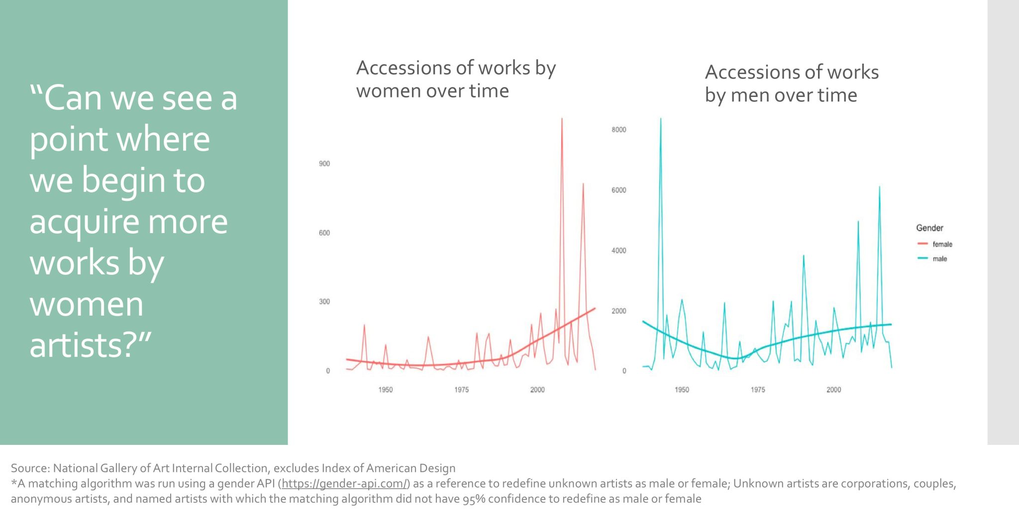
Team 5—a group of undergraduates and master’s candidates from Williams, Macalester, New College of Florida, and Bennington—charted the history of acquisitions at the National Gallery, with the goal to trace changing curatorial and institutional intention. For example, they found an uptick in the acquisition of works by women artists starting in the late 1990s, although these acquisitions still lagged behind those by men.
They also presented a breakdown of acquisitions by medium during different directors’ tenures:
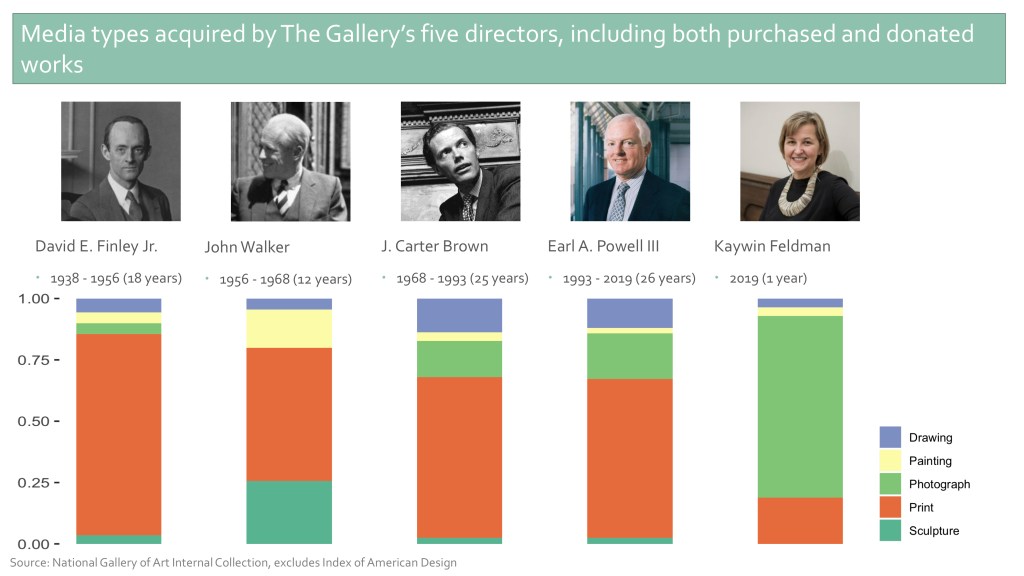
There was striking continuity in the media of acquisitions between the National Gallery’s two longest-serving directors, J. Carter Brown and Rusty Powell. Acquisition patterns looked markedly different under new director Kaywin Feldman, less than a year into her tenure, with a focus on photography and works on paper. Generously, the team built an extensive dashboard for staff and the public to further examine these acquisition patterns.
The National Gallery fielded its own team, Team 6, with members from departments around the museum. Rather than focus on the acquisition of works by women, the team chose to tell quantitative and qualitative stories about women donors who contributed to the establishment and growth of the museum. They showed that 48 percent of credit lines (the record of a donor of a work of art or funds used to purchase a work of art) included women, either on their own or as part of a couple.
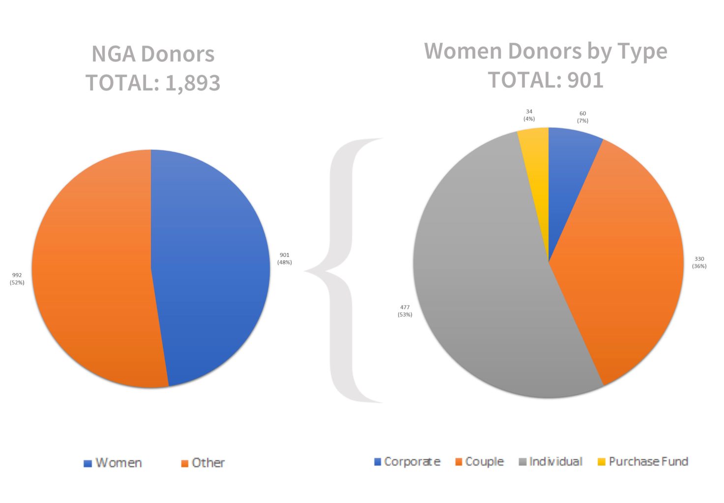
They also showed how some contributions by women donors are invisible in cataloging data because of the way their contributions are recorded. Their identities can be masked by husbands’ names or corporate entities. For example, the credit line “Avalon Fund”—founded and funded by Ailsa Mellon Bruce—would not register as a woman’s contribution in a purely quantitative analysis.
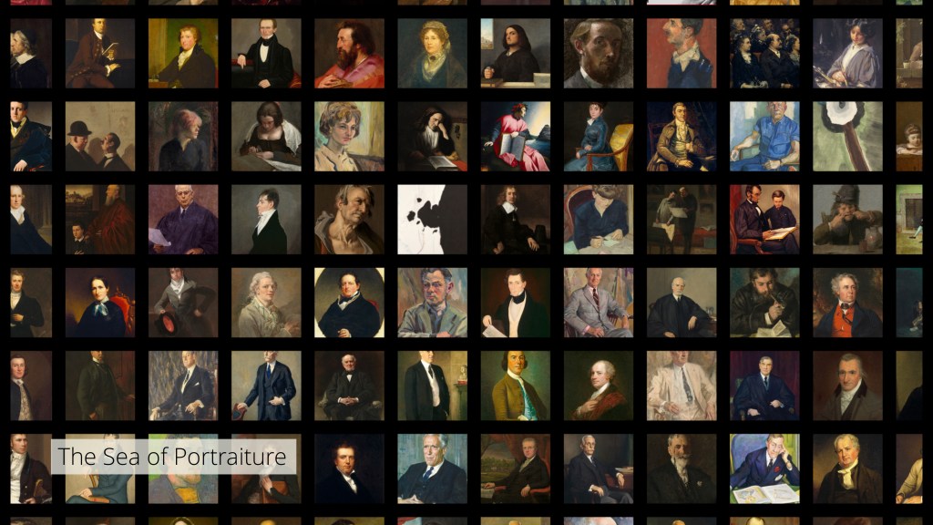
Carnegie Mellon and the University of Pittsburgh (Team 1) took a different approach to the study of acquisition, using open-access images the museum provides via NGA images as data. With computer vision technology, they organized many of the objects in the National Gallery’s collection by appearance and created beautiful digital mosaics of these works.
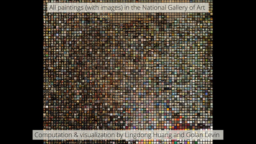
This techno-formalist analysis provoked questions about how stylistic similarities reach across different areas the collection—as shown in the Robert Motherwell painting that appears in the “sea of portraiture.”
Their analyses also showed clear stylistic differences between the works of art the National Gallery accepted from the Rosenwald Collection, a large private collection of prints, and the works the institution declined to accept and passed to another public collection, the Library of Congress (LOC). Comparing Rosenwald images from the National Gallery to those generously provided by the LOC labs indicated that curatorial aesthetic taste can, in fact, be partially quantified.
Trends in Display
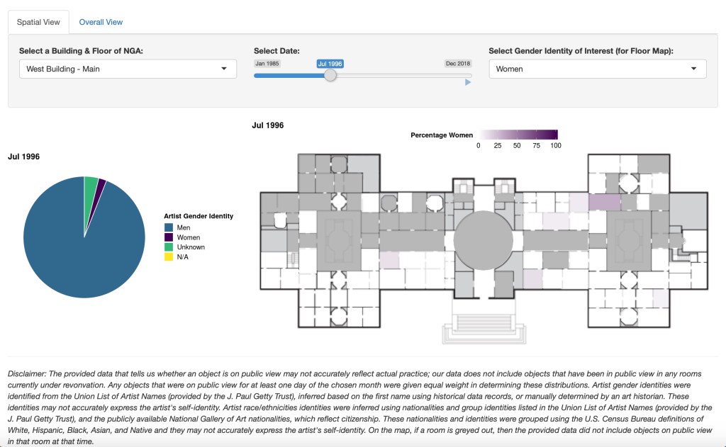
While acquisition builds a collection, curators still have to decide what goes on view or remains in storage. Several teams focused on these display decisions. In their presentation, Team 4 (composed of several co-authors of a paper on the diversity of artists in major museum collections) built a tool that maps the racial and gender diversity of the makers of artworks on display from the 1980s to the present. The team—which included faculty from Williams, Macalester, UCLA, and New College of Florida—generated maps (examples seen below) that track the changing demographics of, as the team put it, “who is on the wall of the National Gallery of Art.” Ultimately, they found the demographics have been fairly stagnant, with few women and artists of color having been on display compared to men and white artists. One can explore these demographics in a dashboard the team built.

Team 2, from Duke University’s digital art history Wired! Lab, mapped the mix of individual works that appeared in each of the galleries in the institution’s West Building over time.
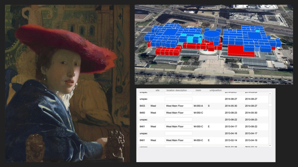
This showed the different ways that curators have presented the collection geographically and chronologically—and highlighted that some installations have remained largely unchanged. Considering the insights of Team 2 and Team 4 together, one can see that the relative permanence of which works are on view has a dampening effect on any change in the demographics of artists on display, even if gender and racial diversity in acquisitions are increasing.
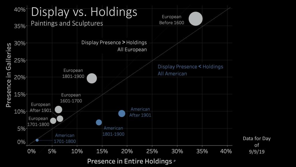
Team 3, from George Mason University, attempted to bridge the gap between acquisition and display. The team showed that European art is disproportionately on display at the National Gallery of Art, even as American art represents an ever-growing share of the museum’s holdings. This team also built a dashboard to allow people to examine their findings.
Ultimately, however, these analyses about display were somewhat limited by the scope of data released. Because of security concerns with sharing the addresses of storage facilities, the location data released to teams was limited. This removed entire galleries—ones that were currently closed and serving as storage but had been open in the past—from consideration. Ideally, as data-driven analyses can help curators to quantitatively evaluate trends in display, institutions should weigh the advantages of releasing as much data as possible to researchers against the likelihood of any security problems linked to that release. The Datathon has demonstrated the clear benefits of a data release—benefits that can only grow as more information is provided to teams.
Now what?
Hosting this event is just a first step in better incorporating data into museums’ efforts to understand their collections and history, be transparent about current holdings, and chart future paths for acquisition and display. Every museum with a computer-based collections management system is, in fact, sitting on massive amounts of data about their holdings. If an institution can export this information to a spreadsheet, it can begin to engage with data analysis, either by drawing on in-house expertise or collaborating with outside researchers.
At the end of the Datathon, Elizabeth Cropper—Dean of the Center for the Advanced Study of Visual Arts (CASVA) at the National Gallery of Art—made a comment that summarizes the achievements and potential of the research presented. Meditating on the different kinds of works acquired at different times, she said the event “impels us to think about our history; because the question is: why is [it] the case that [the museum acquired different kinds of objects under different directors]? We are not arguing with the data, but what it forces us to think about is if [these trends exist], how did [they] come to be so? And given how short so much historical memory is, I think for all of us this is incredibly helpful.” If other museums host events like these or engage with data-driven art history in other ways, my colleagues from the National Gallery and I predict that they will also find the experience incredibly helpful. Excitingly, the Minneapolis Institute of Art is already collaborating with one of the Datathon participants—Prof. Brianna Heggeseth—to start analyzing their collections data in similar ways. Hopefully more institutions will follow.
About the author:
Diana Greenwald is Assistant Curator of the Collection at the Isabella Stewart Gardner Museum and was formerly an Andrew W. Mellon Postdoctoral Curatorial Fellow at the National Gallery of Art.

Upcoming Events
-
Confessions from the Security Vault
Event Date:Presented by: Southeastern Museums Conference -
From Fragmentation to Alignment: Project Management in Museums
Event Date:Presented by: American Alliance of Museums -
Unlocking Your Site’s Membership Potential
Event Date:Presented by: American Association for State and Local History (AASLH) -
CEO Chat: Censorship
Event Date:Presented by: American Alliance of Museums


Being able to see these data sets broken down in such a visually descriptive way is no doubt invaluable information. Since doing this work, has it been considered how there may be more categories added to truly show the scope of the collection (i.e. disability, economic background, etc etc). How do we choose what is important data to store?