Dr. Andrew Simnick is Senior Vice President for Finance, Strategy, and Operations at The Art Institute of Chicago. Matthew W. Norris is Executive Director of Analytics at The Art Institute of Chicago.Since 2014, Andrew and Matthew have worked together to bring applied data and analytics to all aspects of the Art Institute of Chicago.

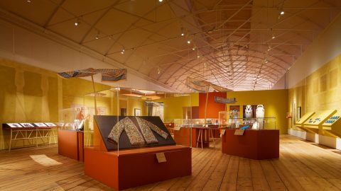
Museums are complex organizations, although they are not always recognized as such. We combine a number of business models within one operation, and we consider both mission- and financially driven objectives in our everyday decision-making. Additionally, we face significant headwinds such as competition with on-demand entertainment, increasing costs, and an uncertain economic environment. All of this places museums in a position that requires us to pursue future aspirations even as we work to answer real questions about how to allocate our resources in the near term.
At the Art Institute of Chicago, this set of challenges has led us to apply data and analytics to decision-making across all areas of our organization. In the process, we have gained valuable insight into how our museum works, unprecedented growth in operating revenue and operational efficiency, and, most importantly, greater confidence in using our resources most effectively to pursue our mission to educate and inspire future generations of museum visitors.
As museums continue to face external pressure, we believe applied data and analytics will be critical for our industry as a whole as we work to navigate an uncharted future.
A creative and strategic approach to scale
The concepts of big data and analytics are now commonplace and have become an accepted part of running a business. The challenge that museums in particular face is how to apply and expand these tools in an environment in which both time and money are limited.
At the Art Institute, by drawing on our experiences of success, failure, and everything in between, we have created and refined a four-step approach to scaling applied data and analytics in a way that is compatible with these constraints:
- Ask the questions that matter most.
- Use lean processes wherever possible.
- Communicate clearly to your audience.
- Practical is better than perfect.
We have anchored our most successful initiatives to these guidelines, which can be adapted by any museum interested in beginning or enhancing its efforts to strategically plan for the future and creatively engage its audiences.
Ask the questions that matter most
There will never be a shortage of interesting questions to answer within a museum. For this reason, our first step is to prioritize potential questions according to their institutional importance. We constantly ask ourselves, “If we had one more hour or dollar, what would we spend it on?” We then focus on answering those questions at the top of the list and move on to the next as we make progress. Some of these queries include:
- What factors actually drive attendance?
- Do local and tourist audiences behave the same way?
- Which objects in our collection are most popular with visitors?
- What audience segments are we reaching?
- How do we get more of our collection online?
- What are the strengths and gaps in our collection?
- How can we streamline the buying experience in the museum shop?
While this focused approach sometimes conflicts with our desire to explore, it has allowed us to develop insights about those issues that have the greatest impact on the Art Institute. For museums new to applied data and analytics, this is also an effective way to build capabilities without making large investments in staff or technology.
Use lean processes whenever possible
While the end user sometimes only sees the final insight or finished product, the majority of the hard work occurs behind the scenes in the process of preparing data for analysis. Early on, we encountered significant limitations in our staff capacity to identify, maintain, and process data sets. This quickly became the main impediment to our opportunity to extend comprehensive analytic efforts across the museum.
To overcome these constraints, we created a “business intelligence core” for the museum (see fig. 1). Through a combination of data warehousing and software, we have introduced automation at different stages in the preparation process, dramatically reducing the time required to access and process internal data. This lean approach also allows us to incorporate external data sets, including demographic, psychographic, and geographic information, where appropriate. While neither visible nor glamorous, this investment in process optimization and automation is paying dividends, enabling us to increase our efforts with less need for staff or consultant time.

Communicate clearly to your audience
Communication is the bridge between analysis and action, but it often gets lost between quantitative insight and operational decisions. Clear communication of the meaning and impact of data is even more important in a museum where quantitative analysis is not always a day-to-day activity, and its insight has the potential to challenge anecdotal conclusions. Building on our organization’s relative strengths in visual interpretation and logical reasoning, we have relied heavily on data visualization to communicate insight while keeping details behind the scenes.
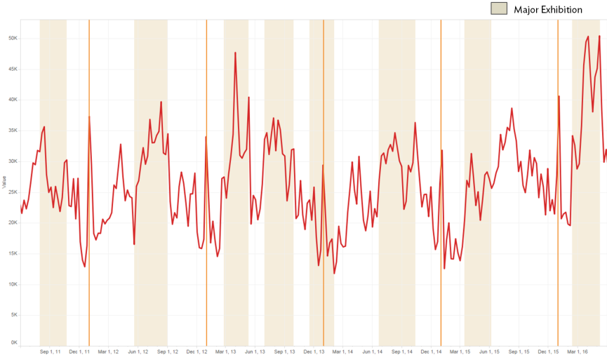
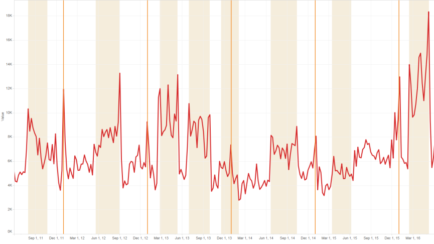
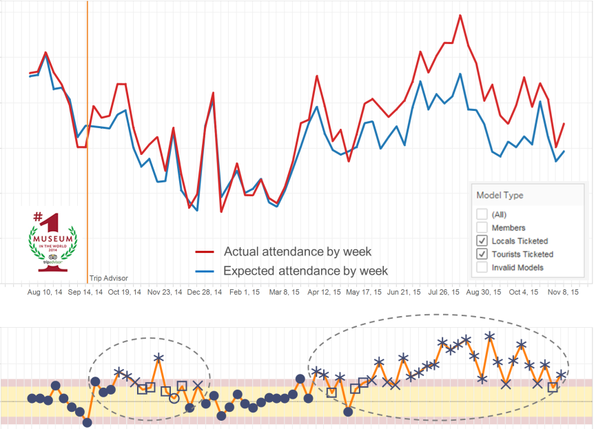
For example, one of our first analyses using visualization highlighted different drivers of visitor attendance. In aggregate, our attendance was difficult to interpret, outside of generally higher attendance in summer than in winter. However, by simply looking at attendance patterns across different purchasing channels and geography, clear patterns emerge (see fig. 2). For example, US tourist volume from fly markets (i.e., 8 or more hours from Chicago) follows a seasonal pattern that is only marginally dependent on exhibitions, while member attendance is relatively flat outside of major exhibitions. These patterns have changed our strategies on when and how to reach out to different segments of our audiences.
A)
 B)
B)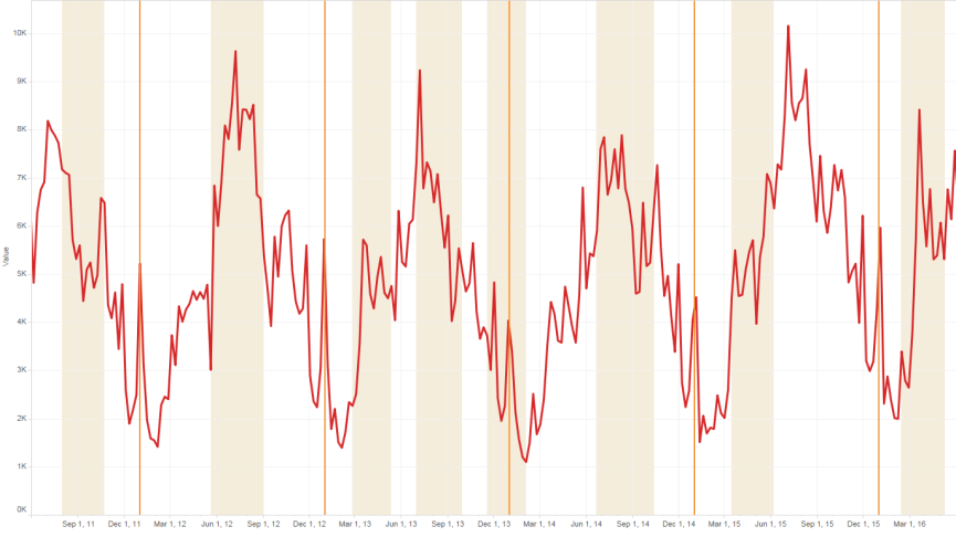
C)
Building on this, we created a series of models to determine which internal and external factors matter by channel. Rather than place the math and the models up front in our internal communication, we designed a visual dashboard to identify and display when meaningful changes in attendance occur (see fig. 3). In the first year of using this tool, we made decisions surrounding marketing spending and content that resulted in a gain of over $2 million in net revenue from admissions, and we continue to use this tool today.
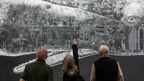
We have implemented interactive visuals in other areas of the museum to translate insight to operational decision making. For example, with the help of interactive visuals, the Art Institute now has 99%+ of its on-display objects online with an image. We also used interactive visuals to help reduce complexity and SKU count within the Museum Shop while maintaining projected revenue.
It is important to remember that not all audiences respond to the same communication methods. While interactive visualizations are helpful in some settings, traditional methods such as Excel, PowerPoint, and PDFs work better in other settings. It takes time to understand of how to best communicate with different audiences, and we recommend trying a wide range of techniques to see which proves most effective within an organization.
Practical is better than perfect
A common pitfall, and one that we continue to face, is the temptation to perfect the data set, analysis, and/or report before trying to answer the question. Delays due to perfectionism can erode the value from investments in analytics, and additional work only matters when it can impact a decision. To make progress, we strive for the “good enough” answer where appropriate.
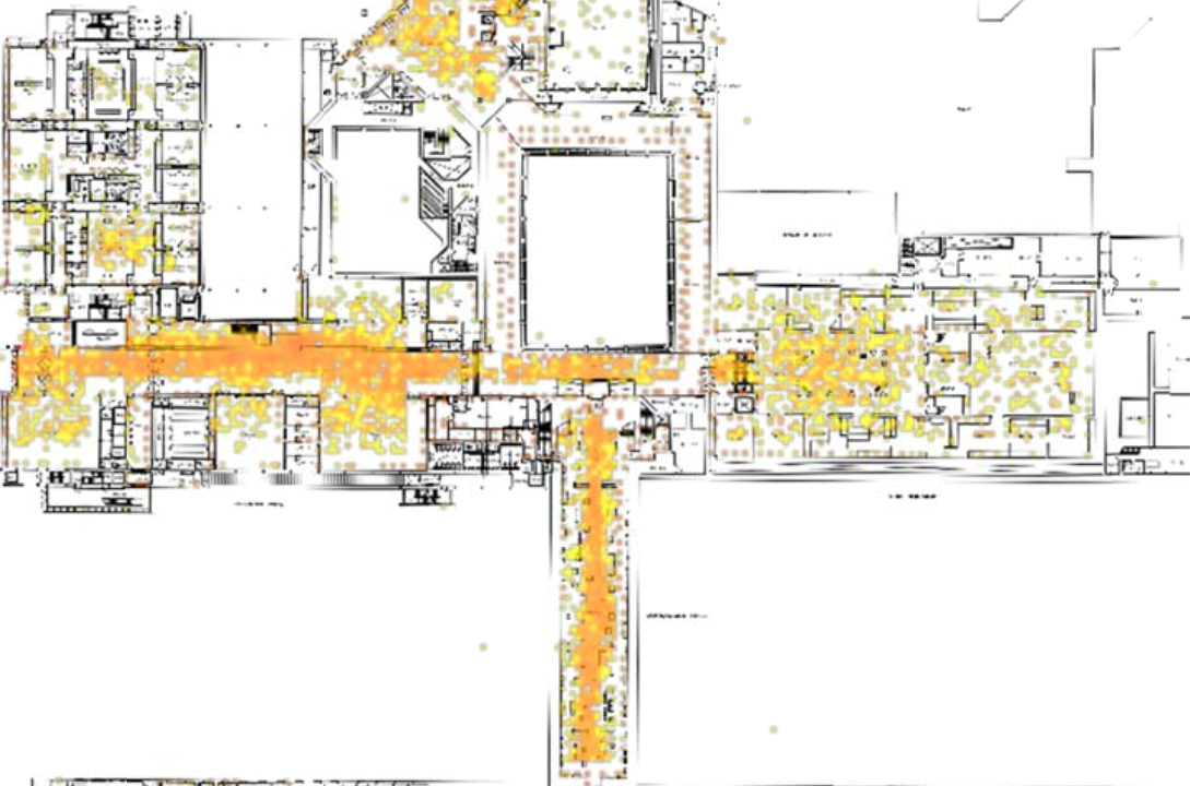
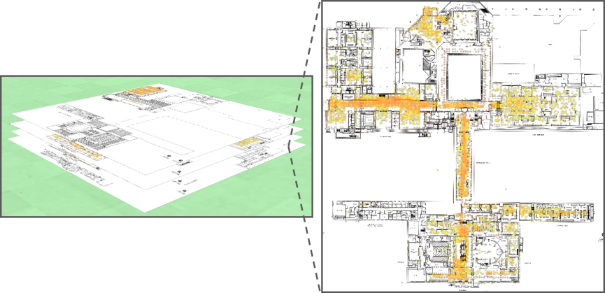
For example, we use data from the museum’s Wi-Fi network to analyze visitors’ routes and dwell time throughout the galleries (see fig. 4). Through this approach, we now know that visitors follow a similar path through the museum regardless of where they enter. We have also learned that using exhibition-like interpretive techniques in the galleries displaying our permanent collection significantly increases dwell time there. While this data is less precise than direct observation in individual galleries, it allows us to quickly observe meaningful trends and make fast, informed decisions.
We also rely on our staff and volunteers to help build data sets when we are looking for a quick answer. For example, we worked with volunteers to capture over ten thousand visitor questions over eight weeks, revealing information about our most popular works and gaps in our frontline service. Our volunteers also worked from physical forms to develop an analyzable data set, providing our first look at the effects of school tours on visitation. While this approach is not as polished or precise as dedicated external support, it helps us make informed decisions quickly and reserve time for those questions that require the perfect answer.
Any museum can use data
Data is everywhere, opportunities to use it are vast, and the uncharted future necessitates it. Reflecting on the past several years, the choice to pursue answers to specific questions in a practical way has made all the difference. We are fortunate to have a new lens through which to understand how our museum operates, and we strongly believe that applied data has the potential to transform our industry for the better as we move together into an uncharted yet exciting future.
Upcoming Events
-
-
Honoring African American History in America’s 250th
Event Date:Presented by: Southeastern Museums Conference -
Environmental Monitoring for Collections of All Sizes
Event Date:Presented by: C2C Care/FAIC -


Thank you Dr Simnick for such an inspiring article and congratulations on achieving such meaningful results. I especially enjoyed the pragmatic, question driven analysis, the use of lean and stellar examples of the return on investment link through insight between factors and decisions. We strongly agree data has the potential to transform the industry too.
Excellent. I lived this complexity, and you have really spoken well to the need of meaningful and reliable metrics.
Would love to see examples of how this approach has been applied in small and mid-sized museums; maybe in museums that are part of a parent organization such as a city or university. Any case studies available?
Thank you for your insights. I work and live in Germany and data analysis has started playing an important role for some arts organisations here as well.