
Have you ever wished you could visualize and analyze some of your museum’s data, but weren’t quite sure how to start? Maybe you’re a museum person who is comfortable with technology, but not quite a coder. Perhaps you don’t think of yourself as a technology person at all, but love to learn and see the value of data for helping your museum improve.
I’ll wager that many of you were impressed and inspired by the work that the Art Institute of Chicago shared about putting data to work inside their museum. It was exciting to hear about their learning and to dream about all the things you could do with that kind of data at your disposal.
Reality Check
The truth is, the Art Institute of Chicago has devoted some really talented staff and some significant resources to this work that many museums across the country just can’t easily duplicate.
Did you know that most of AAM’s member museums have less than 10 full-time employees and the vast majority have operating budgets far less than $1M? I started dreaming about what it might take to enable these museums to take advantage of some of the same techniques.
In this series of posts, I’ll focus on just that. What do we need to get started? How might we make forward progress without a lot of money, prior experience, or a dedicated software team on staff? If our museums were startups – how could we start to grow?
Throughout the series, we’ll start with simple (almost basic) techniques that anyone can try and then ramp up to explore more sophisticated ways you can explore your data and learn things about your museum’s practice. We’ll explore how to visualize and forecast your attendance. We’ll demonstrate some simple tools for creating maps and for thinking about demographics. We’ll take a dive into collection visualization and might even dip our toes into some simple machine learning tools for prediction. Along the way, we’ll try to keep things practical and focused on real museums and real problems. I hope you’ll follow along with us and share thoughts and ideas about problems you’re facing at your home museum, or perhaps ideas that you’re interested in seeing us explore in more depth.
Let’s get started and explore some simple ways you can Become a Data Startup.
Introducing the Grace Museum
To make this series as practical as possible, I’ll try to focus on work with real data from real museums. One of my favorite museums is the Grace Museum in Abilene, TX. I first met Laura Moore and her staff at the Grace while I was working at the Dallas Museum of Art. I loved our work together and thought they would be the perfect example museum to start this series with. The Grace team agreed to dive in with us and have generously agreed to share their data with you directly so that you have some real-world example files to follow along with.
To learn a little more about the Grace, I’ll let Laura Moore, their Executive Director, tell you more about her museum.

In 1937, a group of culturally minded West Texans established the Abilene Fine Arts Museum. In 1992, the Museum relocated to its current home in a renovated 1909 building that was once the majestic Grace Hotel. The Abilene Fine Arts Museum changed its name to reflect the historic location and today, The Grace Museum serves as the cornerstone of Abilene’s cultural downtown center.
The Grace is home to art galleries on two floors, a children’s museum, a photography gallery, a history floor, and an education center that includes a research library. There are twelve full-time staff members with the curatorial staff presenting ten to twelve exhibitions a year, focusing on art, artifacts, and artists who have a connection to Texas. These exhibitions form the foundation for programs ranging from art classes for toddlers to a variety of programs and classes for adults.
Bringing art experiences to children is an important objective. In addition to many programs offered at the Museum, the Grace teaches art classes to students nationwide through Distance Learning and Art Outreach to elementary school children in area school districts. The Grace recently added a distance-learning program for deployed military personnel and their families, connecting them through art and journaling projects made available through podcasts.
The Museum’s permanent art collection, which was started by the Abilene Fine Arts Museum founders in 1937, consists of over 1,500 works of art that includes paintings, works on paper, sculpture, and fine art photographs and over 15,000 history objects, which includes textiles, scrapbooks, historic photographs, furniture, institutional archives, furniture, and the Texas & Pacific Railway Collection.
With a variety of rental spaces, The Grace has grown into a gathering place for the community. The Grace is an AAM accredited museum.
Getting Started
To start our work together, I proposed that the easiest place to begin is to look at attendance. Now, I’m not a big believer in attendance numbers as the best determinant of a successful museum, but I also know that tracking trends in attendance can be the first step at learning about audience behavior.
The Grace Museum collects attendance data in several different ways depending on a variety of circumstances. Many visitors purchase a ticket at the front desk of the museum and therefore, their attendance is counted via the point of sale system. On free nights, the requirement to purchase a ticket is waived and visitors are simply counted with hand clickers. For other events and programs, reservations can be made via the museum’s website and then reports on numbers of attendees for those classes are garnered online. I’ll bet this story sounds familiar to many of you.
As might be the case in your own museum, all these sources of data are assembled (by hand) into one giant spreadsheet that the team at the Grace uses to monitor their performance across all these visitor types and programs.
Here’s an example of that spreadsheet used by the Grace.
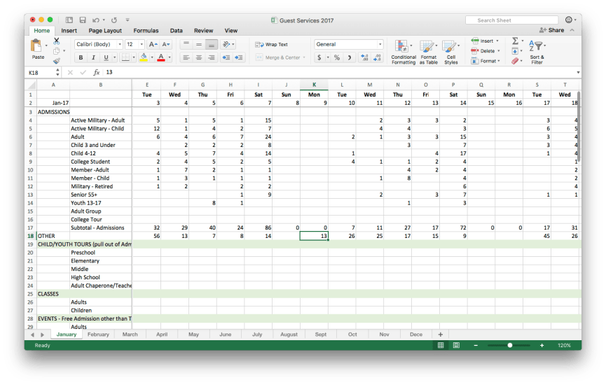
Download a copy of this spreadsheet and follow along!
This format makes it easy for the staff team to see the totals for each type of visitor at a glance for the whole month. To see performance over the year, or between years, an additional step is taken to transfer these counts into an additional spreadsheet that totals each visitor type across all the months. While this spreadsheet is perfectly fine for the reasons it was created, there are a few simple changes we can make that will help us when we want to analyze and visualize the data.
The Most Boring Article Ever Written

That’s right. Grab an extra cup of coffee. Switch to a firm chair and strap in because we’re going to talk about formatting your data! This might easily be the least interesting article you’ve read all week, but I hope that it might become one of the most useful. To go any further with our work to become a data startup, it’s essential that your data is formatted in a way that can be easily imported to whatever tool you’re using.
Tips for formatting data for easy analysis
Often, decisions we might make about spreadsheets to make them look pretty, print nicely or simply be easier for humans to use – might make it nearly impossible for a computer to understand. For this project, we’ll look at the Grace’s existing attendance spreadsheet and see if there are a few simple changes we might make to allow us to begin analyzing attendance in some new ways. First, a few general tips about data:
- Computers like rectangles: Try to make your data fit inside a neat and tidy rectangle. Formatting that adds spaces or indentation to your spreadsheet can make it more difficult to analyze your data after the fact.
- Make your rows and columns consistent: This is probably the most important tip in the list. It’s very important that each row has the same kind of data in it for the entire file. Likewise, each column should only store one kind of data straight from top to bottom. It’s totally acceptable to add more rows or more columns to your data file if you need more room for different kinds of data.
- Add Headers to the first row: If it’s not already there, add a row at the top of your data to hold header labels for each column. This will make it easy to read the data in and name each column correctly. Be certain that your data starts immediately after this header row. This might not look exactly how you like it for printing, but it will make your life easier for data analysis.
- Computers don’t care how long the file is: Sometimes we split our data up into separate tabs or files so that it’s easier to print or pay attention just to the part of the data we care about. While this isn’t a deal-breaker, it can add a little more work when you’re doing later analysis .
- Zero is different than Empty: An empty cell in your data can mean something different to a computer than a cell with zero. Empty cells are sometimes called NULL in computer lingo. NULL simply means that there is no value. In real-world terms for counting attendance, it might be most useful to record a zero if there was really no attendance. Leaving the cell empty might be more appropriate for days when the museum was closed altogether. Again, this is not a deal-breaker, but rather something we should pay attention to.
- Units and Scale: Make sure that all your data use the same units and scale. It may seem obvious, but make sure you choose the same scale (ones, thousands, millions) across any row or column. Also, when using dates, use the same format of the date text across the whole spreadsheet if possible. Typically, it’s easiest to specify dates in a standard format like MM-DD-YYYY, or something similar. If you’re working in Excel, it’s a good idea to format the cells for each row and column appropriately. (money as currency, percents as percents, dates as real dates, etc… )
Let’s get down to work
Now let’s apply some of these tips to the attendance spreadsheet from the Grace Museum and see what improvements we can make. If you want to download the original spreadsheet from the Grace (see the link above) and you can follow along with the steps below to try it out for yourself.
- The first two rows of the original spreadsheet hold the day of the week (Mon-Sun) and the day number in the month of January (1-31). Let’s reformat these into real dates and collapse them into just one row. (Tip: Excel has a nifty trick that if you format the first column as the date format you want “1/1/17”, you can select that cell and then drag the cell border around all the days in the month. Excel will automatically format them in the same way. Cool!)
- Let’s add headers to the first two columns of the spreadsheet. These are broadly the categories of admission to the Grace and the types of tickets available. We’ll name them as such. Note: This spreadsheet uses the rest of the columns as days of the month and the rows for categories and types. It would generally be easier to deal with if all the dates were held in their own column, but since this spreadsheet is populated by hand for some values – it’s much easier to edit this way. In later posts, I’ll show you how to pivot these rows and columns for data analysis.
- Remember – we need to tell the computer what each row and column represents every time. To do this, let’s repeat the name of the ticket category and ticket type in each row all the way down the sheet. This probably seems redundant as a human reader, but it tells the computer very clearly what data is contained in each row.
- Let’s collapse some of the white space between different categories as the computer doesn’t really know what to do with empty space. However, I recognize that this whitespace is there to make it easier for the team at the Grace to read and work with. To help, let’s add background colors (blue and green) to separate the different categories of attendance. The computer doesn’t care about the colors and it helps us humans follow the rows across the page.
- Totals and Subtotals – these are not really needed for data analysis purposes as we’ll be able to do math on the data very easily. However, a subtotal for ticketed admissions and a grand total for each day is really useful to the team. This is great and a good balance between a spreadsheet that computers can make sense of, but still has to be useful to the staff team as well. Later on – we’ll look at how to exclude these two totals from the rest of the calculations so that we don’t double count all our attendance!
Here is what the final spreadsheet looks like. With this work done we’re all set to begin some simple analysis and visualization.
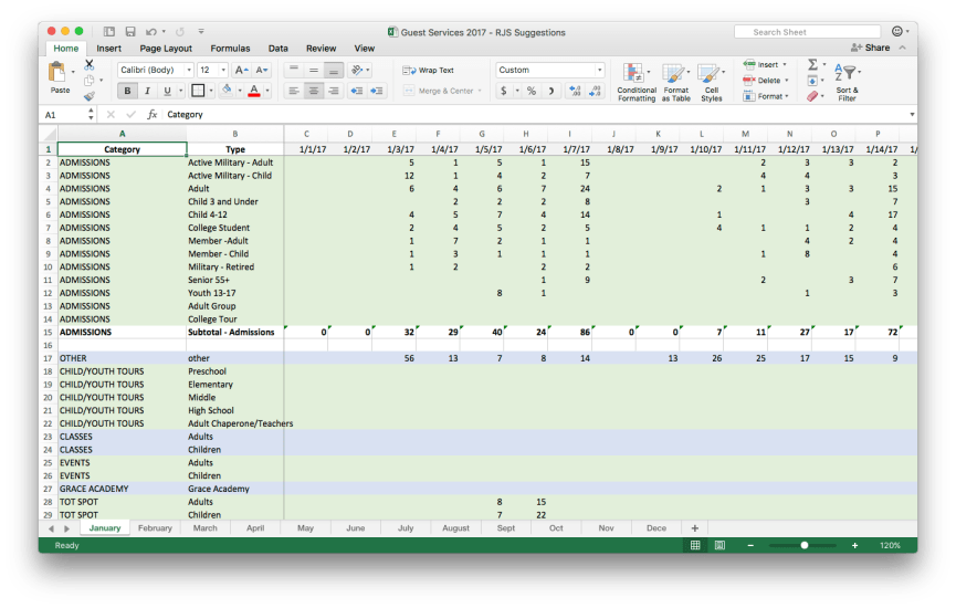
Download a version of this spreadsheet to follow along yourself!
A picture is worth a thousand words
Since many of you are probably familiar with Excel already, let’s just throw this data into a quick chart to take a fast look.
Step 1: Select all the daily totals from 1/1/17 through 1/31/17. (row 39; columns C –AG) be careful not to select the grand total in column AH while you’re at it!
Step 2: With the daily totals still selected, choose Insert->Chart->Columns from the Excel menus.
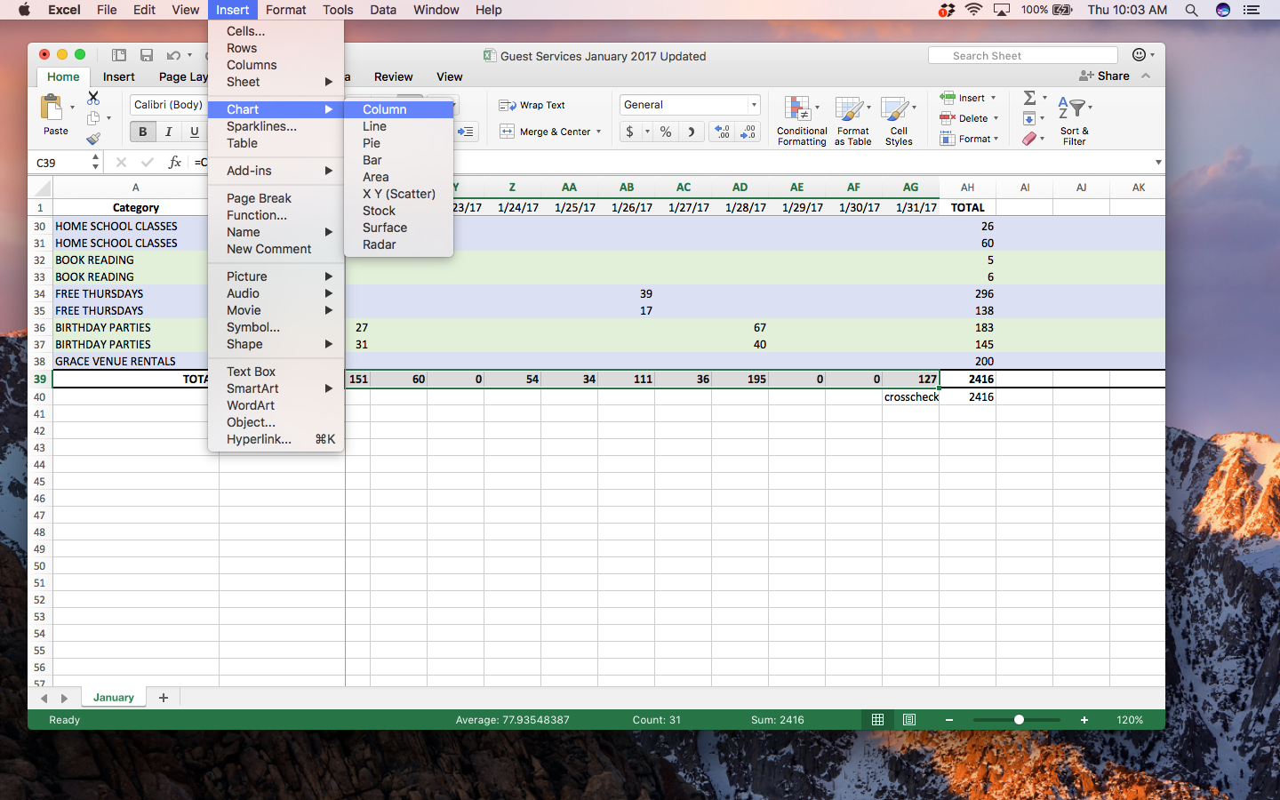
Step 3: While this gives you a preliminary chart of the daily totals, you’ll notice that it doesn’t have any dates or titles for the chart. To do this, right-click on the chart itself and choose the Select Data… menu.
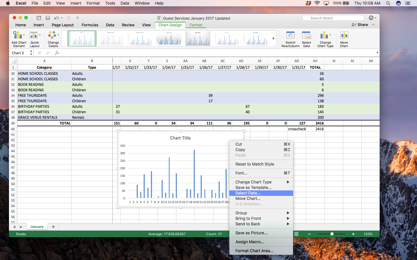
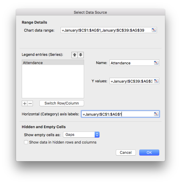
Step 4: Type “Attendance” into the Name field and select the dates from column 1 into the Horizontal (Category) axis labels. (Hint: use the small icon on the right side of this field for an easier way to select the dates)
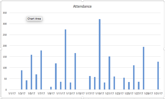
Voila!
Here’s what the finished chart in Excel looks like. Pretty simple at this point, but enough to give you a vision for how attendance varies in a weekly pattern. Notice the spikes in attendance that correspond to the Grace’s free Thursdays?
Next Steps
Excellent work! If you’ve made it this far, you’ve already accomplished a lot. This part of the task is by far the most manual and time-consuming. Talk to anyone who works with data on a regular basis and they’ll tell you that getting your data cleaned up and formatted correctly is always hard work – and always worth it!
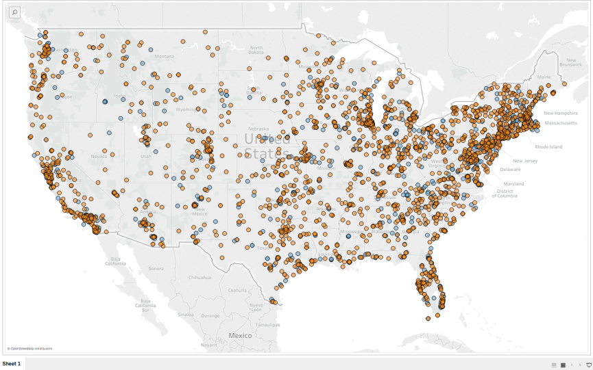
In our next post, we’ll actually cover a few different tools that you can begin using to explore your data with. We’ pick up where this post leaves off and will tackle some initial analysis and visualization in a way that can give us some good insights for using this data inside the museum. Here’s an image of some simple visualizations we’ll create step-by-step in the next post.

I’d be really interested in hearing from you as readers about the kinds of problems you’re working on in your museums and about techniques you’re interested in learning more about and exploring here on the blog. Feel free to add some thoughts to the comments below, or tweet me @rjstein.

Upcoming Events
-
Confessions from the Security Vault
Event Date:Presented by: Southeastern Museums Conference -
From Fragmentation to Alignment: Project Management in Museums
Event Date:Presented by: American Alliance of Museums -
Unlocking Your Site’s Membership Potential
Event Date:Presented by: American Association for State and Local History (AASLH) -
CEO Chat: Censorship
Event Date:Presented by: American Alliance of Museums


Good resource thank you!