This article originally appeared in the January/February 2019 issue of Museum magazine, a benefit of AAM membership. Click here to join!
The Museum of Contemporary Art Chicago has taken purposeful steps to improve accessibility—and has improved the visitor experience for everyone.
Accessibility in museums is a game of small ball. The term—borrowed from baseball—refers to the strategy of scoring runs by advancing around the diamond one base at a time, using base hits, sacrifice flies bunts and stolen bases. In small ball, a team does not wait for a home-run hitter to save the day; everyone on the team contributes.
Accessibility at museums is small ball—a patient, methodical game in which most gains are made without fanfare and major funding. It’s our strategy for improving accessibility at the Museum of Contemporary Art Chicago (MCA), and it is working.
An Intentional Commitment to Accessibility
Every month, the MCA’s volunteer accessibility task force meets to examine the museum’s accessibility efforts. The task force formed in 2015—the year of the 25th anniversary of the Americans with Disabilities Act—for a one-time audit of accessibility work around the building requested by the Chicago Community Trust. Colleagues from many departments, including visitor services, facilities, marketing, exhibitions, performance programs, design, and digital, shared what they were doing with respect to accessibility: each independently, usually with minimal funding, and almost always with little ado. Encouraged by the range and ambition of each other’s efforts, we decided to continue to meet. We have gathered every month since, adding members from our public programs, development, HR, security, store, and prep teams.
This unchartered group was never officially sanctioned by museum management, and task force participation is not listed on any MCA job description. But team members are proud of our reputation as one of the most productive and effective working groups at the museum. In three years, we have:
- developed a rolling three-year plan;
- written and published an accessibility values statement on our website;
- developed guidelines for exhibition planning, touch tours, and visual description;
- created regular, recurring schedules for accessible programs in our theater and galleries;
- incorporated accessibility training into our new staff onboarding; and
- offered lunchtime workshops on accessibility for staff
Some of our wins are small. When a wish list prepared during an early group exercise revealed that the visitor services and security staff working in exhibitions wanted to offer stools to visitors with mobility impairments seeking to rest, the learning team offered the keys to the docent closet, which has folding stools for gallery tours. Other wins are bigger: our performance team, led by former Curator of Performance Yolanda Cesta Cursach, rolled out a pioneering relaxed-performance program for our theater performances, which is being emulated by cultural organizations in Chicago and around the country. Relaxed performances are for people, with or without disabilities, who prefer some flexibility related to noise and movement in the theater. Stage lighting is less intense and theater lights are kept at a glow to facilitate patron movement. Volunteers, many of whom are members of the disabled community, are present to assist, and American Sign Language interpretation and audio description are provided.
A Truly Accessible Website
Another major win is our website, which is managed by Director of Digital Media Anna Chiaretta Lavatelli, along with members of the design, publishing, and new media departments. It launched in 2015, along with the museum’s new identity. The site showcases the museum’s exhibitions, programs, archives, and stories; its playful identity telegraphs the museum’s goal of extending a radical welcome to all. The digital team expressed this radical welcome by building a site that purposefully adheres to the best practices in accessible—or inclusive—design.
To build an accessible site from the ground up, we worked with Sina Bahram, one of the field’s top accessibility consultants. Something he once said stuck with us throughout the process: “I believe that there’s this commonly held myth that if something is accessible, it has to be ugly, it has to look like it’s from 1990, it has to be boring, it can’t be pretty or creative. We don’t want to perpetuate this myth, because it’s wrong and it ends up hurting everybody, from designers and developers to users.” By building accessibility into the site from the start, we avoided the inconvenient (and sometimes costly) retrofitting that discourages other museums from fixing accessibility problems on their sites.
The commitment to web accessibility also forced us to confront areas of our production practice that we might have otherwise overlooked. Our decision to caption and provide transcripts for all videos on the site made it easy to start captioning both online and in-gallery video. This was a good decision since many visitors use these videos instead of introductory panels for our exhibitions; they now draw crowds, sometimes forcing visitors to stand outside of speaker range.
Our efforts to create a site that adheres to best practices in accessible design—and that is also generous and experimental in its accommodations for visitors with vision, hearing, or cognitive impairment—led us to create Coyote, which is both an open-source software and a project to encourage the use of visual description in museum practice. Visual description of images and objects allows visitors who are blind or have low vision to “see” museum works. Without description, museum websites, with their heavy reliance on images to tell their stories, can be impenetrable to visitors who navigate websites through software programs that read text aloud.
More on Coyote
When Bahram first raised the possibility of describing the site’s images (numbering 10,000 then, 19,000 now), the task seemed daunting, even impossible. We puzzled over how we would write, edit, and vet the descriptions in addition to how we could automate the process of pulling images needing a description from our web content management system and pushing descriptions approved for publication to the website.
We also wanted to be able to store more than one description for any image to ensure that a multiplicity of voices could be collected and reflected. We studied existing software tools, and none were suitable for the task. So we decided—with about six months to site launch—to build our own, a process led by a team of developers supervised by Bahram.
That software, named Coyote after the protagonist of a Hopi Indian tale who wanted to see further than his own eyes would allow, has just gone through its second round of development. It does everything that Photo by Nathan Keay, © MCA Chicago we had originally hoped, and it is now a cloud-hosted tool, available to any museum that wants to incorporate image description into its practice with a relatively low bar to entry.
Coyote descriptions are written by staff from many departments at the MCA, all of whom volunteer their time as authors. At monthly description sprints, called “Donuts for Descriptions” (a local company that admires our work donates the donuts), curators, educators, publishing staff, retail workers, security guards, visitor service staff, interns, and colleagues from Chicago-area museums rub elbows, learn from each other, and write descriptions. Together, we have learned how to create effective and interesting descriptions, and we’ve discovered some poets hidden among us. One of our earliest descriptions, of the Kerry James Marshall painting Untitled (Painter) (2009) is still a favorite. Here is its beginning:

of Untitled (Painter) (2009) by Kerry James Marshall. The beginning of the
description is in the text at left.
This portrait depicts a young woman with jet black skin holding a long, thin paintbrush up to a colorful, messy painter’s palette. She is shown in a three-quarter pose, gazing directly at the viewer. Her face, which is central to the square composition, stands out against a large, white canvas to her right and almost blends into the pitch-black background to her left Closer inspection reveals, however, that her skin is subtly rendered, with various shades of contours and highlights.
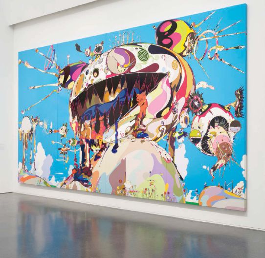
A more recent brief description written by Chief Curator Michael Darling uses colorful language to describe Tan Tan Bo Puking (2002) from the MCA’s recent Takashi Murakami retrospective.
A fantastical landscape features a giant, multi-colored homunculus sitting on top of a hill, its open mouth revealing jagged teeth and seeping fluids, while pustules explode from other parts of its ovoid head.
 As we began to share our descriptions with museum colleagues, patrons, and—most importantly—members of the disability community, we were continually asked why these descriptions were only available to people with screen readers. Our fans pointed out that the descriptions could be of interest to anyone who sometimes feels uneasy or confused in a museum. Heeding their advice, we developed a feature that allows any visitor to our website to “turn on” image descriptions. A simple toggle, underneath the site’s main left- and navigation, allows visitors to see the descriptions that have been written for website images.
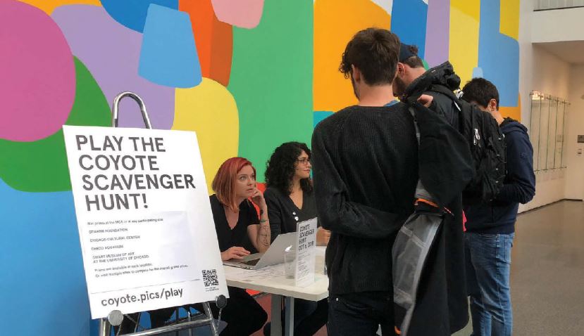
The descriptions have found a life beyond the web as well. A technology innovation grant from the John S. and James L. Knight Foundation in 2017 supported the Coyote project and our idea to use visual descriptions to create fun activities for sighted and unsighted visitors alike. Last summer, we held our first Coyote scavenger hunt. Using a mobile phone interface to the Coyote database, visitors participated in a game of visual hide-and-seek featuring descriptions of works at five Chicago-area cultural organizations.
Like many of the best projects, Coyote has taken us down unexpected paths while proving the hypothesis
of inclusive design: building something to be accessible to one person—in this case, someone who is blind—will most likely benefit everyone. And in creating a tool like Coyote, enhancing our website with a unique accessibility feature, and reaching out to new communities, we’ve seen a project that began its life in the museum’s technology space cross into new disciplines—education, community outreach, visitor services, disability advocacy, and more.
Throughout it all, we have used a small ball approach—patient, disciplined, and determined—to round the bases and record a win for our digital team, accessibility task force, and the MCA and its visitors. We won’t say no if a home-run hitter—a major funder—asks to join the team, but we’ll persist even if that doesn’t happen.
And we’re excited, most of all, to join colleagues from other cultural organizations in offering a radical welcome, online and on-site, to visitors with disabilities, sending the message that museums genuinely are for everyone.
Resources
Using Coyote to Describe the World by Sina Bahram, Susan Chun, and Anna Lavatelli mw18.mwconf.org/paper/using-coyote-to-describe-the-world
Inclusive Design: From Approach to Execution by Bruce Wyman, Corey Timpson, Scott Gillam, and Sina Bahram
mw2016.museumsandtheweb.com/paper/inclusive-design-from-approach-to-execution/
“7 Things Every Designer Needs to Know about Accessibility” by Jesse Hausler medium.com/salesforce-ux/7-thingsevery-designer-needs-to-know-aboutaccessibility-64f105f0881b
“Which Are More Legible: Serif or Sans Serif Typefaces?” by Alex Poole alexpoole.info/blog/which-are-more-legible-
serif-or-sans-serif-typefaces
Upcoming Events
-
Planning and Budgeting for Fundraising Success – OMA Webinar
Event Date:Presented by: Ohio Museums Association -
AASLH History Hour: Civic Practice
Event Date:Presented by: American Association for State and Local History (AASLH) -
What It’s Like to Participate in Museums Advocacy Day
Event Date:Presented by: American Alliance of Museums -
From Idea to Acceptance: How to Submit a Winning Annual Meeting Session Proposal
Event Date:Presented by: American Alliance of Museums