Clare Regan is the Audience Insight Analyst at the Minneapolis Institute of Art (Mia). This is the second article in a series we are presenting on how Mia has expanded its audience.

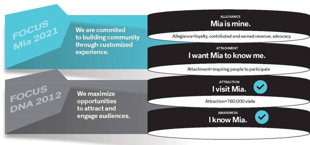
Last month, the Minneapolis Institute of Art (Mia) talked about our new strategy for long-term sustainability. A key component of that strategy is personalization, the use of data and metrics to create an experience tailored especially for an individual visitor.
Personalization is not a new concept. It’s what happens when you go to the café on the corner, and the server calls you by name, remembers how you like your burger cooked, and then recommends the special dessert because he knows key lime is your favorite. But because of the power and depth of data, consumers now look for this type of experience at all levels, from all outlets. And organizations—including museums—are expected to provide it.
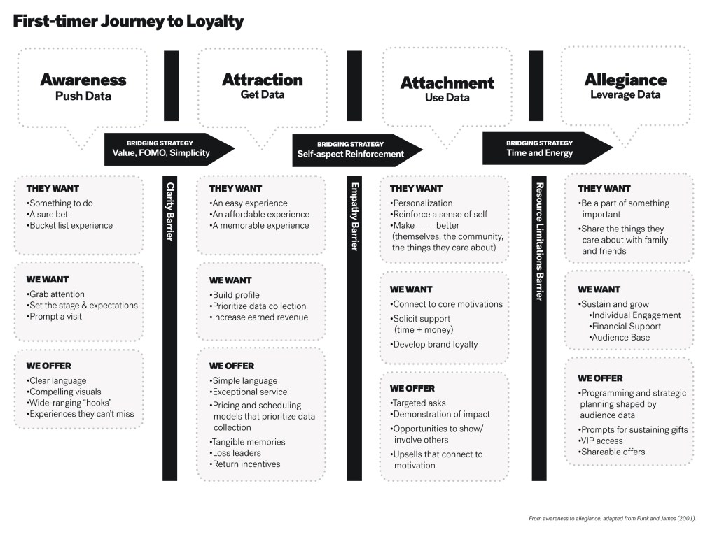
So Mia made data a priority. Our first step was audience segmentation. We looked at our roadmap of the audience journey—which we created based on the Daniel C. Funk and Jeff James study on guiding consumers from awareness to allegiance—with the understanding that visitors cannot be lumped into one generic category. They have different needs, different motivating factors, and different expectations, and in order to move them toward allegiance, we have to understand how best to fulfill what they’re looking for.
In order to form our audience segments, we asked ourselves two basic yet very powerful questions: Who is coming to Mia? Why?

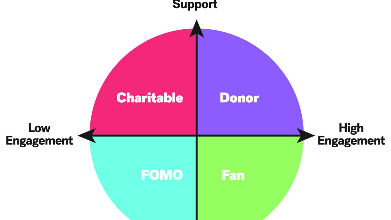
Based on our findings, we divided our audience into four categories.
FOMO, or “Fear of Missing Out”: Characterized by low engagement and low philanthropy support, these are people who come to the museum very rarely or just once. They typically come to Mia to see something they feel is a once-in-a-lifetime experience (for example, “At Home with Monsters,” our recent exhibition highlighting filmmaker Guillermo del Toro’s creative process) or to participate in something like our Third Thursday happy hour-style event because all of their friends are going and they don’t want to miss out on a fun night.
Fan: This high engagement, low philanthropy supporter visits Mia often, but doesn’t provide very much financial support to the museum. They might be free or contributing members, or might not be a member at all, but they are regularly coming to exhibitions and events.
Charitable: Marked by low engagement and high philanthropy, this group supports the museum financially at a high level, but does not typically come to exhibitions or participate in events. This may be because Mia is one of many organizations they support, or they simply don’t have time to visit the museum as much as they’d like.
Donor: Donors offer high engagement and high philanthropy. They are similar to Fans in their enthusiasm for exhibitions and programming, but they also support Mia at a high financial level.
It’s apparent that each of these audiences has very different priorities and therefore must be approached in different ways. The FOMO visitor may not go to the same event as the Donor, just as Fans would likely not receive the same e-mail communication as the Charitable group. To address these varied needs while still focusing on our goal of moving these audience segments toward allegiance and long-term loyalty, we asked the following:
- What does each segment need, and what are they receptive to at each stage?
- How can we meet those needs in a way that builds towards a goal of long-term loyalty?
- Where are our biggest opportunities?
Looking at our different audience segments, we created a process that compares what a visitor wants to what we want, and then comes up with what we can offer our guest to meet his or her needs based on where he or she is in the audience journey.
To execute this strategy, Mia built its own in-house analytics team, developing four new roles over the past year. I’m proud to say I’m part of this new team, and our goal is to lead the museum into being data-driven and in line with current and best practices when it comes to audience research, analytics, and digital marketing. The team crosses multiple divisions and departments, and our roles work together to gather, clean and organize, analyze, and use data.
Since the formation of this team, we’ve made strides toward centralizing our data, analytics, and marketing efforts in Salesforce, we’ve begun building a new ticketing system that will allow us to better track purchasing habits and conversions, and we’ve developed reporting practices that encourage everyone at Mia to use data in everyday decision making.
In addition, Mia has looked to outside expertise to help us plan for the future. In 2016 we formed a collaboration with global management consulting firm McKinsey & Company to accelerate Mia’s analytics capabilities for a more systematic audience segmentation and communications program. The project started as a way to understand our membership, following the creation of our free level of membership, and how membership can be used to understand purchase patterns.
The partnership has since evolved, and McKinsey is now helping us build a long-term data strategy, including segmenting our audience into microclusters and sending these segments on highly personalized journeys.
We’re very excited about the strides we’ve made in data analysis, audience segmentation, and personalization. Next month, we’ll share recent results and lessons learned.
About the Author
Clare Regan is a data analyst in the Audience Engagement division. She plays a key role in analyzing visitor behavior and drawing data insights for the museum and is an emerging museum professional.
Upcoming Events
-
CEO Chat: Censorship
Event Date:Presented by: American Alliance of Museums -
Makerspaces for Museums and Historic Sites
Event Date:Presented by: American Association for State and Local History (AASLH) -
Planning and Budgeting for Fundraising Success – OMA Webinar
Event Date:Presented by: Ohio Museums Association -
AASLH History Hour: Civic Practice
Event Date:Presented by: American Association for State and Local History (AASLH)


Terrific post, Clare! It’s fascinating to see how this plays out at Mia. We’re doing similar work with about 1/10th the number of visitors in Santa Cruz at the MAH. I love seeing your journey maps and thinking about how this work scales to institutions of different sizes and mission statements.
One thing I’m curious about: why is “allegiance” the highest level of engagement? It seems to me that if you are working to “build community,” then allegiance to an institution is a penultimate level rather than the ultimate goal. Allegiance is institution-centric. While it’s awesome to feel a sense of ownership of Mia, is there a next level of community building that that allegiance makes possible – like “connection” or “empowerment” or “strengthening the community”? Perhaps that’s for the next iteration post-2021…
Hi, Nina. Thanks for bringing up an important point.
One of the first conversations we had around loyalty was that it has to go both ways. It’s not all about the visitor’s loyalty to an organization, but also the organization’s loyalty to the community. It’s the exchange of value (and values) between the two.
We pulled the terminology for the audience journey, including the word “allegiance”, from the Funk & James study. It was originally used in the context of sports, the allegiance of fans to teams. We don’t love the word, but it makes more sense in its original context.
The flow chart from awareness to allegiance is a (perhaps imperfect) step to visualize and talk about our engagement work. It’s an iterative tool and will grow and change as we learn more and personalize it further.
Amazing article! We’d love to have more information to see how we can build these engagement models within the Veevart platform!