It’s time again for our next installment of Becoming a Data Startup! For those of you who read along in our last post, you learned some simple tips and tricks for formatting your data that I promised would make things easier for analysis and visualization. This week’s post will take advantage of the work you did to venture into the world of Business Intelligence tools to take some simple next steps in analyzing your data.
Like I said in the last post, this series will be focused on real data from real museums. We met the team from the Grace Museum in Abilene, TX in our last post and used their attendance spreadsheets as an example to get started. Since that time, the team at the Grace has gone back and reformatted their legacy attendance spreadsheets from 2014 with the changes we discussed.
To save you the time of doing so yourself, we’re providing that data for you to download here:
- Daily Attendance Log 2014 (*.xlsx 59KB)
- Daily Attendance Log 2015 (*.xlsx 80KB)
- Daily Attendance Log 2016 (*.xlsx 95KB)
You’ll want to download and save these for later in the post.
Tools for Visualization and Analysis
As you continue down the road to becoming a Data Startup, you’re going to need some tools to help out along the way. Good news is that many of these tools have become easier to use and more cost efficient in the last several years. It’s no longer necessary to know the ins and outs of software development to explore and create compelling visualizations and statistics.
Don’t be confused by many of the marketing names for these kinds of tools. You may hear terms like Business Intelligence, Analytics Frameworks, Dashboarding, or Visualization tools. In short, each of these tools will help you interpret, transform, and display your data in ways that reveal patterns, or comparisons that are difficult to see just from the numbers. It’s not unique to this field, but I think that Museum people are often very visual thinkers by default, so these techniques are often really helpful in communicating about data to your peers across the museum.
The following are a list of a few tools you might want to check out as you continue your journey into Becoming a Data Startup:
- PowerBI – is a business intelligence tool from Microsoft that (obviously) integrates very well with Excel data and the Microsoft product suite. If you find that most of your data exists inside Microsoft databases and spreadsheets, this will be a tool that you want to give some time to. Note: There is currently not a version of the software available for Macs, so if you’re a Mac person like me, you’ll need to look elsewhere.
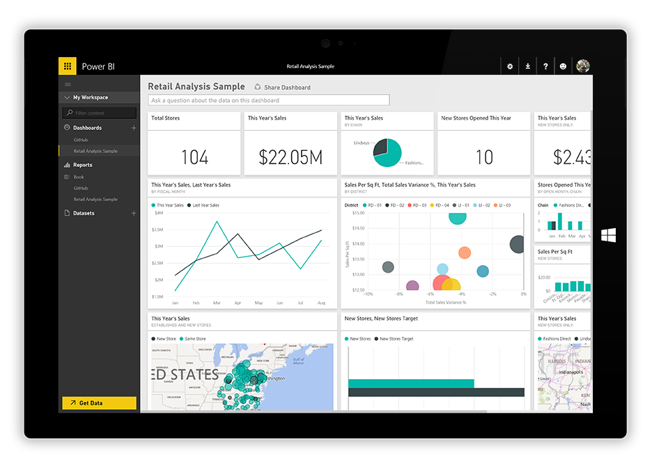
Screenshot of a PowerBI Dashboard - Qlik and Tableau are two different products that fall into a category of drag-and-drop visualization and analytics. The two are comparable in that their features allow you to find some no-cost ways to get started learning and exploring their platform and also enterprise-wide solutions that could allow you to grow both the size of data you work with and the ways that your internal team uses that data. Both make it fairly easy to create business dashboards and more narrative data stories that can help explain a complicated analysis.
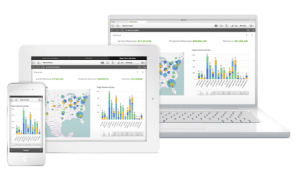
Qlik Sense Analytics across device displays 
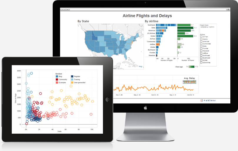
Tableau Desktop visualization tools - Dexibit – in the museum space there are a few firms that are focusing on data and analysis specific to our field. The most notable of these is a New Zealand based firm called Dexibit. Dexibit’s product seeks to help museum integrate data from across many sources into the platform to create data-driven insights that lead to better and more agile decision-making. (note: While I receive no compensation, I do serve on the board of directors for Dexibit.)
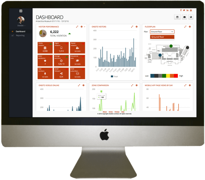
Dexibit’s Dashboard Analytics for Museums
For the purposes of this series, we are going to focus our work inside of Tableau. This is a tool that I’ve used extensively in my prior work at the Indianapolis Museum of Art and the Dallas Museum of Art. It’s also part of the tool suite that the Art Institute of Chicago uses as a part of their work documented in The Power of Applied Data.
Tableau offers a free public version of their tools for bloggers, students, and the rest of us who are working with free and open data. In addition, for those of you working at non-profit organizations with small budgets (< $5M), the Tableau Foundation has a program available that provides donated licenses for small organizations.
Let’s Get Started!
Enough with the introductory comments, let’s roll up our sleeves and get started on some real work as we become data startups together.
STEP 1: Be sure that you have a copy of Tableau downloaded and installed on your computer. Versions of Tableau Public are available for Mac and Windows PC’s from this link. You’ll need to create an account there and anything you save will need to be stored on Tableau Public’s servers.
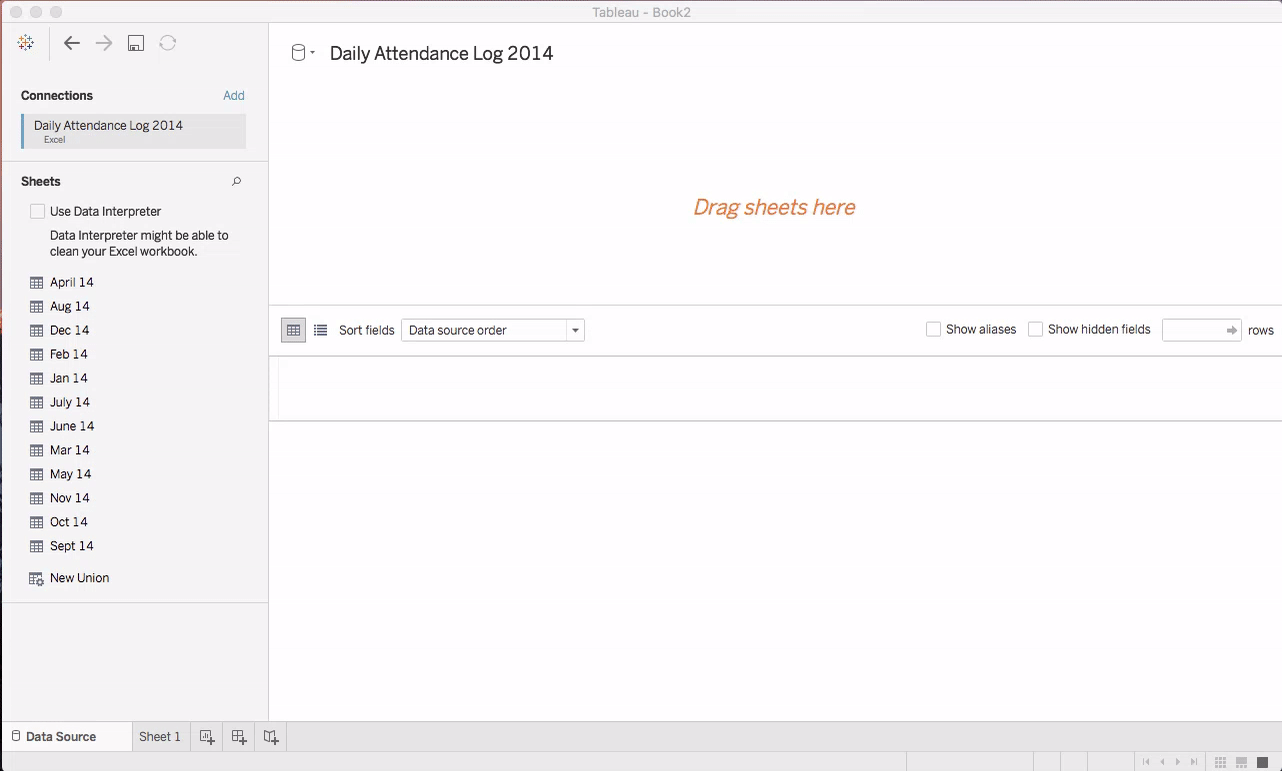
STEP 2: Open Tableau and open the excel spreadsheet you downloaded earlier in the article. Select Connect to a File… -> Excel -> Daily Attendance Log 2014.xslx.
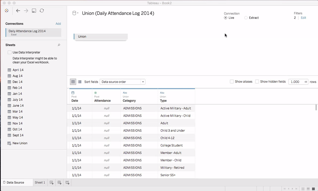
STEP 3: Once this data finishes opening in Tableau, you’ll notice that each tab of the spreadsheet appears on the left-hand side of the window. In many cases, your data will be contained in just one of these tabs which you can drag into the data pane at the top of the window.
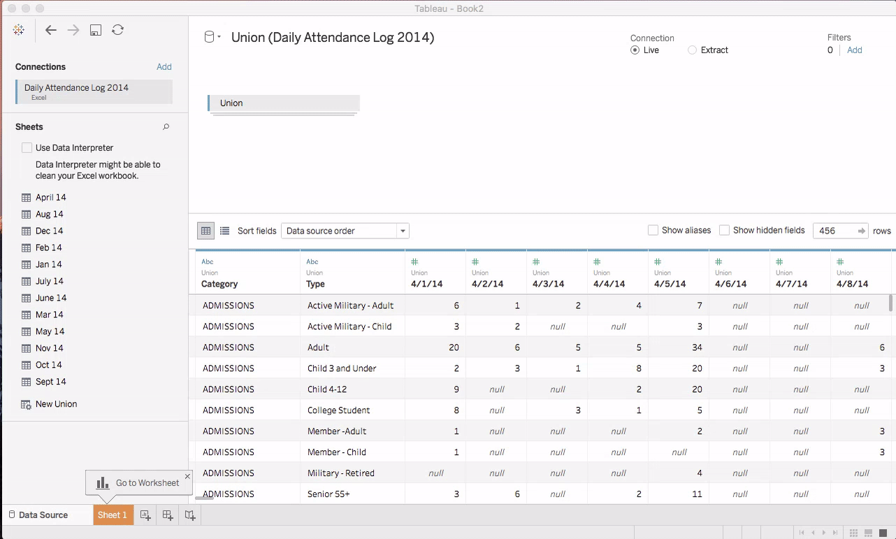
Because our data has one month’s worth of attendance in each tab of the spreadsheet, we’d like to combine these tabs into one big chunk of data. To do this, Tableau allows us to create a Union of all the tabs of data. In technical terminology, a union is simply the combination of two sets of things into one. It’s as if we’ve dumped two buckets of water together into one bigger bucket.
To do this, first drag the New Union widget from the left panel onto the data panel at the top where it says “Drag sheets here”. This will open a dialog box for creating the union. Select the option to define a Specific (manual) union of worksheets and select and drag all the months from the left-hand panel into the dialog box as shown above. You should notice that 12 tables have been added to the union. Click OK and wait a few seconds for the data to appear.
You’ll notice that each day of data appears in the bottom half of the window. Note that you can scroll this window from side-to-side. Because a whole year of data is included here, the window is VERY wide! We’ll deal with this next.
STEP 4: Remember in our first article when we chose to keep the attendance for each date as its own column rather than listing all the dates in a single column? This makes for an easier spreadsheet for humans to use, but as we import this spreadsheet into Tableau, we need to do a little work.
For our purposes, we want to be able to treat daily attendance data as a Time Series. Time series data is simply a sequence of repeated measurements (like attendance) that takes place at known time intervals. You’ll also be familiar with this concept from the morning weather report. The temperature at 6 am is 25 degrees, it’s 30 degrees at noon and 35 degrees at 4 pm. This is also a time series of the temperature changes today.
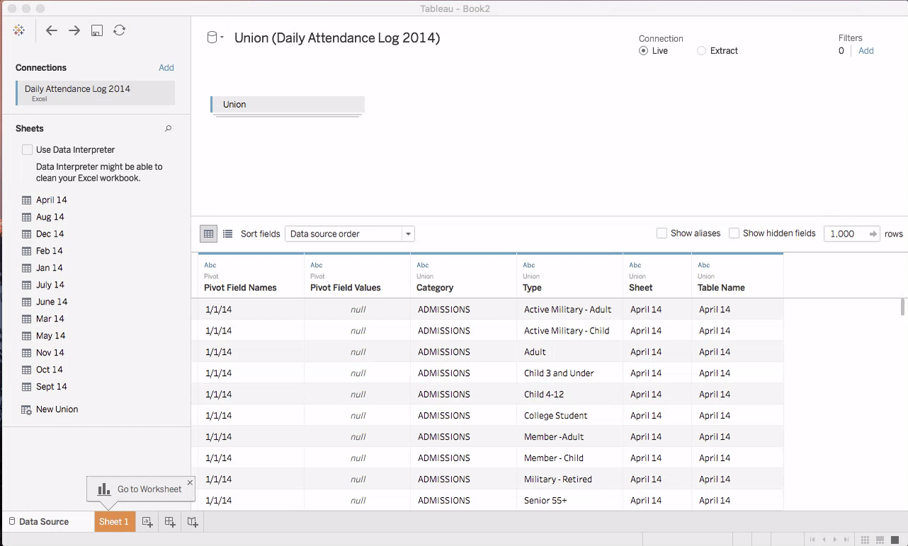
In Tableau, we need to Pivot our time series attendance data from being stored in columns to being stored in one column with many rows. In Excel, you can also make a similar transformation by using a PivotTable.
To complete this pivot of data in Tableau, select the first data column in the data window as shown above and scroll all the way to the right selecting all the remaining date columns. Once the selection is made, right click, or choose the small carrot menu from the upper right-hand corner of the data column. In this menu select pivot. You may need to wait a few seconds for Tableau to complete the pivot. When it finishes, you’ll notice that all your data has been rotated into two new columns Pivot Field Values and Pivot Field Names. We’ll deal with cleaning up these things and a few other details next.
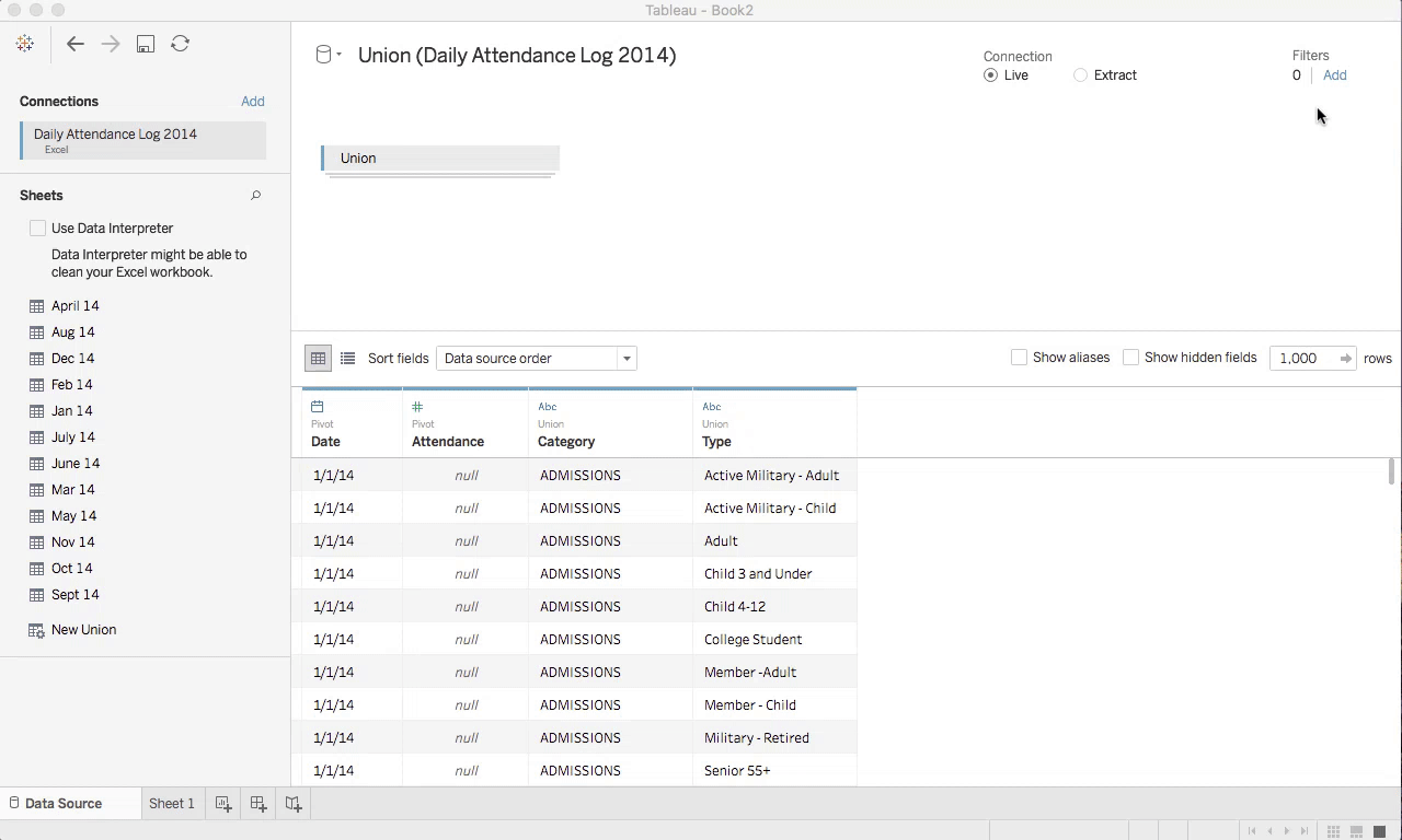
STEP 5: After completing the data import and successfully pivoting our time series data, we have just a few housekeeping things to do moving forward. Let’s rename the columns of data that were created as a result of our pivot in the previous step.
To do this, simply click on the carrot menu in the upper right corner of each column and select Rename. Let’s rename the Pivot Field Name column to Date and the Pivot Field Values column to Attendance.
You’ll notice that our import process also created two columns that aren’t terribly useful. Let’s hide them and get them out of the way for the moment. Click on the right-hand carrot and select Hide to get rid of the columns named Sheet and Table Name.
Finally, notice that in the upper left-hand corner of the data column, there is a small icon that says “Abc”. This is telling us that Tableau thinks this field represents some text data, but in reality these are the dates from our time series data for attendance. Let’s correct that now. Click on the Abc icon in the Date column and change the data type to Date. Later on we’ll also see how we can change the data type of Attendance into a whole number instead of another text field.
STEP 6: As you become more accustomed to working with many different kinds of data that you encounter at your museum, you will frequently find that you don’t really need to import ALL of the data from every spreadsheet. In fact, many times you may only need one or two columns from a dataset to complete the kind of analysis you’re interested in. That’s true for this case as well. There are some extra fields, spaces, and subtotals that were added for readability sake that can now be removed for our analysis.
First, find the Filters section of the Tableau Data Source page in the upper right hand of the display. Click on the link to add some new filters. Next, click the add button and choose the Type field. This will present you with a list of all the types of data that are contained in your spreadsheet. For our purposes, we want to eliminate any subtotals from our data since they will be easy to calculate after the fact. Check the Exclude check-box and scroll down to select Subtotal – Admissions from the list. Let’s also exclude any NULL data as well. NULL fields can sometimes be introduced into the data import by extra spaces and formatting of the spreadsheet. This is an easy way to eliminate those artifacts.
STEP 7: OK – we’re getting close to the end of our data import! Tableau does a remarkable job of retaining all these changes that we’ve made so far and accelerating the speed by which the data can be used for visualization and analysis. One of the ways that it does this is to compress all the data into an Extract that stores just the data you’ve selected in a very efficient way.
Making an extract of the data in Tableau is really easy. Simply click the Extract radio button in the upper right-hand corner and then click the Sheet 1 tab at the bottom of the window to leave the data source configuration screen. Choose a location to save the resulting file when prompted and press Save and wait for a short time for the extract to be created. The time it takes to create this extract can obviously vary depending upon how much data you’re working with and whether you are accessing the data from a file, or over the internet in some fashion.
Beginning the Visualization
Here is the final visualization we’re going to make for starters. You’ll notice this is not anything terribly sophisticated, but it’s interactive, features the basic concepts you’ll need for much more complicated visualizations later on, and YOU’LL MAKE IT YOURSELF!
DIMENSIONS AND MEASURES: In Tableau and in many other business intelligence tools data is automatically categorized for you. Tableau uses the concepts of Dimensions and Measures to tell the difference between categorical and numerical information. Dimensions represent categorical information like the make and model of a car or the kinds of fruit that are found in the produce section. Measures in tableau represent numerical data or data that exist on a scale. Think about the temperature at the beach or the price of gas.
DISCRETE OR CONTINUOUS: This is especially true for Measures (numerical data), but data can either be discrete or continuous. Continuous data exists on a scale, while discrete data can be thought of as being described by headers or chunks. When you’re using Tableau, you may choose to represent your data as either discrete or continuous depending on the kind of visual representation you want to create. If you’d like to graph a line chart of your attendance, you will want to represent your attendance as a continuous value, while if you’d like to see a pricing table for financial reporting, you will want to represent those number as discrete.
STEP 8: You’ll notice that after you’ve imported your data that Tableau is still interpreting the Attendance counts as a piece of text. Following our description of Dimensions and Measures, you’ll also notice that Tableau thinks this data is categorical and not numerical. Let’s correct these few things to prepare for creating some simple graphs.
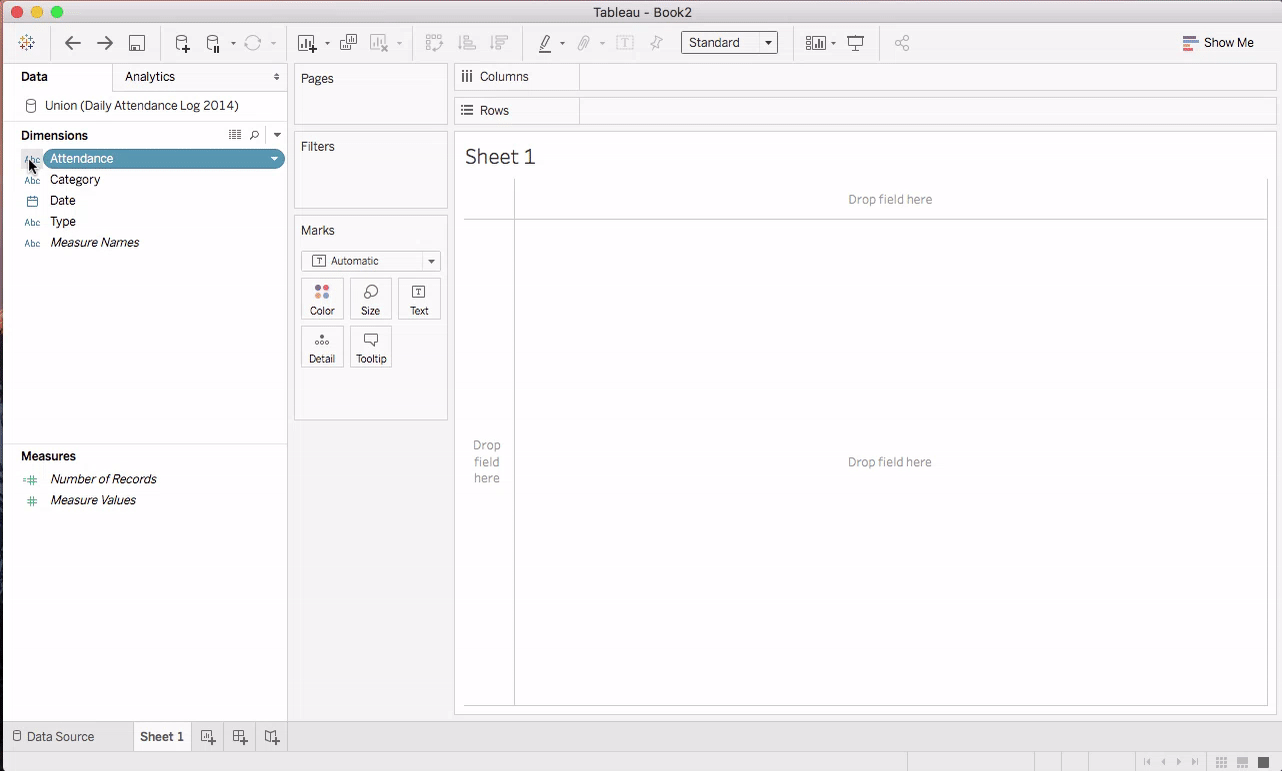
First, click on the Abc icon next to the Attendance field on the data shelf. Since this field counts the attendance of people entering the museum, it represents a whole number count. Select Number (whole) from the drop down. Next, since we want to graph this as a line chart, we need to convert the Attendance data to a continuous field instead of discrete. Right-click on Attendance or use the small down arrow button to then select Convert to Continuous menu option. Finally, since this data represents a numerical value and not a categorical value, let’s convert our attendance to a Measure. Right-click on Attendance and choose the Convert to Measure menu option from the drop down. You’ll see the Attendance field move down to the section listing Measures.
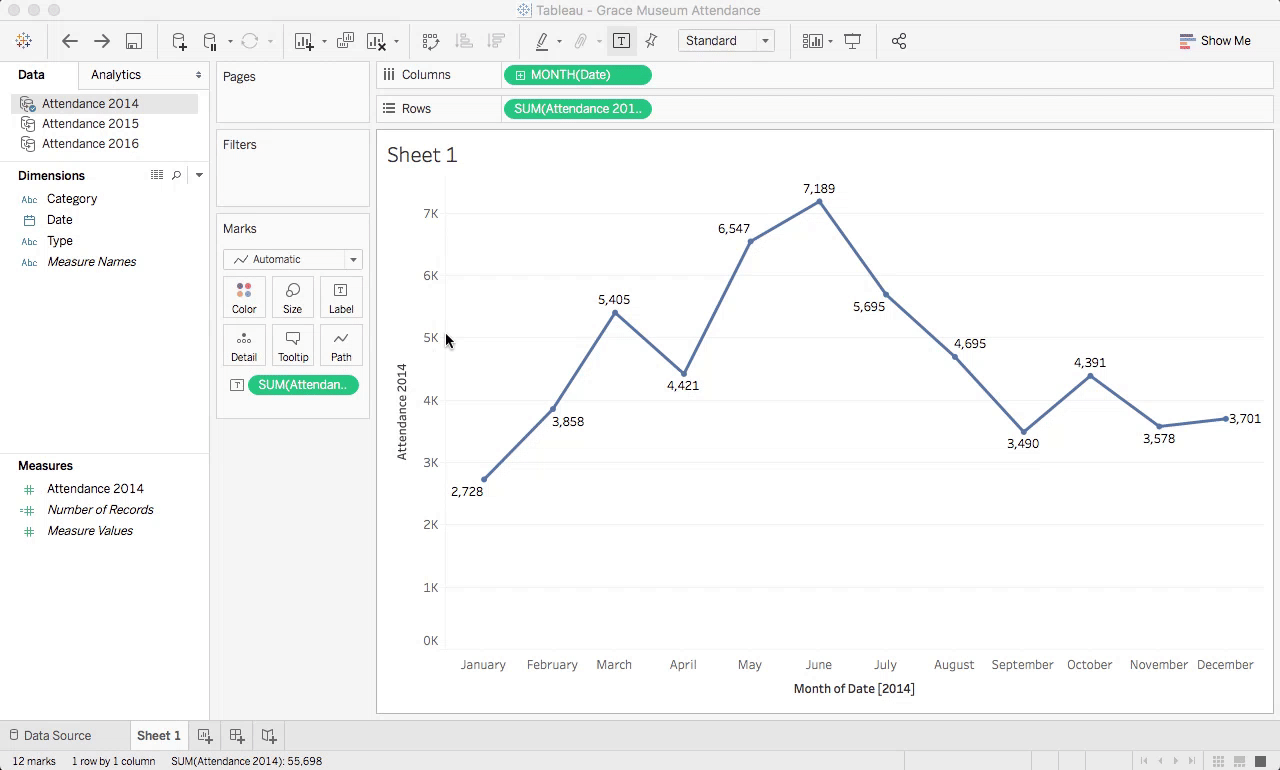
STEP 9: Now for the fun part! Let’s make a graph. You’ve done all the hard work of preparing the data and the rest is really quite easy.
First, let’s add the Date dimension to the worksheet by dragging it to the Columns Shelf as shown in the animation above. This will default the dates to be represented by Year, but this can easily be changed by right-clicking the blue pill that says Year(Date). Simply select the date format for Month to expand the chart to show the months of the year.
Next, let’s add the monthly attendance to the graph by dragging the Attendance measure from the data shelf onto the worksheet for Rows. This will have the immediate effect of drawing a simple line chart of the attendance from each month. Remember – in the earlier step, we chose to represent Attendance as a continuous numeric value – therefore we can see the data as a continuous line chart.
You’ll also notice that when you dragged the attendance data to the rows shelf, Tableau chose to calculate attendance as the SUM(Attendance). This means that tableau is taking all the values that occur in the dataset for the month of January and adding them together to get the number represented on the chart. This is called an aggregation and Tableau’s default to SUM() everything together. If you wanted instead to know the average daily attendance for the month of January, you could simply right-click on the SUM(Attendance) pill and choose Measure -> Average. You’ll see the y-axis of the chart change and you’ll see the average for each month when you hover over the line.
Finally, let’s add some simple labeling to the graph for clarity’s sake. Grab the Attendance measure from the data shelf again, but this time, let’s drop it onto the Marks Shelf where it says Label as shown above. This will immediately add a numeric label at each point in the line chart representing the attendance that month. If you’d like to change some of the options about how the labels are drawn, simple click on the Label button on the Marks shelf again.

MOAR DATA!!!
Now that celebration dances have been performed, we can give ourselves a good pat on the back, but let’s not get too carried away. We’ve done a lot of work and simply replicated a chart that we created a very similar version of in part one of this series. What we really need is the ability to look and study our data across years and from various perspectives. This requires a few different techniques that we’ll move into next.
Remember that at the beginning of this post, there are some download links to the full attendance data from the Grace Museum from 2014 through 2016. THANK YOU GRACE MUSEUM! If you’ve downloaded those, you can repeat steps 1-8 for each file to prepare those data for analysis. To add new datasets like this to the workbook you’re creating, simply choose Data->New Data Source from the Tableau menus and connect again to the other Excel documents from earlier in the post.
OR, if you’re lazy like me – you can simply download the following packaged workbook that I created for you that has all that work already completed! Simply save it into your working directory under a different name and then double-click to open it in Tableau
https://public.tableau.com/workbooks/GraceMuseumAttendance.twb
DATA BLENDING: When you have data from more than one source, Tableau makes it easy to mix and match these data sets together so that you can compare and contrast what’s happening across different data sources. This is true for data coming from a few different files and formats as well as when you might want to mix live data from a database or the internet with static or legacy data from Excel spreadsheets. This is phenomenally handy and we’ll get into some clever ways to use data blending in future posts in this series.
As it stands right now, your workbook contains three very similar datasets representing the Grace Museum’s attendance data from 2014, 2105, and 2016. In earlier work, the team at the Grace has formatted these all together and we’ve not imported them all into tableau.
In the upper-left hand corner of the data shelf, you’ll see a listing of our data sources as shown below. If you click on Attendance 2015 you’ll see a list of fields represented in that dataset.
Notice that we still have Category, Date, and Type as we did when we imported the 2014 attendance data. However, notice this time that there is a red chainlink icon next to the Date field and two broken chain link icons next to Category and Type. Also, notice that the Attendance 2014 dataset has a small blue check mark.
One of the great things about Tableau is that when you add more than one data source to a worksheet, Tableau attempts to find ways to automatically blend those datasets together. In this case, the blue check mark next to Attendance 2014 signifies that Tableau is treating this dataset as the base for a data blend to other datasets. The red chain link next to the Date field in Attendance 2015 means that Tableau has identified Date as a way to join the datasets together. PERFECT! That’s exactly what we want. If you click into Attendance 2016, you’ll notice that the Date field there is also linked.
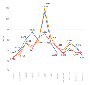
STEP 10: Blending data across datasets like this will make it easy for us to make visualizations that use data from each spreadsheet together in one big view. Let’s do just a few more steps and pull data from 2015 and 2016 into our chart so that we can compare how the Grace Museum’s attendance has changed over the past several years.
First, let’s rename some of the Attendance fields from each dataset so that we can tell the difference between them once we add them all to the same graph. For each dataset, click on the name of the dataset (i.e. Attendance 20XX) and then right-click on the Attendance field from the measures shelf. You’ll see an option to rename that field. Choose it and simply add the year to the name of the field (i.e. Attendance becomes Attendance 2014)
Next, we need to change the way we are displaying the Date because we’re adding more than just 2014 to our graph. Right-click on the Month(Date) pill from the columns shelf and choose the Month value that doesn’t include the year. This will mean that data representing the month of May from every year will be displayed in the same column.
Once that is changed we can select the Attendance 2015 field from the 2015 dataset and drag it onto the y-axis of the graph. When you do this, you’ll notice that Tableau detects that you are adding another axis to the dataset. This is displayed as a double green axis icon. Drop the Attendance 2015 field here and you’ll see that 2015 numbers are added to the chart.
Something else that happened when we did this, was that Tableau added a new shelf to the screen called a Measure Values shelf. You can find this just to the left of the graphs and just below the Marks shelf. You’ll see that the SUM(Attendance 2014) and SUM(Attendance 2015) are both contained here now. To add 2016 data to the graph, simply select the Attendance 2016 field from the left and drag it onto the Measure Values shelf.
Finally, we need to fix the labels for attendance at each point. You might notice that some of the attendance numbers seem to be labeled wrong on the 2015 and 2016 lines. Let’s do the following. Click back to the primary dataset – in this case, Attendance 2014. Once there, you’ll notice a measure called Measure Values. This is a special measure in Tableau that represents all the measures from a particular dataset. For our purposes, we simply need to drag the Measure Values pill to the labels button on the Marks shelf. Once we do this, all that’s left is to remove the original labels from the graph. You’ll notice SUM(Attendance 2014) on the Marks shelf with a small “T” icon next to it. Simply drag it off of the marks shelf as shown above. VOILA! You’re finished!
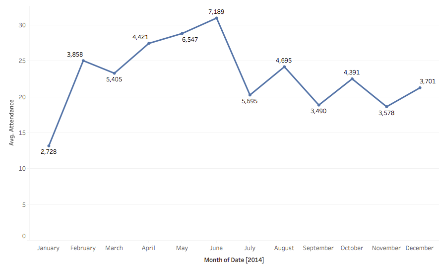
Here’s the completed chart showing monthly attendance at the Grace Museum from 2014-2016. Great work!

Upcoming Events
-
CEO Chat: Censorship
Event Date:Presented by: American Alliance of Museums -
Makerspaces for Museums and Historic Sites
Event Date:Presented by: American Association for State and Local History (AASLH) -
Planning and Budgeting for Fundraising Success – OMA Webinar
Event Date:Presented by: Ohio Museums Association -
AASLH History Hour: Civic Practice
Event Date:Presented by: American Association for State and Local History (AASLH)