Greetings to all you budding data startups! Thanks for checking out this next installment in our series. In this post, we’ll finally be getting some of the ways that we can build data learning cycles and goals that you and your team can work towards each week. For those of you who missed the earlier posts, you can catch up easily by giving them a quick read.
- Becoming a Data Startup Part I – In this post, we looked at what it might take for any organization to become data-driven and met the Grace Museum in Abilene, TX who is providing their attendance data for us to work on throughout this series. We learned some basics about how to structure and collect data that are simple, free, and easy.
- Becoming a Data Startup Part II – In our last post, we explored several tools that museums can use to do data analysis so that we really understand what’s going on inside our data. We focused on one tool in particular called Tableau and how anyone can use it to import and graph your attendance data.
In this post, I want to focus more on goals – how we set them and how we can make it easy and compelling for our museum team to monitor them and learn about our performance together. This is a topic that I presented on at AAM’s recent Annual Meeting in St. Louis. In case you missed that session, or couldn’t attend the conference – I thought I’d embed my slides to that talk here. At the end of the talk, you’ll notice some graphs and charts that look suspiciously like they came from Tableau. Today, I’m going to show you how to begin making something similar.
[slideshare id=76136226&doc=digitalmuseumplanningrstein-170519185101&w=500]
To make it easy for you – I’ve exported a packaged workbook from Tableau that has all the data files already loaded and cleaned up so that we can move ahead quickly.
Download this workbook and open it in Tableau (reminder, Tableau public is free for personal use and small non-profits can apply to the Tableau Foundation for free software licenses)

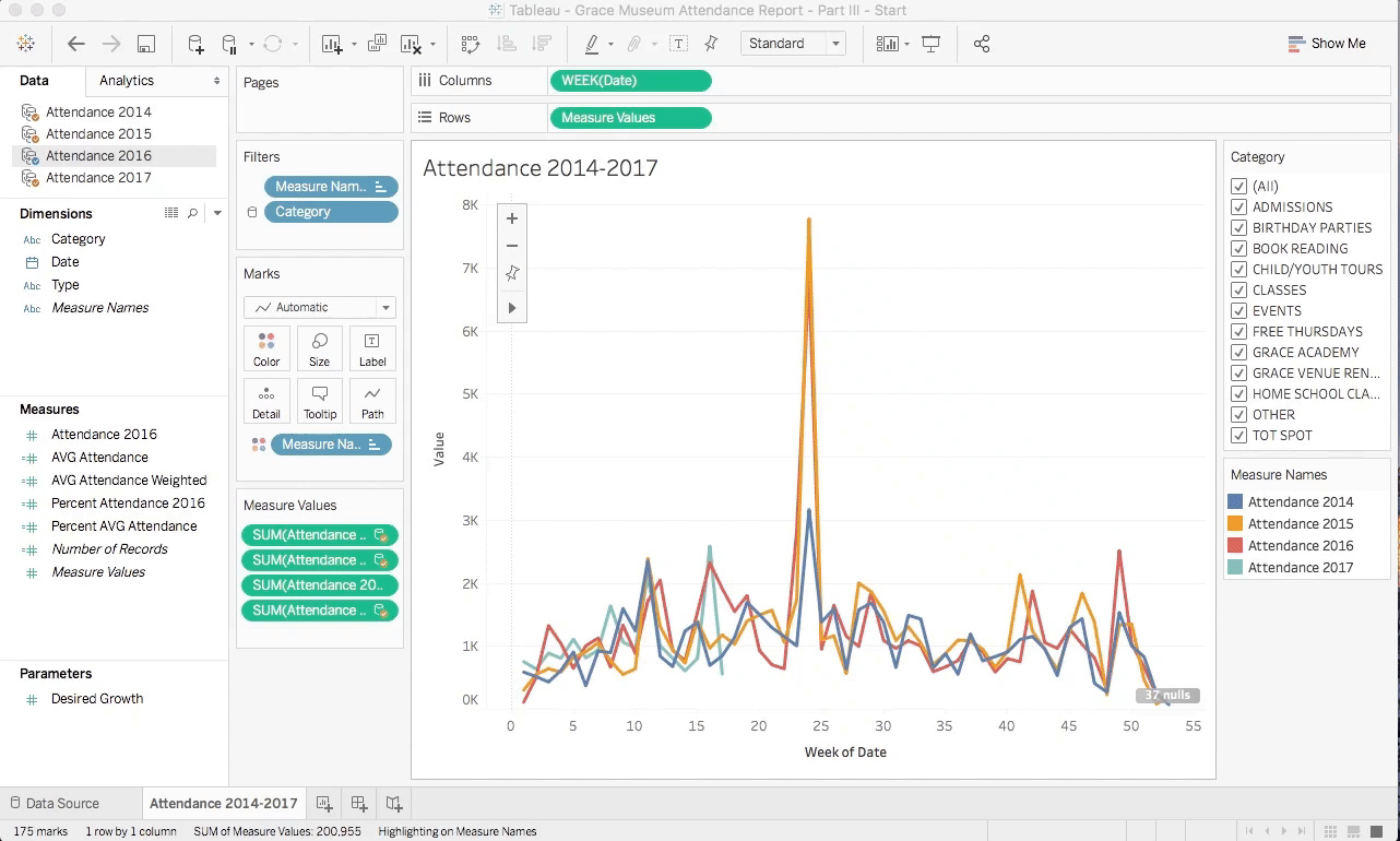
This is what Tableau should look like when you first open the packaged workbook provided above. You should notice that most things look familiar from where we left off in our last post. I’ll draw your attention to just a few things that will be important to us later.
First, notice on the right side of the screen are two small boxes – Category, and Measure Names. Clicking on the items in each of these boxes allows us to highlight or filter the data in our charts interactively. First, try unchecking the Events category. You’ll notice a large change in the data around week 24. By unchecking Events, the attendance data from those events is removed from the chart. You can try playing with a variety of categories to look at the contribution each category has on overall museum attendance for the Grace. Clicking on one of the colored boxes for Attendance will highlight that year’s attendance amidst all the other years. This can be really handy to see clearly among a fairly busy graph.
Next, notice that the Attendance 2017 line is incomplete. This line ends at week 17 because our 2017 performance is still in progress. Over time, as new data is added to the 2017 Excel spreadsheet, this line will advance until it too is complete in week 52. Watching the progress of our 2017 attendance each week is a great way to stay tuned-in to whether we are meeting our goals on a frequent basis.
Who’s winning the race?
If you’re anything like me, this initial graph is a bit hard to understand. The weekly view is so spikey (that’s a technical term) that it can be hard to know exactly what’s going on and even harder to learn along the way. I often find it much easier to look at data like attendance as a year-to-date value. Luckily, this is easy to accomplish in Tableau.
As shown in the image above, simply hover over each of the items in the Measure Values shelf. Click on the small down arrow to reveal other actions you can perform and then select Running Total from the Quick Table Calculation menu.
A Table Calculation is a mathematical formulation that is applied to multiple data elements in either a row or a column of data from your Excel document. This is exactly the same as the Sum Totals we calculated in Excel from Part I of this series. The Running Total table calculation simply computes the total for all values up to the current point of the data.
Having done this, now it’s much easier to see that 2015 and 2016 were significantly more successful in terms of attendance than 2014. Great job Grace Museum! Try clicking the Events check box on and off again for giggles. Doing so, you can see that events have played a major role in that attendance uptick.
Baby steps towards the goal
For your team to become successful as data startups, the ability to set and progress towards achievable goals is in my mind the most important skill to master. Goals like this are tricky beasts to define and we’ve all been apart of projects whose goals are often too lofty and unattainable – resulting in an unclear set of objectives and a sense of hopelessness that those goals can ever be met.
Goals that support team learning are achievable, realistic, and based on actual past performance. Furthermore, there must be an obvious and incremental path to achieving these goals and measuring our progress.
In one of my favorite movies, What About Bob, the main character, played by Bill Murray, is struggling to overcome a series of paralyzing fears. Among the advice from his therapist is the introduction of the Baby Step method – “setting small reasonable goals” as a way to conquer those fears. “It works!”, Bob exclaims as we follow him through a series of hijinks that unfold during the rest of the movie.
Not to draw the comparison between museums and psychiatric patients too far, but museums often lack such practical step-by-step thinking about how to achieve the goals they set out for themselves in their missions and strategic planning.
Picking a place to start
There are a thousand different ways to pick a goal. For our purposes, let’s start with one of the most obvious. We have three prior years of actual attendance, one first-order guess at what our final 2017 attendance might be is to look at the average of those past three years.
In Tableau, we can define what is called a Calculated Field. Simply, a calculated field is just a small math equation that is calculated over the data we’ve loaded into the workbook. A simple average is just the sum of all values divided by the number of values – easy!

The image above shows a calculated field called AVG Attendance that I wrote for this lesson. It can be found in the packaged workbook you downloaded at the beginning of this lesson. You can see it for yourself by selecting the Attendance 2016 dataset from the Data pane and then by right-clicking on AVG Attendance under Measures to Edit the calculation.
Essentially, you can see that this calculation adds the sum of attendance from 2014-2016 and then divides that number by 3 to get the average. A special function in Tableau called ZN() helps us deal with values that don’t exist in the data (i.e. when attendance for certain days are missing), and we use the function SUM() to add up all the values of attendance for whatever time period we have chosen. In this case, we chose to view weekly data (7 days), but we might have also chosen to see the data on a monthly basis (28-31 days).
Let’s take a look at what this average looks like by graphing it quickly in a new Sheet within Tableau. You can follow along in the next image. Click the new sheet icon from the bottom of the Tableau window. Drag the Date dimension onto the Columns shelf and set it to Week Number. Next, drag the calculated field we created, AVG Attendance, to the Rows shelf and fit the width of the graph to your window so we can see the whole year.

You should notice that the shape of the year looks familiar, with a large spike around week 24, and if we were to tick the events category on and off, you would see that spike get shorter and larger respectively. This average is a good first-order guess at what one year’s attendance might look like on a weekly basis.
Of course, you might rightfully say that “our museum has changed a lot during those three years – this average doesn’t represent what we really think will happen!”. Let’s refine our prediction a little bit more and see what might happen if we weight our guess to be more like our most recent performance. Take a look at another calculated field we’ve created called AVG Attendance Weighted.

This formula is very similar to the earlier Calculated Field we created for the simple average. The only differences you’ll note here are some decimal numbers multiplied by each year’s attendance. In a simple average, each factor is weighted equally. For an average of three years, each one represents 33% of the average. In our weighted average, we’ve just shifted this balance around a bit. I chose that the most recent year (2016), should get 50% of the weight, followed by 30% for 2015, and 20% for 2014. Notice that these values sum up to 100% – as they should. This weighted average should then give us a prediction that is informed by past performance but looks most like our 2016 performance.

Let’s graph this against the simple average and see what happens. The image above shows you what we’re doing. Simply drag the calculated field we created for AVG Attendance Weighted onto the y-axis until a dual-axis icon appears, then drop it to add a second line to the chart.
What you will see is that the Average and the Weighted Average are very similar to each other for most weeks of the year. One exception seems to happen around week 16 where the weighted average is about 20% higher than the simple average. Something good must have happened in 2016 to drive this change! Indeed – if you look at the 2016 attendance, you will notice that it exceeds the simple average by 75% – a HUGE difference.
Goals versus Predictions
So, I want to own up to a small inaccuracy I’ve woven into the story thus far. By choosing to use averages to set our goals for attendance – we’ve perhaps stretched the truth a bit on what a museum would choose as an actual goal for their attendance. In the museums I’ve been a part of – a goal of beating the average attendance for the past three years would not cut it.
To be fair, what we’ve actually done is to create a reasonable prediction of what might happen if all the circumstances in our museum remain relatively the same as the past three years. That’s nice, but it’s not really the way that museums work. We’re always planning new things, trying new things, and searching for new ways to connect with audiences who aren’t yet coming. In that light – a prediction about maintaining the status quo probably isn’t what we’re looking for.
A goal is set for us to work towards achieving. A stretch goal is sometimes even more assertive by setting a high-bar for performance that we’ve not ever met before. This sounds more like the kind of museum planning (for better or worse) that is more familiar to me.
So, if we’re going to stretch to achieve new heights, how do we know the baby steps we need to take each week to hit that goal? How might we know, in the moment, whether we are ahead or behind the pace we need to cross the finish line? Our example here is about attendance, but in reality, this approach can be used for any number of goals we might pursue.
Let’s pretend that the Grace Museum chooses that they want to try and break an attendance of 70,000 visitors by the end of 2017. Let’s show you how to build a few dials and knobs into our worksheets that can let us gameplay our goal-setting.
First, we need to determine what percent of the full year’s attendance comes from each week of the year (i.e. 2% of the 2016 attendance happened in Week 45). In each of the datasets (Attendance 2014—Attendance 2016), we’ve created a calculated field for you called Percent Attendance <Year>. If you edit this for 2016, you’ll see the following.

This formula simply takes the sum of Attendance in 2016 for each week and divides by the sum of Attendance for all weeks in 2016. The TOTAL() function in Tableau performs calculations across all columns of data in our imaginary spreadsheet – thus for all weeks in the year. This simple division gives us the percentage of attendance for each week in the year. You can click through each year of data and see that these fields have already been created for you.
Note: In setting up these calculated fields, I also set the number format for each to represent a percentage. Otherwise, these numbers will simply display as a decimal by default. This can be done by right-clicking on the field you created and then choosing the Default Properties -> Number format option.
From this point, we’ll need to know the average percent of attendance contributed by any week of the year to the yearly total. This process is the same as the process of creating the average and weighted average we covered above. In the Attendance 2016 dataset, you’ll notice that I’ve created a new field for you called Percent AVG Attendance. It looks like this:

Let’s create a new sheet and drag each of these into a chart so that we can inspect our work.

Following along in the image above. I’ve already dragged the Date field from 2016 onto the Columns Shelf and set our view for weekly data as we’ve done in earlier steps. First, drag the Percent Attendance 2016 Measure onto the sheet as shown. You’ll see the percents appear for each week. Next, switch to the Attendance 2015 dataset and do the same thing for Percent Attendance 2015. You’ll see a second row of data appear for 2015 and you’ll also see that Tableau has created the Measure Values shelf for you to hold those Measures. Next, switch to the Attendance 2014 dataset and drag Percent Attendance 2014 to the correct (topmost) position on the Measure Values shelf. Finally, return to the 2016 data and drag the Percent AVG Attendance measure to the last position in the Measure Values shelf.
As you scroll left and right – you’ll notice that the percentage contribution of each week is displayed in this chart and that the last row of data contains the average of the 2014-2016 data. If you’d like to check even further – you can turn on row totals by using the Analysis -> Totals -> Show Row Grand Totals menu in Tableau. Doing so will show you that all the weeks together make 100% – yeah!
While this chart isn’t very exciting and it won’t be one that you use on a regular basis, it’s an important intermediate step for us that will allow us to pick a stretch goal we want to achieve and then map it onto our past weekly performance to stay in touch with reality. (What a concept!)
Building the Goal
While there are many ways we could choose to set an attendance goal, for the purposes of this tutorial, we’re going to build a tool that lets us specify a percentage increase over the average attendance.
To do this, we need to introduce a new concept called a Parameter. You can think of a parameter like a placeholder for a value you’ll choose at the time you generate the report. Rather than one fixed number, parameters give you an option to choose and change that number easily. Think of this like knobs and dials that you can fiddle with to adjust your goal.
First, be sure you have selected Attendance 2017 as the active dataset. Next, to create a parameter, simply right-click in the Measures area of tableau and select the Create Parameter… menu option.

Let’s name our parameter Desired Growth. Tableau asks for a bit more information about the parameter you are creating. For our purposes, Data Type will be a Floating-point number. This is simply a decimal number. We’ll choose a default value of 0.05, or 5%. And we will choose a display format for percentages. Any value is fine for us, but in other cases, you might choose to limit the values that can be chosen.
Now that we have a parameter to use, let’s create a calculated field based on our average attendance projections that will lead us to the desired growth we choose. Look for the measure named Attendance Goal 2017 and edit it.

Notice in this formula, we are simply multiplying the Desired Growth we’re looking for against the AVG Weighted Attendance field we created in earlier steps. Since we’re specifying growth as an increase (i.e. 5% increase), we need to add 1 to that decimal to give us a larger number (i.e. 105%).
For convenience sake, we are also going to create two new fields called YTD Attendance 2017 and YTD Attendance Goal 2017. These are simply the RUNNING_SUM() table calculation we created in an earlier step and will help us in the next few steps we’ll take.

The image above shows how we can create our weekly metrics for 2017 attendance versus the goal we chose. To create this, start with a new sheet. Drag the Date from Attendance 2017 dataset onto the Columns shelf. Set the date to Week Number as we’ve done in past steps. Next, drag the YTD Attendance Goal 2017 to the Rows shelf and set the view to fit the width of the whole table. Finally, drag the YTD Attendance 2017 to the vertical axis until the dual axis marker appears. Voila!
Now you can see that the Grace Museum’s 2017 Attendance is doing well against the goal we set of 5% growth above the weighted average. But what if we want to play with that number a bit? What if we want to shoot for 70,000 visitors instead of just a percentage increase?

To start, let’s add a label to this graph to show us what our end-of-year attendance goal is as a number instead of just a chart. Simply select the last point on the orange line and right click. Go to the menu called Mark Label and select Always Show. This will display a number with the total attendance in the last week of the year. We’ll have to move this around a little to display nicely. Just click and drag it to wherever you like.
Next, right-click on the Desired Growth parameter we created and select the menu called Show Parameter Control. You’ll see a new card added to the display called Desired Growth and showing our default value of 5%. Click into that box and try changing the value around a bit. Notice how changing the value also changes the graph of the attendance actual versus goal lines? Also notice that the label for total 2017 attendance has changed too. If we play around a little bit, we can see that to reach 70,000 attendees by the end of 2017, the Grace Museum would need to exceed their average weighted attendance by 20%.
Good work! You’ve got a working learning goal all setup and ready to rock! Let’s not subject the Grace Museum to that much of a stretch goal though! Perhaps we’ll go back and choose our original 5% growth estimate.
So, where do I stand today?
The work we’ve done so far, shows us a nice picture of whether we’re running ahead, or behind the goals we’ve set for ourselves. They can also be updated whenever we have more data to look at – which means we can use it as a way to keep our staff team on top of how we’re trending.
While they’re great, the charts we have created don’t really tell us the magnitude we’re ahead or behind by which makes it a bit difficult to share in a hallway conversation. It would be nice to say something like, “we’re running 10% ahead”, or, “I’m not sure what happened, but we seem to be about 10% behind our goal”. Let’s look at how that might work.
As you might guess – we’re going to create another calculated field that looks at our Performance to Goal. Funny enough – I’ve already created one for you titled Performance to Goal. Let’s edit that field and take a look.

This one’s also easy. We’re just dividing our current performance, YTD Attendance 2017 against our goal, YTD Attendance Goal 2017 and then subtracting 1.0 from that result to get percent ahead and behind our goal. Let’s make a new chart that shows us what this looks like.

First, start by dragging Date onto the chart as we have before and setting the time to weeks. Next, drag the Performance to Goal measure onto the Rows shelf. This will give you a line chart like we’ve used before. In this case, I think it’s a little more useful to see this represented as a bar chart. To change this, simply use the dropdown on the Marks shelf and switch from Automatic, to Bar. Finally, notice that the chart includes all the weeks of the year, even though we just have data for the first 17? Let’s fix this by clicking on the small grey text in the lower right side of the window that tells us there are 32 nulls. Clicking on this gives us two options 1) Filter the data and 2) Show data at the default position. Choosing the default will mark every empty week of the year as zero and filtering the data will simply eliminate all the empty values. You might choose differently in other circumstances, but for this one – let’s just eliminate those pesky empty values.
OK, this is looking good – but I think we could make this chart a little nicer and more informative. I’d like to be able to color the graph green when the data is trending positive and red when the data is trending negative.
To do this, we need to create a very simple calculated field that can check whether the Performance to Goal measure is greater or less than zero. Here’s what that one looks like:

This may look a little bit more like computer software, but it’s really very easy. We are simply saying that if the value of Performance to Goal is less than zero, we should return False. On the other hand, if it’s greater than zero, this field returns True. This simple test will allow us to choose which color to use for each bar. Let’s add that to our chart and while we’re at it we can also add some labels for each week.

To do this, simply drag the PerfAheadGoal measure to the Marks shelf and drop it on top of the Color button. This will color each bar a different color depending on whether it is greater or less than zero. The default colors Tableau chooses can be changed by clicking on the Colors button and choosing Edit Colors.
To add some numeric labels to the bar chart, just drag the Performance to Goal Measure to the Marks shelf and drop it on top of the Label button. The Label button has many different options for representing labels that you can play with. For our purposes, the default options for labels are probably fine.
Pulling it all together
Way to go! Now you have charts that can show you your weekly actual attendance, historic attendance over the past three years, and your performance to goals that you can set for the end of the year. That’s pretty amazing!
Remember, the best way to use these will be to load new data on a frequent basis (probably weekly) so that you can get an up-to-the-minute idea of whether you’re running ahead or behind your goal. If it turns out your goal was too high, or too low – no problem! Simply adjust the Desired Growth parameter that we created earlier in this lesson.
Now – let’s look at another part of Tableau that can show us many of these charts in just one glance. Let’s create a Dashboard. This will take a few simple steps.
Let’s give the sheets we’ve created some good names since those will become the titles we use for our dashboard. Right-click on Sheet 4 at the bottom of the Tableau window. Select Rename Sheet from the menu options and give it the title 2017 YTD Attendance vs Goal. Similarly, right-click on Sheet 5 and let’s give it the title of Performance to Goal.
To create a dashboard, just click the New Dashboard button in the bottom of the Tableau window. This can be found right next to the New Sheet button we’ve used so far.

You’ll notice that the window for creating dashboards is different than the one we’ve been using to create sheets. First, let’s set the size of the Dashboard window to Automatic so that it always fits our screen, no matter what size we’re using. Next, drag the 2017 YTD Attendance vs Goal sheet to the main window of the dashboard and drop it. You’ll see that this chart now automatically fills the full window.
Grab the Performance to Goal sheet and drag it over to the dashboard as well. When you do so, you will see that Tableau turns parts of the window slightly gray to indicate how it will split the layout up. Drop the Performance to Goal sheet on the bottom half of this window. Finally, grab the Attendance 2014-2017 sheet and drag it to align on the right side of the Performance to Goal sheet in the Dashboard window.
Great! Now you’ve got a fine-looking dashboard with all three of the main charts that we’ve developed so far. You might notice that the far-right edge of the dashboard has also brought over all the filters and legends from the individual sheets. Let’s clean this up a little bit.

In the far-right column of the Tableau dashboard, click on the first sub-window for the Category filter. This will cause a gray border to appear around that sub-window with an X in the upper-right corner. Click the X to remove this sub-window. Do the same thing for the second category filter and for the color legend for historic attendance.
You should now have just two sub-windows left in the far-right column. The first are colors for the Attendance versus Goal chart and the second is our Desired Growth Rate. Click into the color legend and click on the small down arrow to reveal menu options. Select the Floating option to break this window out of its column. Simply drag this window on top of the YTD Attendance chart in whatever position you like. Do the same thing for the Desired Growth parameter, dragging it under the title for this chart.
Now play around with changing this parameter from 5% to 15% or 20% and see that both charts automatically update themselves. Nice!
Finally – for the sake of printing – you can choose to fix the size of your dashboard to fit a particular paper size. Simply click on the size drop-down from the left-hand column and choose Fixed Size. When you do, you can then click on the menu that says Custom to choose a paper-size that you can print from. Let’s choose Letter Landscape (1100 x 800). Once you’ve done this, you can change the page setup and print menus under File to print as you normally would.
Final Bits
In case you got lost along the way, or just want to skip to the closing credits, you can download the final version of this packaged workbook from this link.
Grace Museum Attendance Report – Part III – End
Congratulations! You’ve successfully built a sophisticated reporting and performance management tool!

Upcoming Events
-
CEO Chat: Censorship
Event Date:Presented by: American Alliance of Museums -
Makerspaces for Museums and Historic Sites
Event Date:Presented by: American Association for State and Local History (AASLH) -
Planning and Budgeting for Fundraising Success – OMA Webinar
Event Date:Presented by: Ohio Museums Association -
AASLH History Hour: Civic Practice
Event Date:Presented by: American Association for State and Local History (AASLH)